Intermarket Analysis Throught Macro and Technical Methods
10-Year Real Rate Trading: A Complete Guide.
How to Break Down and Interpret the 10-Year Real Interest Rate.
What you will find here:
- A study and breakdown of the 10-year real rate.
- A quantification of what has been happening with it, since September 24 and why its recent movements are due to changes in the term premium.
- How this affects the real economy.
- The intermarket effects these changes provoke.
- Lastly, a setup that results as a consequence of all the analysis we’ve been doing.
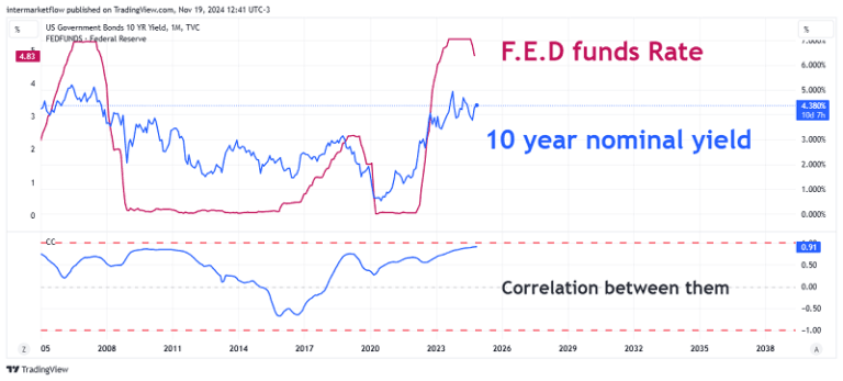
The 10 year real rate as a key rate. Why?
The 10-year real rate is the market’s benchmark rate. There are several reasons for this, but the key distinction—when compared to the 2-year rate—is its independence from the rates set by the Federal Reserve. This independence makes the information conveyed by the 10-year real rate much “purer,” as it provides a clearer reflection of what the market expects for the future.
10-Year Real Rate and Its Correlation with the Fed Funds Rate.
The 10-Year Real Rate and Its Effects on the Real Economy.
The 10-year real rate impacts the real economy through various channels and
activities:
- Housing Market: It directly influences the real estate sector, particularly 30-year mortgage
rates. - Consumer Behavior: It shapes decisions related to consumption patterns.
- Investment Decisions: It plays a central role in investment choices, which, in turn, ripple through
the broader economy.
Breaking Down the 10-Year Real Rate into Its Components: Real vs. Nominal
We’ve already seen, here,that nominal rates—the ones publicly published—carry several implicit messages within their structure. Understanding these messages is key to deciphering what the market expects for the next 10 years.
This insight is especially critical for operations, particularly long swing strategies or for holders.
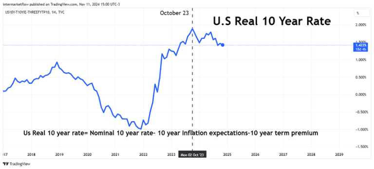
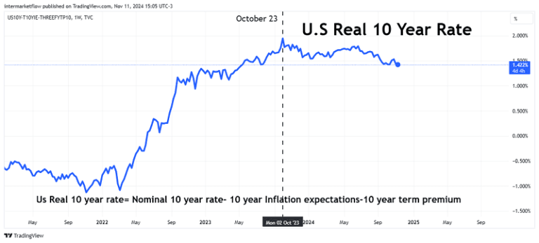
10-Year Real Rate Formula:
Real Rate=10-Year Nominal Rate -10-Year Inflation Expectations – 10-Year Term Premium.
Monthly 10-Year Real Rate Chart
Weekly 10-Year Real Rate Chart
Components of the 10-Year Real Rate, Daily Time Frame in EMA(9).
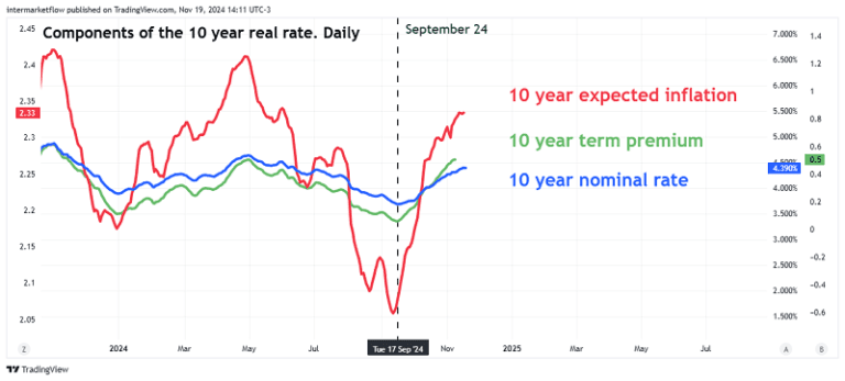
This chart has the variables plotted on different scales. It’s not useful for viewing absolute values, but it helps in understanding the movements of each variable. It’s in a daily time frame, and the series are averaged over 9 periods using the exponential method (giving more weight to recent periods in the calculation).
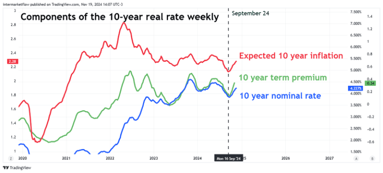
Components of the 10-Year Real Rate, Weekly Time Frame in EMA(9) Mode.
10-Year Real Rates by Component.
Same methodology
On September 24, just over a month ago, a new macroeconomic narrative entered the market: nominal rates
began to rise. This period is particularly significant because it was referenced by Jerome Powell during his press conference and, importantly, it
directly impacts our trading style.
10-Year Real Rates: The Numbers
As we analyze this shift, it’s crucial to understand the implications of rising nominal rates and how
they align with real rates. This connection offers valuable insights into market expectations and helps refine our strategies in response to evolving economic conditions.
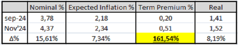
The 10-year real rate has risen by 8.19%. The real issue, however, is that the risk component has surged by 161.54%. Jerome Powell referred to this rate increase—albeit ambiguously—suggesting that the market sees future growth.
However, what the market has been signaling since September is risk. As a result, it demands higher compensation to account for that uncertainty.
Term Premium on a 10 year real rate.
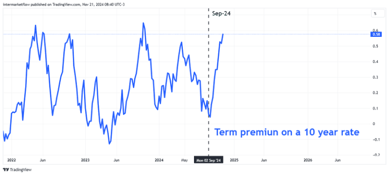
This chart reflects the numbers from the previous table.
10-Year Real Rate and 10-Year Nominal Rate on the Same Scale
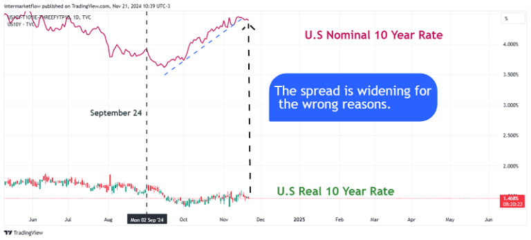
Since September, something has changed: real rates have remained relatively stable while nominal rates have been rising due to a higher term premium.
This is the chart to watch—not only because it reflects current levels but also because it perfectly illustrates what’s happening.
10-Year Real Interest Rates and the Global Financial Crisis: A Historical Perspective.
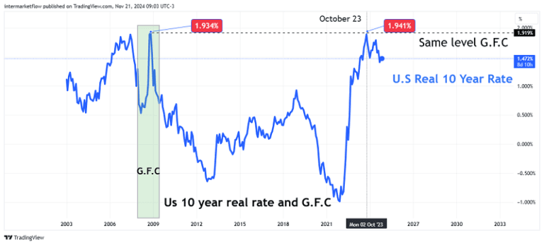
In grey, GFC recession
The peak level reached during the Global Financial Crisis (G.F.C.) is the same level we touched in October 2023. This serves as a reference point in a historical context.
Intermarket Analysis and the 10-Year Real Rate 10-Year Real Rate and Gold.
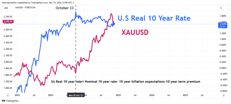
Gold has managed to hold its ground and even rise despite the 10-year real rate increasing. However, the breakthrough from the consolidation zone begins precisely when the 10-year real rates start to decline. This is not a coincidence—it’s causality.
In October 2023, a new macro narrative quietly entered the market.
It should not go unnoticed that a safe-haven asset with a high opportunity cost is at historic highs. This Is a clear reflection of the overall state of the market.
10-Year Real Rate and the S&P 500
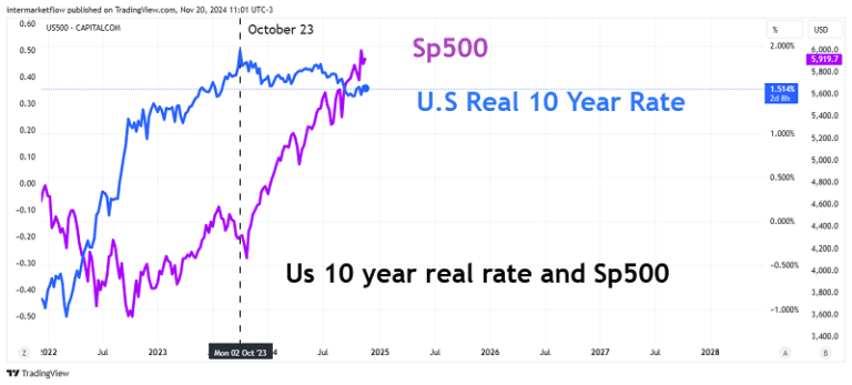
Typically, one would expect that lower interest rates would be expansive for the stock market—and they are. However, since September 24, nominal rates have risen by 15%. This should be corrective for equities, not only because of the rate
increase itself but also because the reason behind the rise signals the market perceives greater risk. This is the central point.
10-Year Real Interest Rates and the Russell 2000.
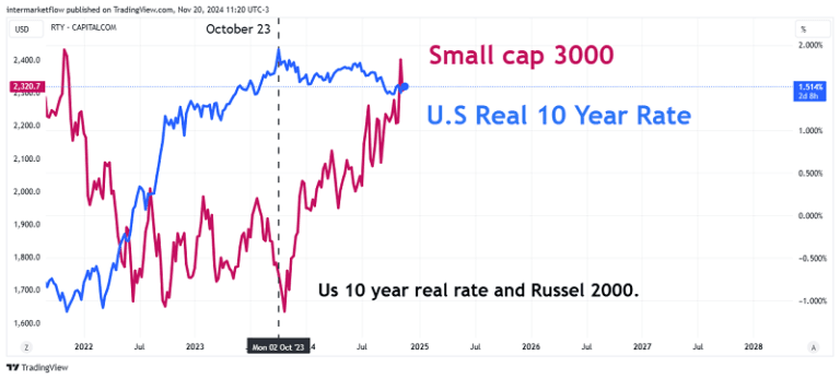
The effect is broad and not exclusive to the S&P 500.
10-Year Real Rate and Real Estate.
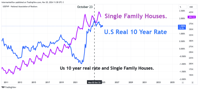
According to the Realtors Association, single-family home prices simply keep rising.
10-Year Real Rate and AAA Bonds.
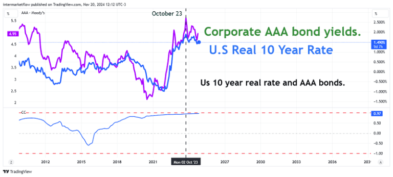
The correlation is grounded in the fact that AAA bonds cannot offer a lower rate than the country’s sovereign debt, simply because they are issued within the same country. The spread between the two provides significant insights into the risk the market perceives the corporate bond market.
In fact, spreads between government debt and corporate debt are excellent proxies for assessing the current state and expected evolution of the economy.
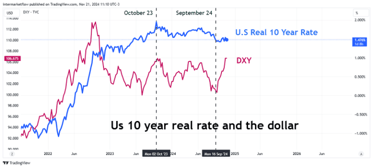
10-Year Real Rate and the Dollar.
10-Year Real Rate and Energy Futures.
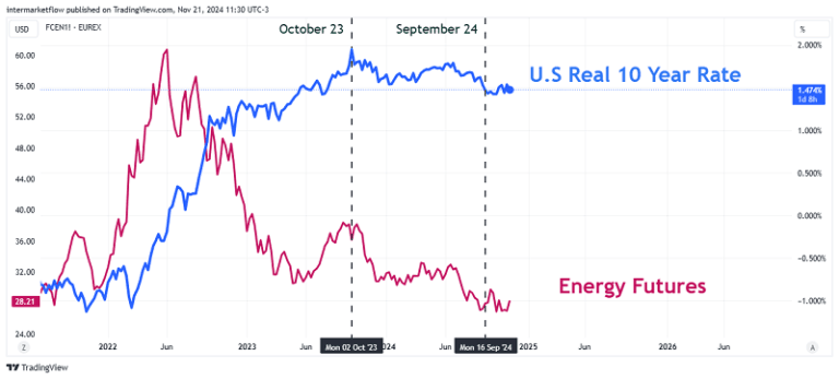
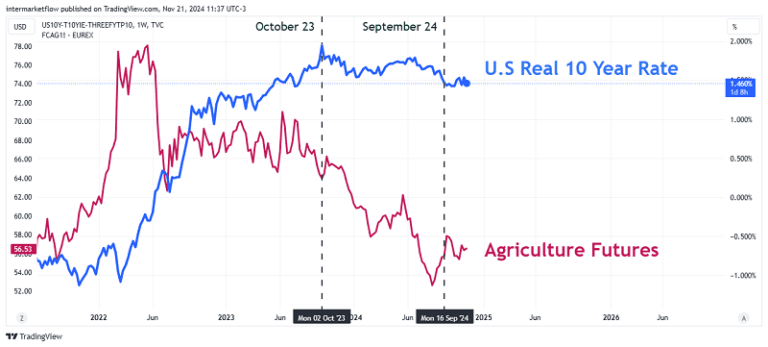
There is also a message in the value of this price. Low prices indicate lower future demand. Here, we see that this expectation remains valid at least until March 2025.
10-Year Real Rate and Industrial Metals Futures.
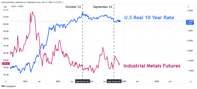
The same situation repeats itself. Same message. We already observed this here.
10-Year Real Rate and Agricultural Futures.
The effect of the 10-year real rate on all economic assets is remarkable. In one way or another, it impacts everything. Nothing in the real economy operates in isolation of the 10-year real rate. We return to the foundational diagram of Inter Market analysis.
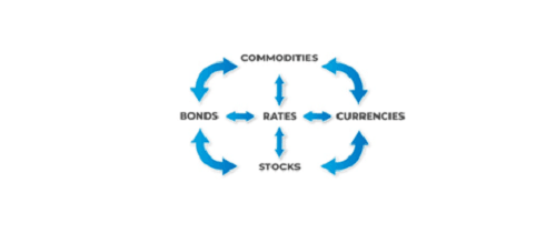
In Article #1, we covered the fundamentals of Inter Market analysis. If you haven’t had the chance to read it yet, I suggest you do so here. It clarifies essential concepts.
10-Year Real Rates and the Macroeconomic Context
A decline in 10-year real rates can have both positive and negative consequences, depending on the macroeconomic context, the phase of the economic cycle and the reasons behind the decline in rates.
Our Hypothesis
Within the macro and global context we have been developing across several articles (macro,global, stage of the cycle), a decline in rates can have the following effects on the real economy:
- Financial Assets: Prolonged low rates can inflate asset prices such as stocks, real estate, or crypto currencies beyond their fundamentals. Is there something similar to
reality here? - Reduced Returns for Savers and Conservative Investors:This drives point 1.
- Distortions in Capital Allocation: Low-return or risky projects may receive financing that they otherwise shouldn’t.
- Banks’ Margins Are Affected, Reducing Profitability: This drives the situation referred to in point 3.
- Signs of Structural Economic Problems: Such as an aging population and low productivity, creating negative growth expectations for the future.
Many of these effects, if not all, are reflected in today’s economy. Furthermore, many assets show the same reading as our hypothesis, such as gold, energy, and the rise in more defensive equity sectors.
Defensive and Aggressively Defensive Setups
We can be defensive, and we can also defend aggressively. These are two completely different approaches. Position size, leverage, and time horizon vary from one scenario to another.
Regardless of the choice, the operational strategy is clear. We proceed in search of the vehicles.
The Determining Chart.

The market has already priced in higher risk on 10-year bonds. However, it doesn’t seem to have done the same with some other assets.
We are looking for:
- Safe-haven assets
- Defensive sectors
If we seek aggressiveness:
- Sectors exposed to a growth slowdown
- Cyclical sectors that haven’t adjusted their values.
- Asset categories that are out of balance.
As always, this choice determines the size and horizon of the trade.
Defensive Sectors
- Short term bonds-Cash-Gold.
- Defensive stocks sectors, Health Care, Utilities, Staples.
There’s not much mystery here. The novelty lies in the fact that it seems gold is absorbing flows that previously had other destinations, such as the yen and the Swiss franc. This shift highlights a change in investor behavior, where gold is increasingly viewed as the preferred safe-haven asset. As a result, it’s drawing in capital that might have otherwise gone to traditional safe-haven currencies.
Aggressive defense: Combined operation.
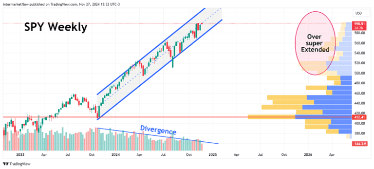
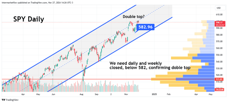
As you all know, we believe this chart is unsustainable. There are several reasons for this:
- Micro level: The valuations and expected dividends are very close to the 10-year rate.
- Macro level: Everything we’ve been discussing here and here.
- Technical level: it is overextended, beyond the value zone that the market considers. Additionally, the last part of the rise is happening with very low volume.
- Inter market level: The messages are clear. Commodity futures for March 2025 are down. Gold is rising strongly, and the decline in the 10-year real rate, which we believe is happening for the wrong reasons, adds another layer to the analysis.
Trading the S&P 500 means you’re trading the best—the top companies, the most solid ones. It’s not an asset where you go looking for a peak. It’s an asset that should only be traded with technical confirmation, and not directly, but through another vehicle.
In other words, aggressive defense only kicks in under specific circumstances that must be met prior to the trade. This is a very important difference compared to the previous style.
Very aggressive setup in the following blog article. Look for it there!
As always, I must remind you that these are not recommendations. These are our analyses and, in some cases, our trades that we have decided to make public for marketing purposes.
You can find us at intermarketflow.comor on X @intermarketflow.
We’ll stay in touch.
Martin
Intermarketflow.com
- Intermarketflow