#27 Two Year Real Rate Trends and Analysis.
Decomposing Two-Year Real Yields into Their Components.
Here you will find:
- The break down of the elements that make up nominal interest rates.
- We calculate and graph real interest rates.(Nominal – Inflation Expectations – Term Premium).
- We observe nominal rates are dominated by distinct macro narratives beneath the surface.
- We analyze yield curve control as a monetary policy tool and examine how changes in the term premium filter into the real economy.
- Based on all this, along with our macro view of the U.S. and global economies, we continue operating under our main hypothesis.
- In this case, the selected vehicle is the European comercial trade, as it represents the link where we see the greatest weakness.
After the FOMC decision, during the subsequent press conference, Jerome Powell fielded several questions on bond prices and yields. Broadly speaking, he suggested that the recent rate increases reflect growth expectations.
Methodology for Analyzing the Two Year Real Rate.
Of course, we must define time horizons to obtain the various rates present in
the market.
- To work with 2 year real rate, we need the 2-year nominal rate (2-year yield), 2-year inflation expectations, and 2-year term premium.
- The following charts are averaged in an EMA-9 format. Essentially, they are averages of the last 9 data points, weighted mainly by the most recent data. This approach helps us filter out noise and see the data more clearly.
Key Drivers Influencing Rate Movements
2-Year Real= 2-Year Nominal – 2-Year InflationExpectations – 2-Year Term Premium
Breaking Down the Two Year Real Rate on a Monthly Time Frame.

We break down the 3 variables on different scales to visualize correlations across two
time frames. While we won’t be able to see levels due to the different scales used, we can observe behaviors and correlations.
Breaking Down 2-Year Real Rate on a Weekly Time Frame.

Future Projections: What to Expect.
Real economic growth expectations would be reflected in real interest rates. The inflation expectations and term premium components shouldn’t be the main drivers behind rate increases, as this would imply other market expectations regarding real growth.
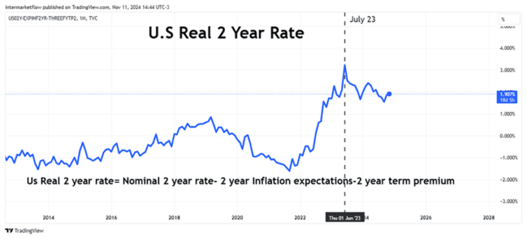
Recent Trends in Financial Markets, Charting Two Year Real Rate, Monthly time frame.

Since July 2023, it has been in a primary downtrend, with lower highs and lower lows in real rates.
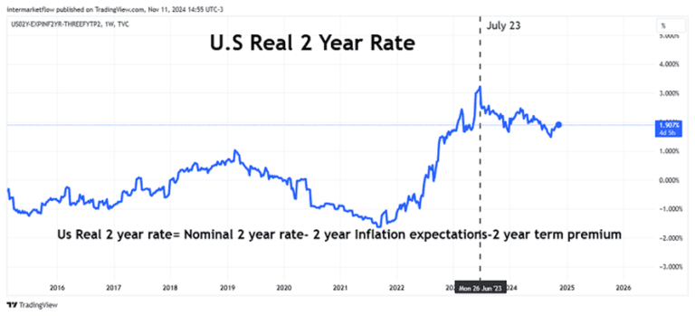
Charting real rates, Weekly time frame.

One way to summarize this information is the spread between Two Year Real Rates and 2 year Nominal rates.

Understanding Recent Rate Changes.
The spread between real and nominal rates (comprising inflation expectations + term premium) decodes the messages coming from the bond market. The bond market anticipated real economic growth up until July 2023.
Notice that the real rate nearly equaled the nominal rate, implying that inflation
expectations and the term premium were practically zero.
Comparative Analysis: Then and Now.
Since then, the dominant macro narrative has shifted. The spread has widened, and real rates have started to decline, meaning that the other components have grown.
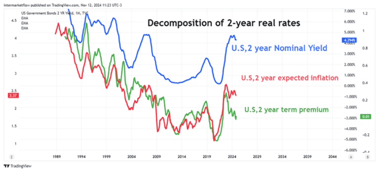
Charting 2-Year Nominal rates, 2-Year Term Premium and 2-Year Inflation Expectations.

Recent Shifts in Interest Rates, reading the markets.
Notice that the nominal interest rate is relatively stable since July 23.
However, beneath the surface, dominant macro narratives are shifting. The term premium has clearly risen in recent months, meaning the market now demands higher 2-year returns to absorb interest rate risk over this period.
This macro narrative shift entered the market in September 2024, just recently. The term premium increase is significant enough to offset declines in inflation expectations. It´s big!
What the Numbers Reveal.

Conclusions:
- Movements in nominal rates have several sources: Changes in real rates, inflation expectations, and the required return to purchase Treasury notes—in this case, with a 2-year maturity.
- Nominal rates mask the variation in other variables, which are highly volatile and quick to change. These shifts send radically different messages from the market.
- The change in the real interest rate over the analyzed period is negative, indicating that the market holds worse outlooks for the real economy during this timeframe.
- The rise in nominal rates is due to a significant increase in the term premium.
- J. Powell knows all of this and more.
How the Term Premium Filters into the Economy in Real Life.
In each note auction, buyers and sellers appear. The balance of supply and demand determines a price, which in turn sets the term premium, given inflation expectations already established in markets via several channels.
The problem arises when the government intervenes—whether through excess supply or forced demand increases.
This is known as yield curve control and is practiced around the world. It’s simply another monetary policy tool, which can be implemented in different ways.
In plain language.
For example, by changing the debt’s duration.
If the debt profile were shifted from 30 years to 2 years, this would involve issuing more 2 year debt (over supply) and issuing less 30 year rate (supply shortage).
This lowers the 2-year rate (the price to pay for the note,but worsens the overall debt profile) and drives up 30 year rate (the price to pay for a 30 year bond) achieving a nice upward-sloping yield curve, but starting from lower initial levels—in other words, an active stimulus policy (Yellen style).
It’s also true to say, that this monetary policy could work to boost activity in an initial phase and it’s definitely more politically acceptable.
The cost of this is a weaker debt structure, especially over the next two years. In other words, they’re kicking the problem two years down the road.
All of these align with a U.S. and global economic slowdown and governments trying to avoid it. That’s the current scenario, with a market that sees the outlook as increasingly risky.
For all these reasons, we continue trading under the same hypothesis across different vehicles.
That’s all for now. Trades and setups derived from this analysis can be found in the blog Article #28 and are exclusive for subscribers.
Please share this.The subscription won’t cost you anything and it makes our day.
You can find us at our site intermarketflow.com or on X @intermarketflow.
Watch Animal Planet. The best traders in the world are there, trading for their lives every day!
See you soon,
Martin
Intermarketflow.com
- Intermarketflow
