Intermarket Analysis Throught Macro and Technical Methods
We are entering Stage 4 of the Macro Narrative: Backed by the integration of Macro, Intermarket, and Technical analysis.
The revolution is here—a new macro narrative is taking control.

Here You Will Find:
- The rationale for the transition to Stage 4 of the macroeconomic narrative.
- A recap of the different types of analysis supporting this view: Intermarket, Macroeconomic, and Technical.
- A review of macro identity, explaining the key conflict points between the incoming and outgoing macro narratives. This is key to understanding everything that follows.
- A breakdown of trading systems to use in each stage of the narrative.
- A setup for Gold.
- Setups to short the S&P 500 using leveraged ETFs.
Reading the Macro Narrative Stage Determines the Trading System to Use.
- Stage 1 of the Macro Narrative: Primarily trend-following systems—breakouts are traded, and the most common strategy is “Buy the Dip.”
- Stage 2 of the Macro Narrative: Trend-following systems still dominate, but momentum takes on a more prominent role.
- Stage 3 of the Macro Narrative: Mean reversion systems come into play, focusing on finding tops and bottoms. This stage is characterized by high volatility.
- Stage 4 of the Macro Narrative: Key technical levels are identified to confirm the start of a new trend, where trend-following systems regain prominence.
Origins of Conflicts Between Macro Narratives.
Macro Identity
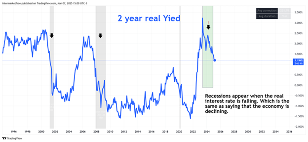
Nominal Rate (2Y) = Real Rate (2Y) + Inflation Expectations (2Y) + Term Premium (2Y)
(We use the short end of the curve because this is where the Fed’s communication with markets is clearest.)
There are three main sources of discrepancy:
- Disagreements about the real interest rate, which is essentially a disagreement about economic growth expectations.
- Disagreements about expected inflation.
- Disagreements about the perception of the term premium.
Recessions and the Variables That Shape Interest Rates: A Historical Perspective
- Disagreements About the Real Interest Rate
This is equivalent to disagreements about future economic growth.
- Discrepancies in Expected Inflation
These arise when market participants differ in their outlook on future inflation trends.

- Discrepancies in the Term Premium.

Where Is the Macro Narrative Conflict Today and What Are the Consequences for Trading?
The data indicates that today’s disagreement centers around the real interest rate, which is essentially a debate about the future growth of the economy.
Argumentation Through Different Types of Analysis.
- Macroeconomic Analysis
We have approached this analysis through its various components:
- Correlation between the 2-year yield and the Fed Funds Rate.
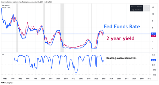
Below, the Correlation Coefficient Between Both Variables
As we’ve discussed multiple times on the blog, the 0-2 year segment of the yield curve best reflects communication between the Fed and the markets. The short time horizon ensures that the 2-year yield is strongly influenced by short-term rates.
Correlation Between Interest Rates and Volatility.
The chart below displays the correlation coefficient between interest rates and volatility.
- When this coefficient approaches 1, the macro narrative between the Fed and the market is aligned.
- However, as new information enters the market, correlation fluctuates.
A decline or breakdown in correlation signals that the market is diverging from the Fed’s projections, or that competing macro narratives are emerging. This generates volatility—one of the key characteristics of Stage 3.
In other words, lower correlation means greater narrative conflict, leading to increased volatility. Over time, correlation tends to reestablish itself as either the Fed or the market adjusts its stance.
Spread Between the 2-Year Yield and the Fed Funds Rate.
This spread reflects the level of macro narrative conflict and the degree of disagreement between the Fed and the market. Its impact can be seen in indicators like the VIX.
Key Takeaways from the Chart
- The 2-year yield always leads the Fed.
- It’s crucial to understand its impact on assets with similar duration.
- A correlation breakdown signals the emergence of a new macro narrative, which may or may not become dominant.
- The Fed’s control over interest rates weakens as the time horizon extends.
- When correlation remains high for too long, the market is ready for a new macroeconomic narrative and its corresponding adjustments.
- The spread between these rates is an excellent indicator of market uncertainty.
- Since the 1990s, every recession has required both rates to decline, with the 2-year yield leading the Fed’s rate cuts.
- This makes the 2-year yield a highly reliable leading indicator.
Macro Analysis Method: Economic Sector Analysis, Especially Cyclicals
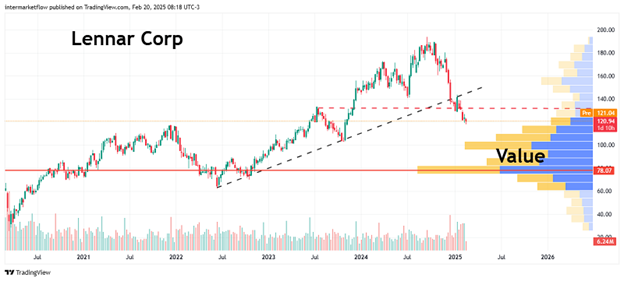

This led us to develop several setups for this sector.
In the technology sector.


This also led us to develop a setup for them, which we presented on the blog. NVIDIA , TECS, You can see all of this in the X timeline as well. In December 24 we predicted and traded this. Especially dates!
Consumer discretionary sector as a whole.

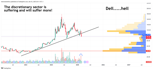
All of this led us to a setup we proposed on SCC, which we presented here.
2. Identifying the Macro Narrative Stage Through the Labor Market
On the 7th of this month, we posted the following chart on X.
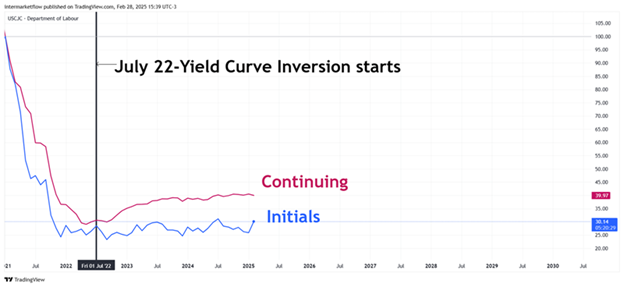
Reviewing Our Labor Market Analysis.
We have been covering the labor market since July 24, X. We concluded some time ago that the labor market was not resolving unemployment claims, which put the economy on a path of rising unemployment.
3. Macro Narrative Status Through the State of the American Consumer.
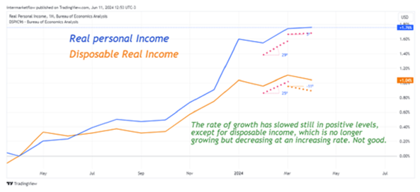
We analyzed this here, and the conclusion was that disposable income was declining, eroded by inflation that has persisted for over four years.
Methodology 4: Yield Curve Inversion
We analyzed this here, and for almost seven months, we have been anticipating this scenario.
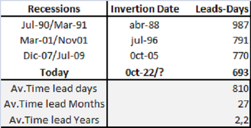
Reviewing What We Saw Here
We had concluded that a recession was more likely between May, June, and July 2025 because, when overlaying the leading times of the three yield curve interpretations, all three converged within that quarter.
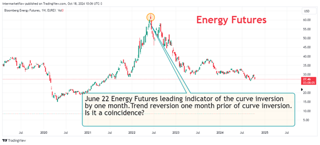
Methodology 5: Macro Narrative Status Through Intermarket Analysis
We have analyzed this on multiple occasions (here), but it can be summarized in two charts.

The gold breakout has been sending clear signals that something isn’t right. Given gold’s role as a safe-haven asset, the message is unmistakable.
We also observed this through oil, both spot and futures.
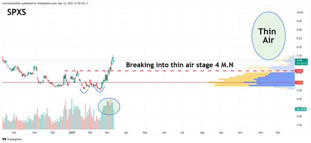
Methodology 6: Identifying the Macro Narrative Stage Through Technical Analysis.
OR
UPGRADE
Free trial has expired.
If you believe this is an error, please
contact the administrator.
OR
UPGRADE
If you believe this is an error, please contact the administrator.
The focus of technical analysis is price movement. The underlying assumption is straightforward: prices reflect all available information at any given moment, including market sentiment.
Reviewing what we recently discussed, we analyzed this chart, which helps illustrate the point.

Prior to this chart, we had already pointed out the critical situation the S&P 500 was facing.
This scenario has been consistently posted in our timeline for at least four months.

Reviewing the Analysis.
Regardless of subsequent price movements (available in our X timeline on January 10, 24, and 29, and February 7, as well as in several articles, including the January 22 piece), our hypothesis about the S&P 500’s process became clear.
The power of technical analysis lies in its ability to condense all this information into a single key level—the low, marked on the chart.
Since this is a weekly chart, a close below this level would mark the beginning of a new bearish phase, signaling the transition into Stage 4 of the macro narrative.
At this price and moment, technical analysis confirms its role as the ultimate timing tool.
The Market, Its Sentiment, Irrationalities, and Capitulation.
Across all aspects of analysis, the messages aligned. However, the market chooses what it wants to see (Stage 2) until reality gradually imposes a new macro narrative (Stage 3, which we identified clearly).
The challenge lies in timing—this is where technical analysis becomes indispensable, defining narrative boundaries through price action.
As we know, the market can remain irrational much longer than one can stay solvent. It is price action that confirms when a narrative has shifted.
- Narratives are lagging indicators
- In Stage 2, they self-reinforce (trend)
- When reality diverges too far from price, the trend shifts
Despite the strength of technical analysis, it remains incomplete without a solid macro foundation—and, above all, a clear intermarket perspective.
- Intermarket analysis shows the “global forest”
- Macro analysis reveals the condition of individual “trees”
These approaches are independent yet essential for understanding global market dynamics.
Entering Stage 4—What Does It Mean?
Does this mean prices will only fall? Not necessarily.
There will be countertrends of varying strength, but the dominant trend on a daily timeframe is now bearish.
In this highly directional phase, trading strategies must adapt:
- Mean reversion setups lose effectiveness
- Momentum-driven, trend-following systems take priority
Conclusions
- The breakdown in correlation between the Fed’s rate and the 2-year yield signals a macro narrative conflict.
- Macro analysis of consumer conditions.
- Macro analysis of the labor market.
- Macro analysis of different economic sectors.
- Macro analysis through yield curve inversion.
- Intermarket analysis—the first to signal weakening expectations.
- Technical analysis defines the price and moments when all of this happens.
All these perspectives pointed to the same conclusion. However, only when technical analysis defined clear boundaries did we confirm that the dominant macro narrative had shifted, bringing the economy’s future growth into question.
Even though the analyses were correct and aligned, it was ultimately the market that decided when prices had to adjust.

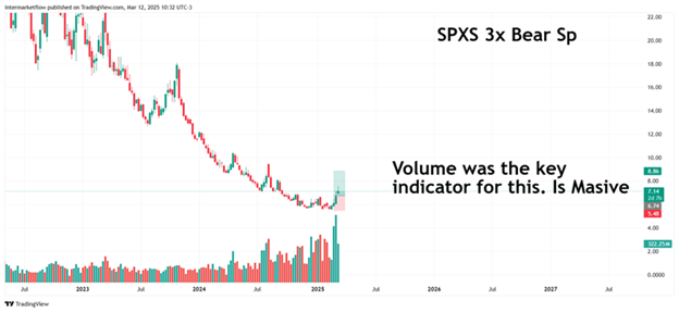
Set-up: Trading the Beginning of a Stage 4 Macro Narrative.
The start of this stage will be characterized by strong countertrend moves. Many market participants are still resisting capitulation, which is why a buy-the-dip strategy should not be rushed. Instead, it should be implemented only after a failed bullish attempt.
FOMO is the worst mistake—it widens stop levels and always carries the risk that the market remains irrational for longer than expected.
Choosing the Trading Vehicles.
At this stage, one can either:
- Look for weakness to short
- Look for strength to trade the trend
Two assets fit these characteristics:
- Gold and S&P 500, but in opposite directions
We will analyze Gold for the Explorer subscription and add S&P 500 for Frontliners.
Gold
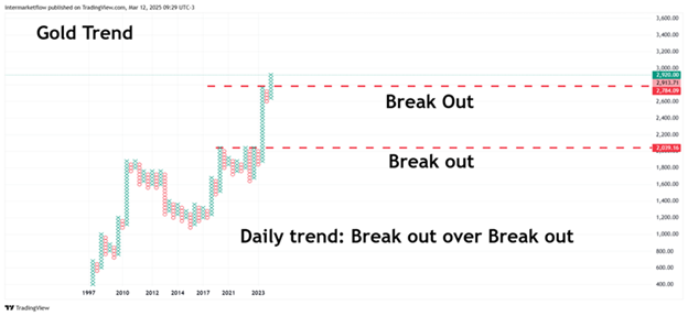

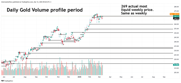
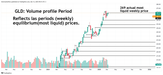
Key Price 269.

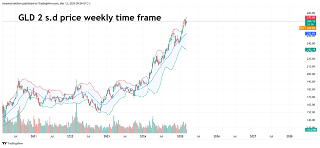
Reading Charts.
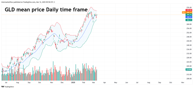
We have a key price level. The daily move has been corrected, but we see an overextension on the weekly timeframe, with price at 2 standard deviations above the mean.
Oscillators are correcting, yet the trend remains clearly bullish.
Strategy: Buy the Dip
Given the overextension on the weekly timeframe, a short-term correction is expected.
- This trade is for a daily timeframe.
- The stop is tight, but it must respect a risk/reward ratio of 3:1

Of course, this entire analysis is backed by intermarket dynamics.
Here is the current state of the money markets—a key factor that could trigger a massive move.
Gold is not a bad candidate for such a moonshot scenario.

Frontliners
These are the charts currently under analysis.


The Frontliners subscription is designed for pro traders.We assume a strong understanding of markets and technical analysis, with traders actively engaged in the trenches every day.

Well, that’s all for today. Here you can find a detailed breakdown of our subscription services.
Once again, this is our work, made public for marketing purposes—not trading recommendations.
Stay in touch,
Martin
[/lock]