Intermarket Analysis Throught Macro and Technical Methods
#39 Inter Market Analysis update, it couldn't be clearer.
Here you will find a complete Inter Market analysis as of today for:
1 Rates, in the different sections ot the curve. (Bonds)
2 Stocks.
3 Commodities.
4 Currencies.
Conclusions from analyzing the 4 mother categories.
5 Finally, a complete technical setup to short Nvidia Corp.
Concrete, tangible and, above all, operable situations.
The dominant macro-narrative is being tested (we saw this here).
This will impact:
- Volatility.
- Price dynamics.
- Direction of prices in the market.
Our focus should be on analyzing the structure of each market and understanding the state of the participants.
As we all know, Economics equilibriums are dynamic and constantly changing due to the entry of supply, demand and information into the market.
The idea of ceteris paribus, or all else being equal, does not exist in real life.
1. Rate Cuts and Inter Market Analysis at full work.
Equity capital may be assumed constant, but the categories of assets where it can be invested for profitability/return are finite.
These categories, such as stocks, have generic aspects that affect all assets within that category. The analysis of the macro-cycle, interest rates, and technical indicators helps determine the state and viability of these asset categories as destinations for funds.
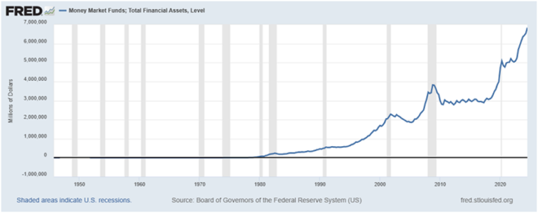
Considering the current situation of money markets, is a crucial starting point for understanding market movements.
Money Markets Today.
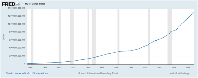
M2 U.S.
Two sides of the same coin.
With interest rates in the 4.5% range, there is a lot of sense in the fact that this is the case. In macro terms, this situation is a guarantee of a deceleration/recession in the future. All of that is consumption/investment deferred over time. That’s a lot, and it is growing at a delusional speed.
Our conclusions:
– Cash is king and it’s denominated in dollars.
– The rate at which it is growing can be interpreted as panic. It is growing too fast in the last few quarters.
– IF we look back, every time this series has peaked, it caused a recession or was followed by a recession. It is 100% effective.
– It is a coincident recession indicator. Neither leading nor lagging, it is coincident.
– It is an important control parameter to locate us in the macroeconomic cycle**.
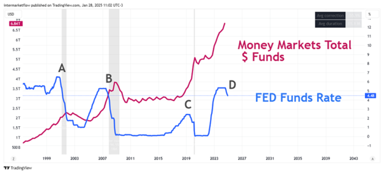
All of them are points in time where rates start the period of cuts. We saw here that this moment is a very reliable leading indicator (the date of the first rate cut with respect to the next recession). This was one of several interpretations we quantified of the yield curve.
We can see that the rate cuts, eventually and with a lag, makes Money Markets less attractive. Of course the outflow of funds does not only depend on rates, the external context, the expected profitability of other assets are part of the same decision, but it seems that the rate cut is the starting point, from which things start to happen.
Inter Market Analysis: Bonds, the key, keep in mind.
It’s not about finding a bond. Like stocks, there are thousands of them. What we look for, through bonds, are rates. In particular, the rates for each section of the curve. It’s about finding a part of the yield curve or identifying which term the market is positioning in today.
The state of each section, which as we already know are totally different assets. As a metaphor, the short end is a pear, the middle is a watermelon and the long end is a banana.
Each section is an asset in itself. Totally different from each other. We are going to analyze them through various ETFs, which are designed to track exactly that.
Keep in mind, this whole analysis takes as the period of analysis, September 18, 2024 to date. That is, from the time of the first rate cut to today.
Short-Term: SHY 1/3 Year U.S. Treasury Bond ETF. (Form by bonds, goes up when rates go down and vice versa )
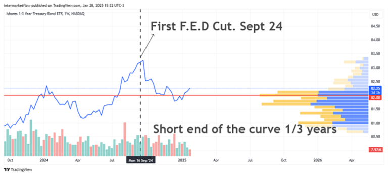
Read the body of the market!
The price is above the value zone (the one with the most interest/trades/volume). Market interest is massive below these prices.
If short rates were to rise again, this etf would find support at those lower price levels. Above, there is not much interest. That is, the market is not validating, is not buying up short bond prices (ergo lower rates). The interest volume falls as the price rises. Nobody out there will accept lower short end rates today.
We can interpret this as an over-demanded asset, above its “equilibrium”. Relative to its own equilibria.
Why does this happen?
If you have cash, by buying a bond you collateralize your deposits. Of course, you pay for that. Especially if you are a Pension Fund. You eliminate the counterparty risk. The bank may collapse, for example. Now you have an American bond. If the bank fails, the bond is still there and has a superior guarantor.
Short/Medium Term: Etf I.E.I Between 3 and 7 years of U.S. bonds.
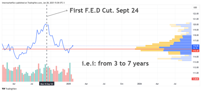
As we move away in time the market situation changes. In this section we are in the part that the market considers to be of value. Look at the skeleton of the market. An equilibrium would be one where the majority of market participants are willing to buy and or sell.
An alternative way to think of equilibrium would be to see it, as the most liquid price. Where you buy or sell the fastest.
This price is not far from its equilibrium “value”. That price is just below the current price. This small over-demand has its origin in the same cause as the previous one.
Medium Term: Etf I.e.i, between 7 and 10 years.
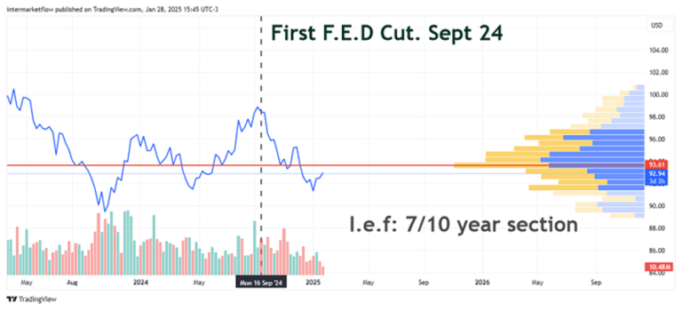
We are temporarily moving away and little by little the market situation is reflecting other situations. Here we are already a little outside the value zone, a little more unbalanced. There is no massive consensus, the zone is becoming less and less interesting. Adding to this, the volume falls with the fall of the price.
It is clearly a less balanced situation than the previous one. Think, as rates go up, the etf goes down, there are fewer participants. This is what we are seeking to understand. Risk Aversion!
Medium/Long: Etf TLH between 10/20 years.
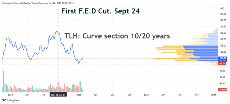
Same situation as above. The further we go back in time and the more misaligned the market is. The more uncertainty there is. Here the price is at the extreme of falling out of the interest zone. Again, volume is falling as rates rise.
Long end: TLT
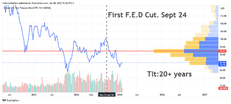
Already at the end of the curve is where the imbalances become maximum. We are far away from the value zone for the market. Long-term rates are de-anchoring and this has very profound real economic implications. Think about mortgage rates for example. If this continues the F.E.D. will intervene. This situation is extremely harmful to the real economy. Especially for the Real State and the sectors that depend on it.
Conclusions
– The cuts began and rates began to rise across all maturities. Rises driven by bull sentiment? By a Bear sentiment?
– Uncertainty obviously magnifies over time. The long rate markets are out of balance, or rather, they are more out of balance than the short ones.
The market is short term, low durations, in dollars within the money markets. This is obvious, what was not obvious are the market conditions of the other sections.
3.Inter Market Analysis: Commodities, Gold.
Keep in mind that the focus of analysis is from September 18 2024 to date.
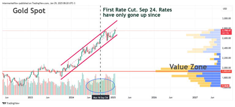
Market Structure. The key!
– An asset that is overextended above its value zone. And by a lot!
– In spite of this situation, the volume at these levels, not only does not fall, but on the contrary, it is getting bigger and bigger.
– This condition is what generates trends. The market supports higher prices and you can read this in the fact that there are more and more participants at higher prices. This is one way to differentiate a bubble from a real trend.
In these markets, mean reversion and momentum function as triggers. The correct, till proven incorrect, trading strategy here is the old, well known and much loved “by the dip”.
Fundamental Analysis of This Situation: Gold price determinants.
- Inflationary expectations.
- Interest rates, especially the 2 and 10 year rates. They determine its opportunity cost.
3.Dollar, not so direct but clearly intuitive.
4.Safe haven asset.
According to the Federal Bank of New York.
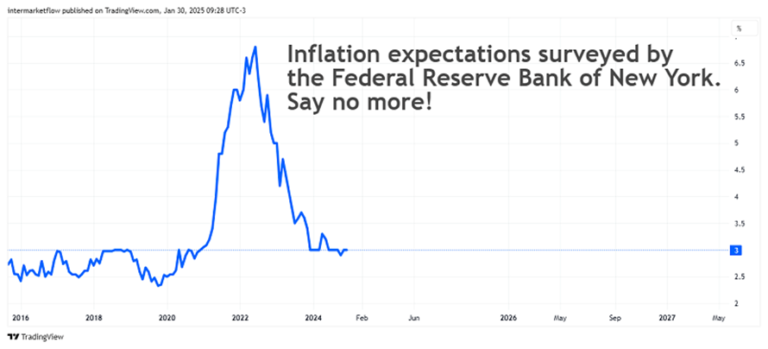
This move up in rates is not about higher inflationary pressures. It is not positive sentiment, bull or productivity that is driving them.
Gold is not only rising but gaining traction through higher volume despite rates. Clear Inter Market Signal!!
Disclosure Principle: Two scenarios.
If inflation expectations were upward, the curve is positively sloped and bullish:
- The market expects a growing economy, at increasing levels of productivity (to sustain that rise in levels) in the future. If this were the scenario, or the dominant macro narrative, gold would NOT behave as it has been doing.
- On the contrary, the market expects more rate risk, thus demanding more rates to buy bonds. This is the scenario where gold will act as a safe haven. Another check point.
Gold is sending a clear message of market sentiment. Because of its history, of what it represents, the context in which it is doing it and the volume with which it is doing it, this message cannot be ignored.
Oil.
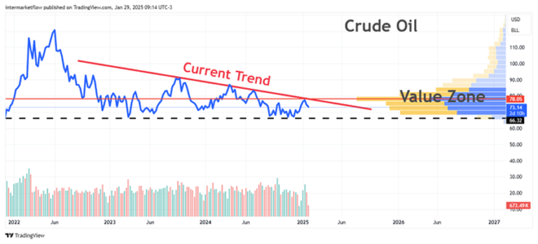
This market is in a value zone, consolidating within a downtrend. This asset is a control parameter about the dominant macro narrative. The consolidation and the value zone are balanced and there is trading volume at these prices. This asset is in balance, given the dominant macro narrative.
Dollar.
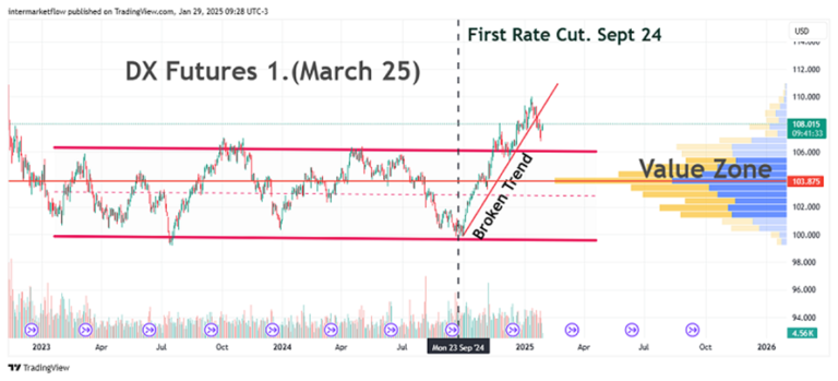
It is striking, but the rate cuts generated the opposite of what it should have generated. The dollar, which should have depreciated, from the very moment the rate cuts enter the radar, only started to rise, even coming out of a lateralization/consolidation.
This trend seems to have stopped and is testing the breakout. The situation is about to be confirmed and must be followed. The dollar remains the safe haven currency, as evidenced by the Money Markets. Its actual value is far from what the market feels as equilibrium.
Movements are probable here.
Stocks.
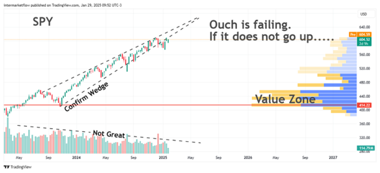
To understand the weakness of the chart, compare this graph with gold. The support structure is different. Out of equilibrium, not validated by the entry of new participants. A plane that is running out of gas. In the last few weeks, it has been gliding. Notice how it is getting harder and harder to keep going up.
Lastly, volatility.
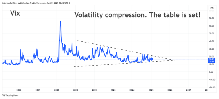
This characteristic is what popular wisdom calls the calm before the storm.Tic,Toc,Tic,Toc…
Nothing wiser than popular sayings.
Conclusions
– The rate cuts has generated a chain of discordant reactions, or worse, contrary to what it should have generated.
– Long rates, at extreme values, are out of equilibrium. No market interest.This situation is not sustainable in time because it has strong implications in the real economy. Government intervention?
– Money markets are full of dollars and growing. The dollar is a safe haven despite the drop in interest rates.
– The stock market structure is extremely weak.
– Gold has a very solid market structure.
The global equity market is in a risk-off.
The following trades and setups are born under this premise.
Well, that’s it for this first part of the episode.
Setups, trades and portfolio decisions derived from here can be found in the next blog article.
Important:
Big changes are coming to Inter Market Flow.
As of March 2025 we will start offering a paid service.
– We need a bigger research team.
– Better reporting tools, data presentation, real time access to market prices , etc.
– We need to solve all of this.
– We need to be profitable to achieve sustainability and above all, maintain quality.
I trust you will understand.
More info, write to us via X.
I will keep you updated on the evolution of this situation.
We will be in touch.
Martin