Intermarket Analysis Throught Macro and Technical Methods
#42 Observing reality through the prisms of intermarket, technical and macroeconomic analysis.
When the price action confirms the intermarket and macroeconomic messages
Here you’ll find:
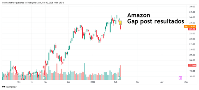
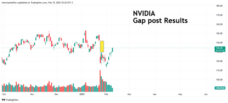
The reaction of Amazon, NVIDIA, and Google to their earnings announcements.
Why the results weren’t as expected and the similarity in the price reactions of the 3.
The clearest message from the intermarket: gold in full stage 1 of price action.
Macro analysis of the American Real Estate sector.
Analysis of the sector’s ecosystem: Prices, Rates, Inventory, and outlook.
Various setups for trading with different technical strategies, in this case, in the tech sector. These are published in the next blog article. #42
A narrative (macro) drift starts when new information challenges accepted facts. Agents selectively choose data that supports their view, resisting change. Over time, reality drifts too far from the dominant narrative, and prices begin to reflect this shift. Highs and lows start forming.
Narratives always lag behind reality. It’s prices that impose the new dominant narrative.”
Today, we’re in a narrative crisis. A revolution brews beneath the surface, and prices are starting to reflect it.
This week, tech companies reported earnings. Below is each stock’s price reaction post-announcement.
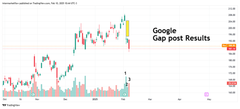
Volume appeared on the dip. This is not the strategy to use at this stage of the asset’s price action. It only resulted in a doji. On the second day, buying volume fell, showing hesitation, which led to selling with volume on the third day.
Buy the dip” did not appear.
Buy the dip in action, but look at the volume… it’s getting lower each time…
All the results, regardless of how one might interpret them, did not align with the dominant narrative.No one expected abnormal CAPEX. For some, it validates their narrative; for others, it validates the opposite narrative.It doesn’t matter. Reality expressed itself through prices.
Broadening the scope: Intermarket analysis.
Here, too, there are dominant and competing narratives. All the time and across all asset categories.
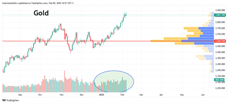
Gold carries several implicit messages. With rates in money markets around 4%, these messages become even stronger. There’s alarm in the markets. This asset is indeed one to trade with the old and beloved “buy the dip.
Macroeconomic Cycle Analysis.
Construction, the leading sector of the cycle, is showing an increasingly critical situation that is not reflected in mainstream media.
Let’s look at Real Estate:
This sector represents ~18% of the American economy. It’s a sector that leads the economic cycle. Due to its business model and demand structure, it’s extremely sensitive to long-term rates (30 years).
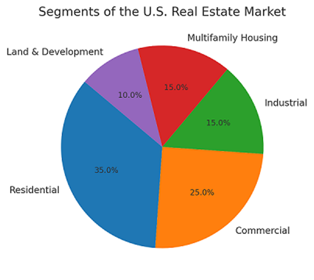
Real Estate: Market Segments.
Real Estate Monthly Reports.
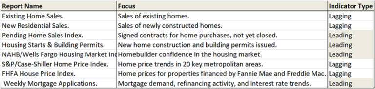
This is a limited list of the most “popular” monthly reports in the sector. Due to the time required for data collection and the type of data they reflect, half of them are lagging indicators that reflect what the leading indicators are suggesting.
Knowing that the construction sector is a leading sector, the information it generates leads the macroeconomic cycle.
Real Estate: Incoming Market Supply, Building Permits + Housing Starts.
Excellent reports when interpreted together. Permits are just that—permits granted—while housing starts indicate where construction has actually begun. The lag between them ranges from one month to ~3 months on average.
Same scale, annualized, and with a 4-period EMA.
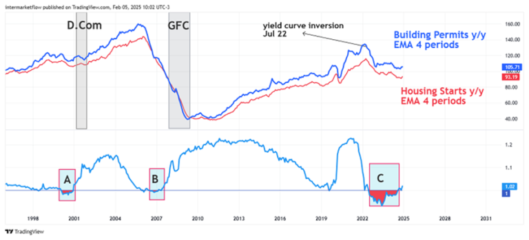
The indicator below is the yield curve plotted daily through the value generated between the 10-2 year yields. The shaded red area represents the time and depth of the curve inversion at each moment.
Real Estate: Interpreting Permits and Starts Interpretation:
- The spread between permits and starts reflects builders’ expectations. They take the first step by requesting permits, but at certain times, permits exceed starts. The spread is not constant.
- Permits last between 6 months and a year and represent between 0.5% and 3% of construction costs. If the project is not completed within the stipulated time, the permit can be renewed, but of course, it must be paid for. In other words, permits are not just insignificant numbers.
- A, B, and C are the curve inversions prior to the Dot.com bubble, the GFC, and the current inversion. The red areas show their duration and depth, and the differences between them are striking in terms of both duration and depth.
- Note that when the spread reaches its maximum (when builders have the worst expectations), permits and starts obviously decline.
- Permits began to fall one month before the curve inverted in July 2022. A leading indicator in a leading sector!
Real Estate: NAHB/Wells Fargo Housing Market Index.
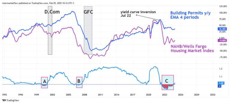
This indicator aims to estimate builders’ confidence in the market, particularly the single-family home market. It reflects the same point we analyzed above, but it’s measured differently. It’s a survey of 400 single-family home builders on various aspects of the market.
Specifically:
- How sales are today.
- How they will be in 6 months.
- How they view the state of potential buyers today.
It’s coincident and leading for permits.It’s clear that from the supply side, the outlook is not good, and production has been falling since the exact moment the curve inverted.
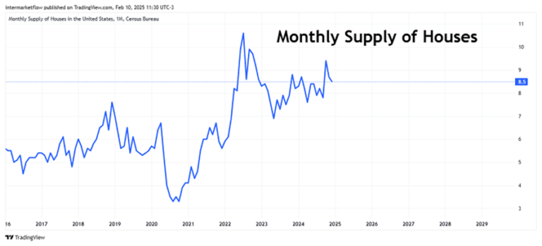
Real Estate: Demand, Supply, and Inventory
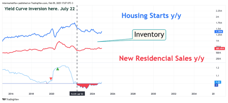
These reports are comparable because both cover the entire new construction market, including single-family and multifamily homes.
The curve inverted, supply began to fall, and sales stagnated. That sounds like a recessionary market in itself, and on top of that, we have inventory to clear.
Real Estate: Focus on the Latest Curve Inversion.
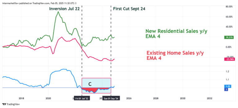
- The used home market plummeted. Of course, who would give up a 3%/4% mortgage to switch to a 7% one?
Real Estate: The Ecosystem Today, Near-Term Outlook, and Key Variables
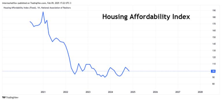
This index weighs the average family income, the average home price, and mortgage rates. It’s hard, very hard, to buy a house today compared to 3 years ago. Practically twice as hard.
Mortgage Rates.
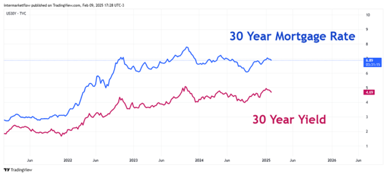
Mortgage rates always have a spread relative to the 30-year Treasury bond rate. Neither the spread nor the 30-year Treasury rates are constant.
If we analyze this solely from the perspective of the level, we can say that mortgage rates are high in historical terms. That’s true.
What’s beneath the surface, as we’ve seen here, is that the market structure for long-term rates is out of balance and with fewer participants each day.
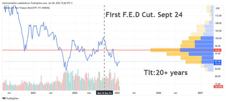
Do you remember this chart?
Look at the price of the asset (ETF replicating long-term bonds)—it’s far from what used to be an “equilibrium” price. On top of that, notice how trading volume is falling. This is the market structure for the 30-year rate.
The mortgage rate is built on the 30-year rate. Additionally, the current conditions of uncertainty for the long term are causing the spread between rates to widen. This reflects what we see in the market structure. Everything is interconnected. The Fed cannot allow long-term rates to become unanchored because, if they do, it will have to intervene. In fact, it already did with regional banks. We’ve also seen this here.
Real Estate Inventories.
Real Estate Prices.
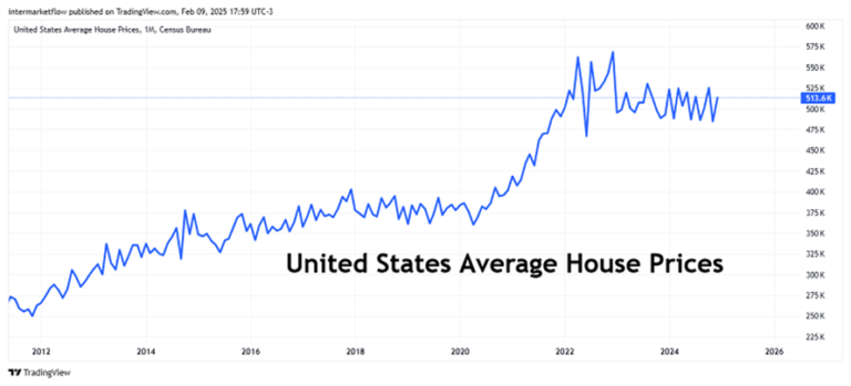
We have prices, rates, and inventories at historically high levels. We also have inventory that will lose value over time. We’ve seen this here as well.
Conclusions:
- Micro Analysis: Reality imposing a new narrative. In this case, tech companies, but there are others in various sectors.
- Intermarket Analysis: The current and very dominant narrative. Gold, no cracks there, and the message is clear.
- Macro Analysis: The leading sector of the cycle has been dragging problems since the curve inverted. The first symptom emerged with the regional bank crisis. The lender of last resort was implemented—we also saw that—but it doesn’t make the problem disappear.
- There’s a new aggravating factor: the situation in the long-term rate market structure. Here
Remember, narratives lag behind reality. What we do know, even without fully understanding it, is that a new narrative is emerging. It’s visible in price behavior and across all asset categories.
Trading:
Well, depending on the asset category, you can trade in almost all styles.
Buy the dip, contrarian, mean reversion—all are correct if we choose the right asset for each, at this moment and for our time horizon.
How important it becomes to be able to trade different assets in times like these.
Well, that’s all for today. As always, the technical setups we’re studying are in the next blog article. For the 10,000th time, this is what we’re seeing and sharing for marketing purposes. THESE ARE NOT TRADING RECOMMENDATIONS.
Remember that starting in March, we’ll be launching a paid version of the service. The reasons for this were already explained in the last episode, so I don’t want to be repetitive. I hope you’ll join us because we need you.
Intermarketflow.com
- Intermarketflow