
Junk Bonds: What Are They Warning Stocks About?
Our weekly report drew two main conclusions:
- The broad bond selloff was revealing early signs of a credit crisis beneath the surface, visible in dollar-volume activity and high-yield bonds.
- The course of action now depends on risk appetite: eliminate risk exposure, hedge rates, equities, and currencies, or—for more aggressive profiles—target the downside in small caps, high-beta stocks, and credit-sensitive sectors.
What has changed, and where does the market stand today?
Credit Stress and Market Risk Regime
How to Read: Left: returns. Right: trading volume. Each group runs 4W → 1W → 1D, from light to dark. Values are expressed in standard deviations (z-scores) from each category’s own historical average. More on z-scores here.
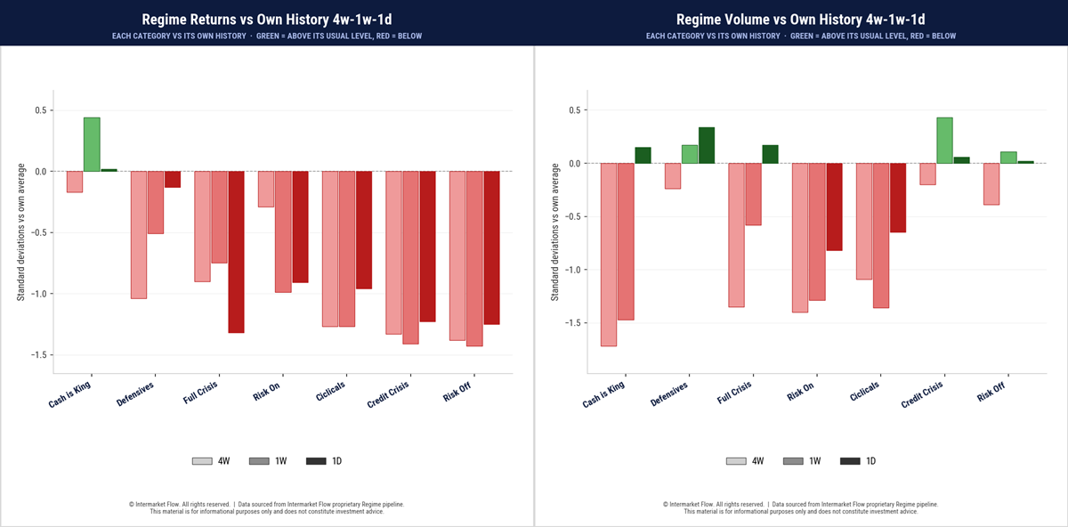
- Hands-Out persists. Outside Cash Is King, every risk profile shows below-average returns across all three horizons.
- Neither risk-taking nor defensive positioning delivers above-normal returns. Our regime reading remains: not Risk-On, not Risk-Off—Risk-Out.
- Within this dominant regime, risk profiles diverge. A second layer of analysis reveals noticeably less deterioration in returns and volume in the Risk-Off profile than in other distressed categories.
Intermarket Regime
How to Read: Left: returns. Right: trading volume. Read each asset’s bars from left to right to track the evolution from 4W to 1W.
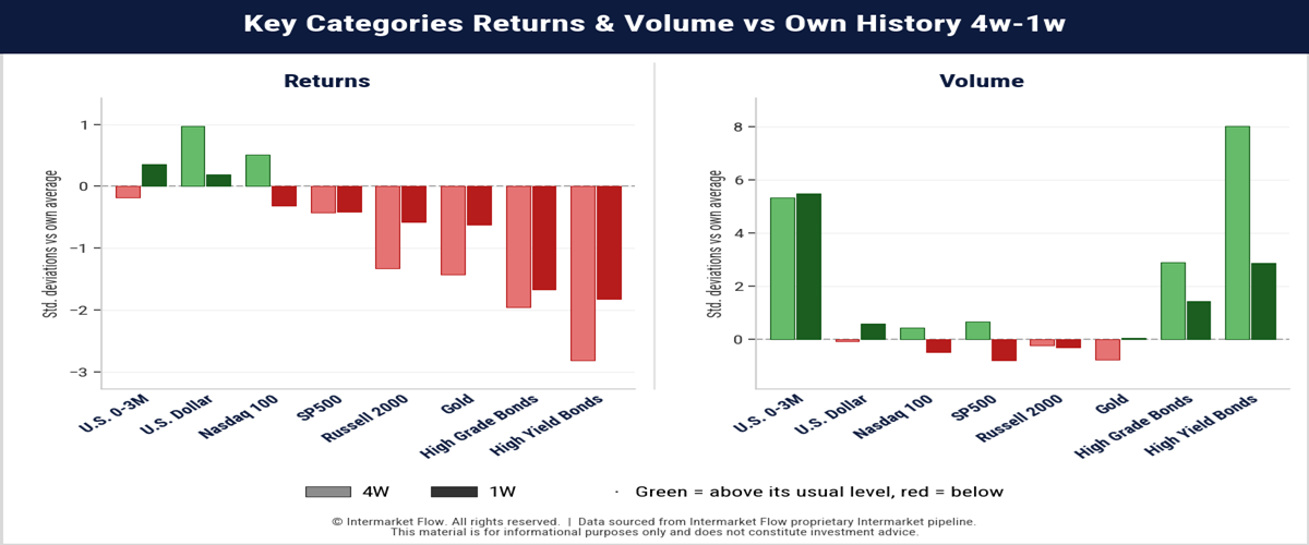
- High-yield continues to post the worst returns while also registering the highest trading volume, as shown in the right-hand chart.
- This bearish convergence is also present in high-grade bonds.
- Normalization allows us to measure the difference between these two types of bonds. Their situations are not identical, and this divergence reveals credit risk expectations.
- Statistically extreme trading volume at the short end of the curve (0–3 months) also reveals the scale of what is happening in the bond market, where everything is gravitating toward “Cash Is King.”
- Equities show total indifference to the stampede underway in the bond market.
Intermarket causality flows from bonds to equities. The pull is gravitational: higher rates compress valuations and expected cash flows. This divergence is unsustainable over time.
Junk Bonds: Measuring the Scale of Capital Flows
How to Read: Bars show the dollar value traded in each category across 4W → 1W timeframes. Moving between these horizons reveals how the scale of capital activity—and the pace of the credit crisis—is evolving. This measures the size of trading activity—not returns, share volume, volatility, or net inflows and outflows.
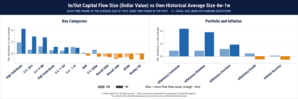
- In the left-hand chart, the critical data point is the scale of Junk Bonds flows.
- Based on the preceding analysis, we know these are outflows.
- Capital is moving most intensely in junk bonds and at the long end of the curve.
Portfolio Composition
This chart shows the scale of capital flows across different asset profiles within an inflationary context.
- Capital is flowing into assets associated with restrictive, non-expansionary conditions, revealing the market’s underlying outlook.
- Media attention is focused on AI. In the markets, the real action is happening elsewhere. Beyond fears over credit, expectations point toward an economy that is, at a minimum, contracting in real terms.Contraction expectations far outweigh expansionary scenarios.
Market Volatility Profile
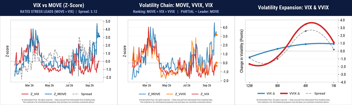
- The MOVE-to-VIX spread remains at extreme levels. Interest-rate volatility has failed to translate into higher equity volatility.
- The second and third charts show that the surge in VVIX—the expected volatility of volatility—did not translate into higher expected equity volatility today.
- VIX and VVIX now show similar standardized readings.
- The VIX is not signaling increased expected equity volatility over the next 30 days. Unlike last week, the surge in VVIX has reversed sharply.
Main Conclusions
- We remain in a “Hands-Out” regime.
- The run on junk bonds is accelerating.
- Capital outflows in this category are statistically extreme.
- Portfolio composition points to broadly inflationary and predominantly contractionary market expectations.
- Expansionary profiles are receiving substantially smaller capital flows.
- The volatility pattern holds. The spread between bond and equity volatility remains at extreme levels.
- Unlike last week, the surge in VVIX has reversed sharply.
- The VIX is not signaling increased expected equity volatility over the next 30 days.
Course of Action and Thermometer Charts
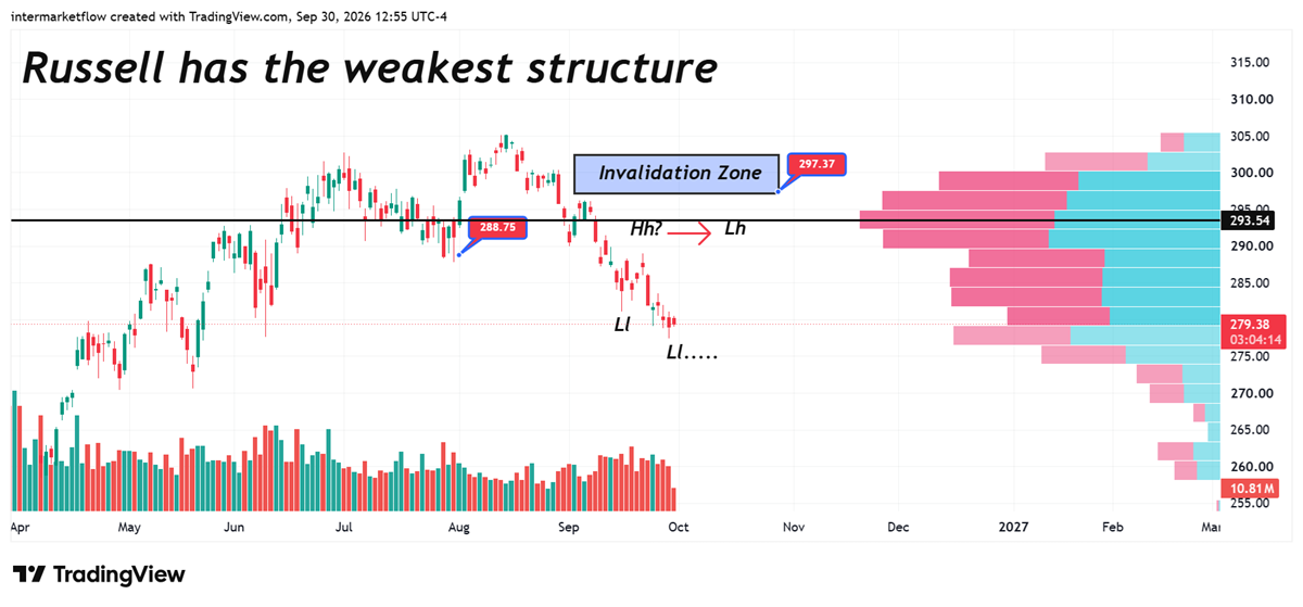
We return to the chart we have shared for weeks in previous reports. The bearish structure is already confirmed. This signals weakness across the small-cap universe, particularly among credit-sensitive companies.
These charts are also a continuation of those sent in previous reports. Technically confirmed and overextended.
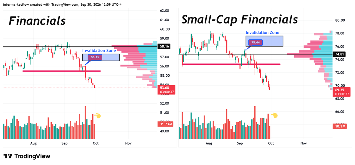
It is difficult to understand: if the heart of the economy—the sector that drives everything through credit—is in freefall, what can be expected from the sectors exposed to it.
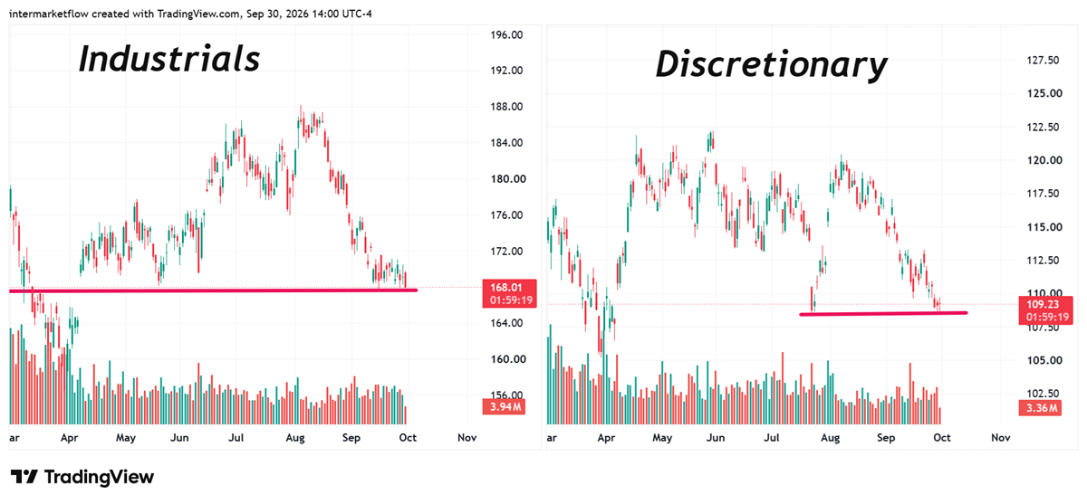
Setups begin to emerge that exceed the risk profile and are grounded in the macro scenario. One reinforces the other, creating a vicious circle.
Intermarket Flow
If you believe this is an error, please contact the administrator.