
High Yield: The hidden run inside bonds sell-off
In our Weekly and Mid-Week Reports, we’ve been calling this a Hands-Out regime for weeks: investors showed no clear preference for taking or sheltering from risk. They simply wanted out.
This week, prices—and above all, volume in critical assets—are beginning to signal a regime shift. Let’s take a look.
Market Regime Through an Asset-Level Lens
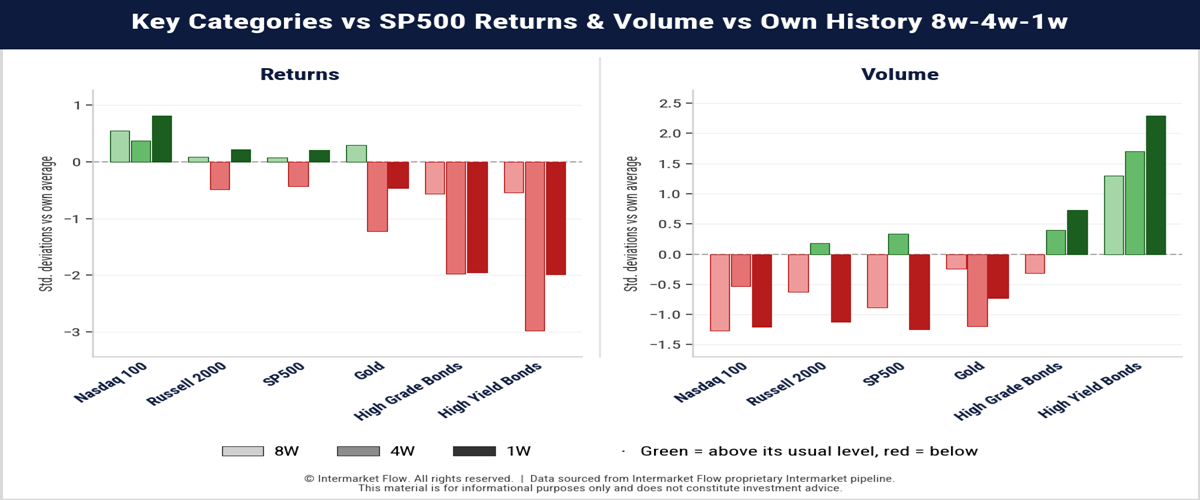
How to Read these Charts
Each asset shows three bars in time order: 8W→4w→1w. Both charts are measured in standard deviations (z-scores) from the asset’s historical average for each time frame. Colors: Green is above average. Red is below average. The zero line is the average return across the 1W, 4W, and 8W timeframes.
Reading Logic. Read the bars from left to right (8W → 4W → 1W) to track the trajectory. Compare the return panel with the volume panel.
Key Takeaway
- High-yield bonds show a Bearish Convergence
- Returns stay strongly negative. Volume rises sharply.
High Yield: A Run Emerging Inside the Bond Selloff
- Equities vs. Bonds Divergence: Equities held weekly returns despite volume running well below its historical norm.
- Meanwhile, the broader bond category has been bleeding continuously for weeks with negative returns across types and categories alongside rising volume.
- Both High Grade and High Yield are under pressure, but High Yield’s trajectory stands out as negative returns converge with accelerating volume from the 8-week to the 4-week and 1-week readings.
- Last week High Yield volume hit +2.3σ versus +0.7σ for High Grade.
- A z-scores of 2.3σ is statistically extreme and it describes a run, not a normal distribution on high yield.
The Size of Capital Flows by Asset
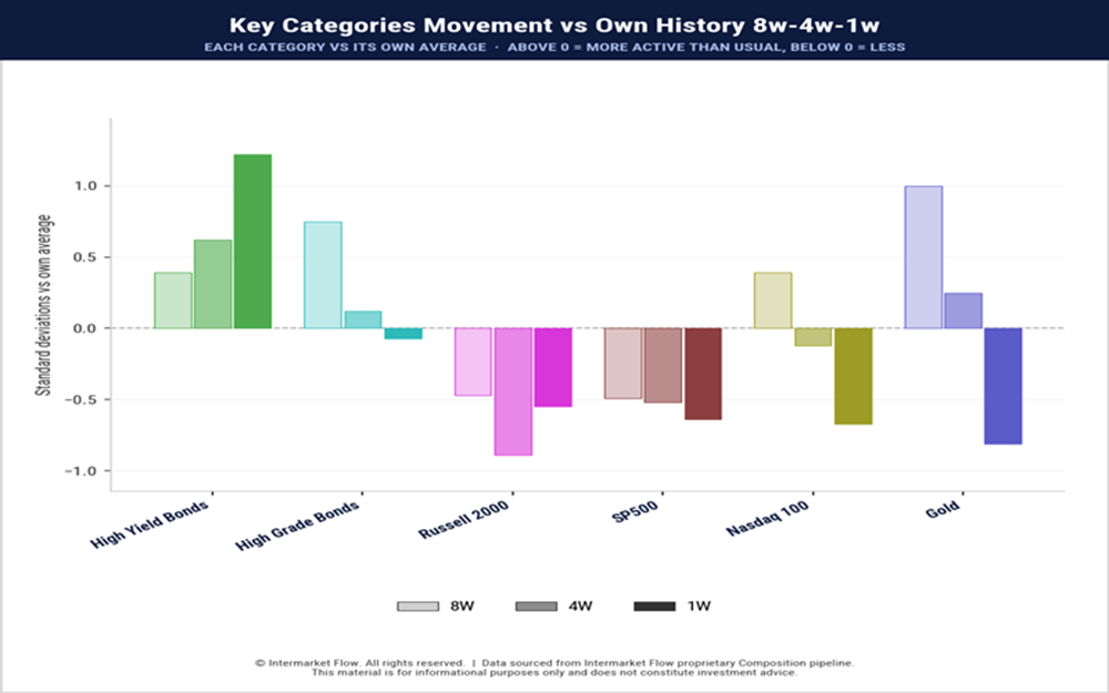
How to read
This measures the size of capital flows in Dollar Value, relative to its historical average size. The result is bigger or smaller than average, not positive or negative flows.
- Dollar Value flow size is below historical norms across most of the market, but High Yield breaks this pattern as its weekly reading exceeds +1σ, accelerating steadily from the 8-week to the 4-week and 1-week windows.
- After months of Hands-Out regime, market-wide activity is depressed while High Yield capital movement intensifies, confirming an active, continuous and accelerating run.
Bonds by Duration: Pressure Moves Along the Curve
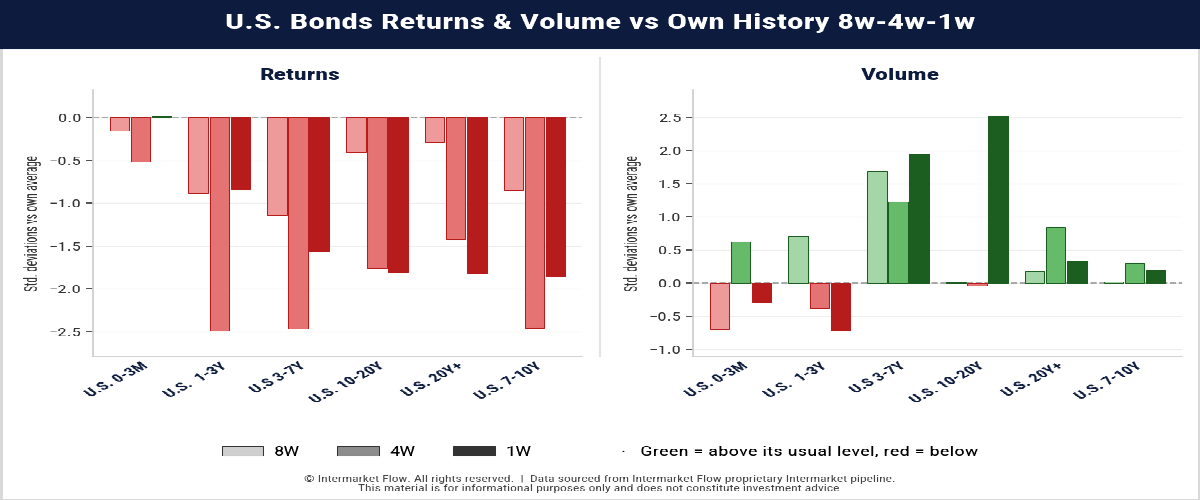
- Bond returns are below their historical averages across nearly the entire curve. Last week, the sharpest acceleration came in the 10–20-year segment: volume reached roughly +2.5σ while returns remained deeply below average. This is the clearest weekly expression of the pressure and it is statistically extreme.
- The adjustment in rate structure reflects a sharp, historically significant, bear flattening of the yield curve.
- This severe repricing goes beyond standard fluctuations, crushing duration performance and actively raising borrowing costs across critical sectors of the economy.
The shift in the yield curve shown in the third chart below.
Markets from a Volatility perspective
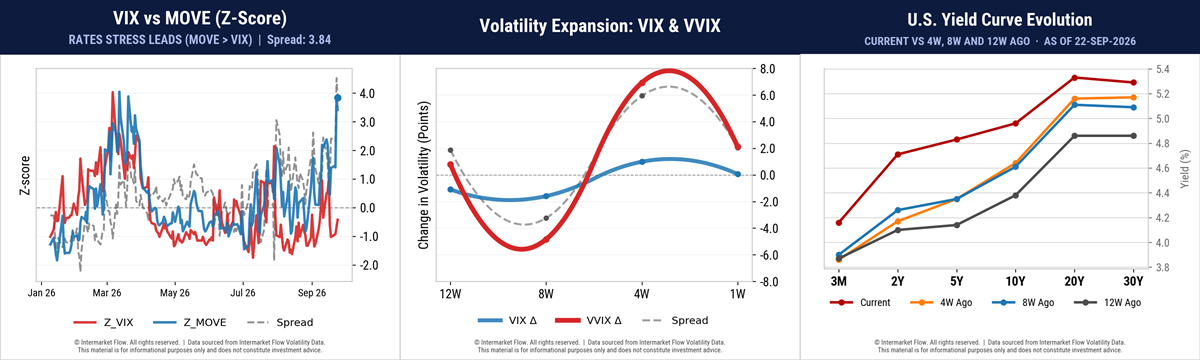
- The left chart shows the 30-day expected volatility spread between bonds (blue) and equities (red). The grey dotted line is the spread, currently at annual highs.
- Mid chart shows past realized volatility versus the hedging demand (VVIX) it generated at that time. The market is sensitive and fearful, hedging against rate volatility; however, rate volatility does not transmit to equity volatility, which ex-post generated an overreaction in demand hedges.
The Transmission: From Credit to Russell
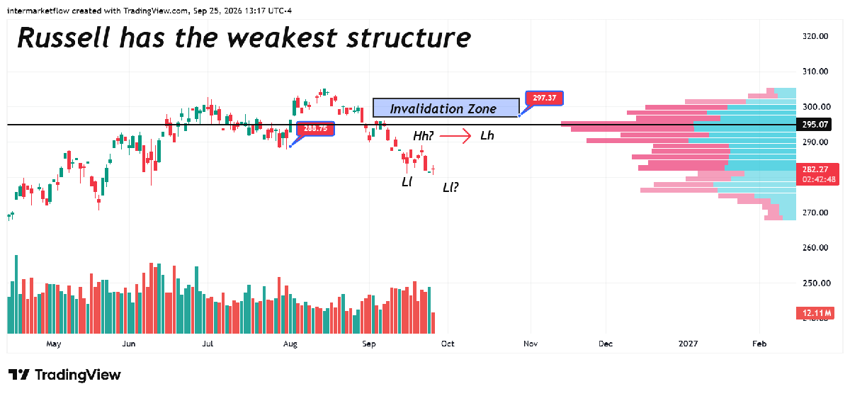
- Small caps are already paying the price for the rising cost of capital. For weeks, we’ve been sharing this chart as a gauge of that transmission: higher financing costs are squeezing margins, and the market is reflecting that pressure.
- Russell has printed a lower low while its rebound has failed to make a higher high, with even getting close to the invalidation level set at 297.37.
- At the same time Nasdaq made new all time highs with SP500 very near to doing so.
Main Conclusions
- Large Caps & Nasdaq: Holding prices without volume or a meaningful rise in volatility, despite higher rate levels and rate volatility.
- Small Caps: Feeling the pain. Higher cost of capital hits margins directly. Elevated prices, thin participation, and incomplete repricing leave the broader equity market exposed to a sharp correction.
- Bonds: Falling across the category. Within that selloff, lower-quality credit deteriorates faster.
- High Yield: Sustained pressure across 8W, 4W, and 1W readings, followed by a sharp acceleration in activity last week. The broader bond decline is masking a run on High Yield.
Real economy charts
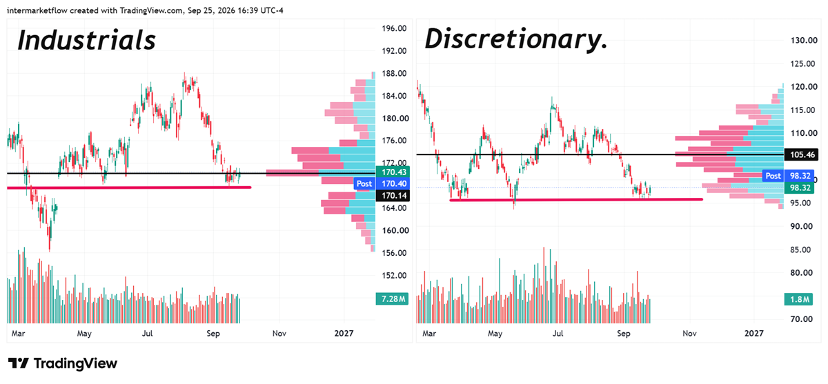
- From a technical perspective, both sectors are on the edge of the abyss. Breaking the current support—which is going to happen—enters a zone with no trades, no clear support points, and therefore a free-fall drop in open air.
Action Plan Execution & Risk Management
Each reader’s risk tolerance and portfolio objectives dictate the aggressiveness of the response.
- From zero equity exposure to a direct attack, both are viable options.
- The profile now, and for some time already, is credit-dependent small companies. Sectors where credit is essential for proper performance.
- This is the part of the real economy that will stall first.
- All necessary conditions for violent market moves are fully in place. No volume, no volatility, and the valuation adjustment mathematically generated by rising rates.
Thin markets generate fragility and sensitivity so be ready for overshooting moves in both directions and adjust operations sized accordingly.
Intermarket Flow
If you believe this is an error, please contact the administrator.