#102 Capital Flows: The Credit Risk Awakening
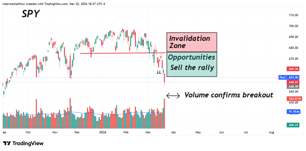
The market has pivoted from duration fear to credit panic. We analyze how Capital Flows are aggressively exiting junk bonds and equities to seek refuge in USD liquidity and crude oil. The record breakout volume in SPY validates the start of a new regime of extreme volatility.
#98 Intermarket, Flight to Quality, and Cash is King
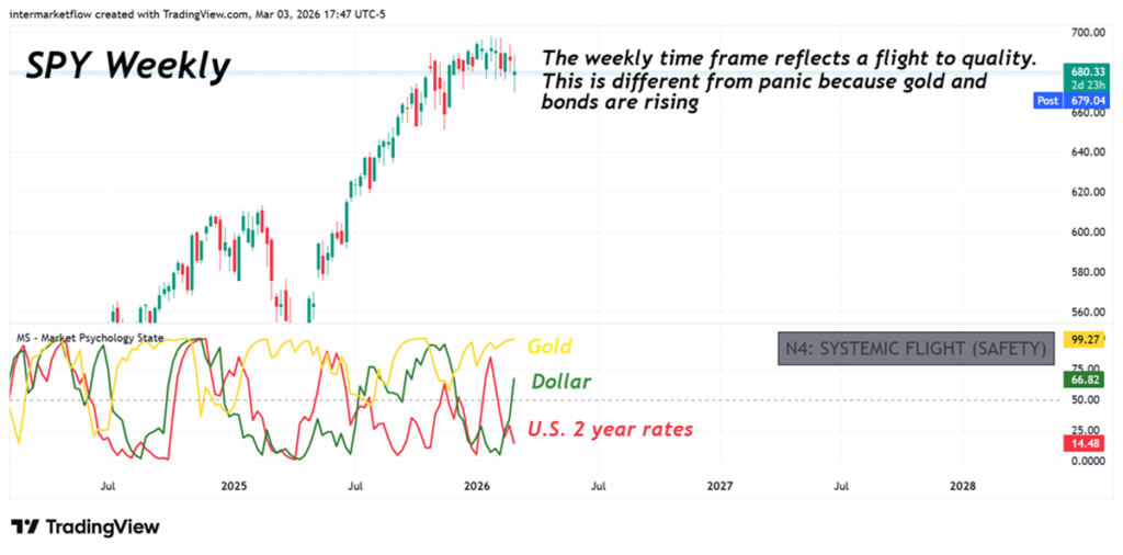
This report analyzes the current Intermarket dynamics behind the recent flight to quality. By observing the interaction between equities, bonds, gold, and the dollar, we identify the signals that define this Intermarket flight to quality regime and what it implies for market positioning.
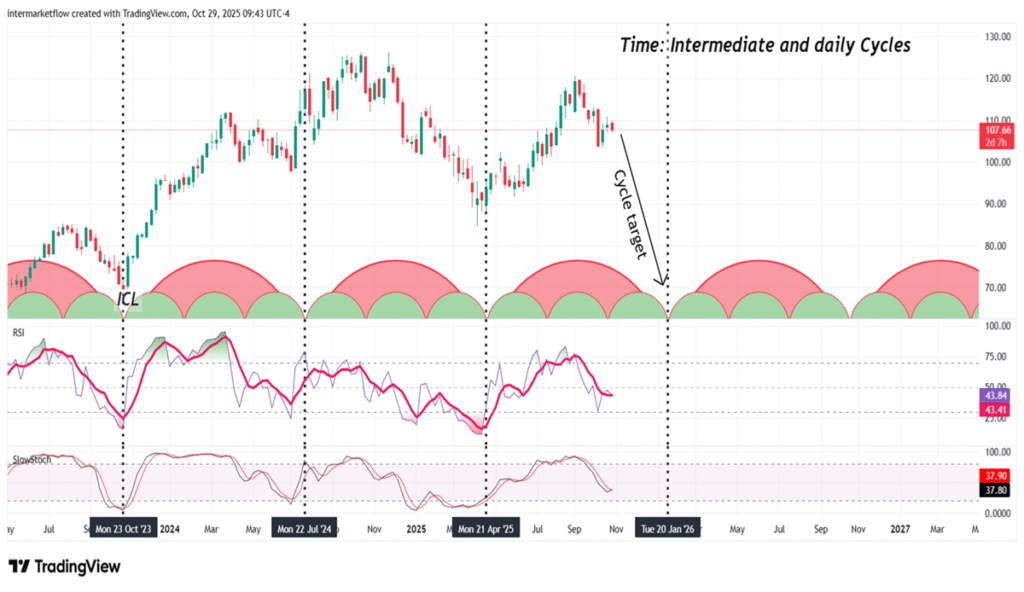
#97 Intermarket Signals: Capital Flight from US Beta to Global Alpha
Intermarket Signals point to a structural capital flight from US beta. While Fed liquidity masks a cyclical collapse and creates a bull trap in the S&P 500, smart money is aggressively repositioning into Swiss Franc safety, Korean semiconductor alpha, and Brazilian real yield. Read the full Sunday Verdict to map the rotation.
#94 The SOFR Breaking Point: Navigating the Dollar’s Structural Squeeze
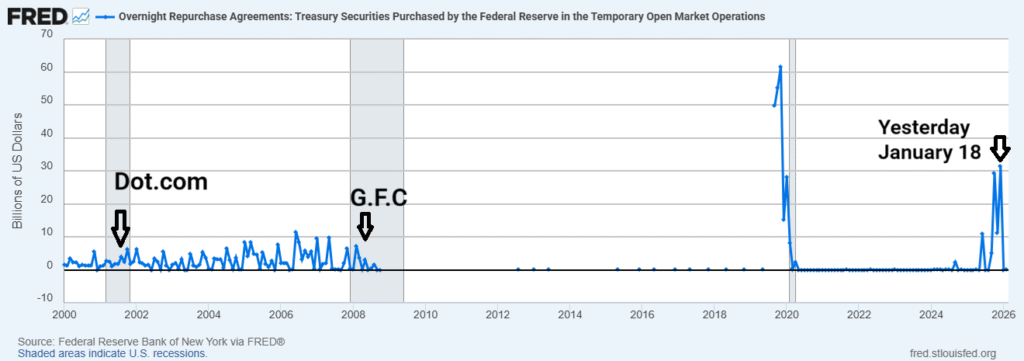
Liquidity has not vanished; it has been relocated. While the market is distracted by the “soft landing” narrative, the system’s plumbing is undergoing a structural stress that most are choosing to ignore. This report analyzes the critical transition from the Reverse Repo (RRP) facility into captive bank reserves and explains why the current growth model has officially entered a solvency trap.
#84 The discretionary delusion and the market’s stance. Three vehicles to track.
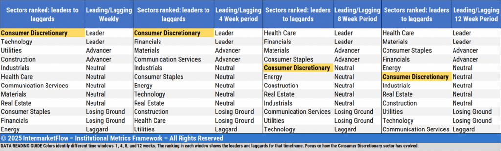
We break down retail sales and why Consumer Discretionary is completely detached from reality. We picked three vehicles to go deeper, while tracking how risk-takers positioned themselves this week.
#79 Equity Assets: A global paralysis

Equity assets Across the world, they’ve gone into hibernation. There isn’t a single asset class that has received inflows as a sign of confidence ahead of the upcoming rate cut. Volume — the only real confirmation — signals paralysis. And in that context, returns are irrelevant. Equity Assets: To kick off this piece, the first […]
#5 Mid-Week Technical Analysis: Stagflation Captured in Two Charts
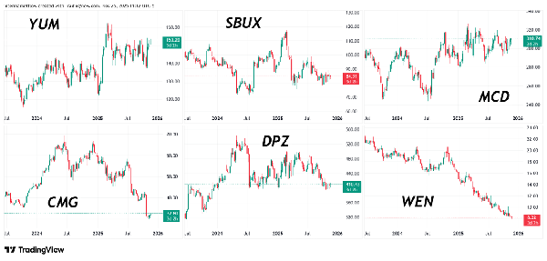
We describe how a stagflationary process hits different sectors at different moments. With two charts, we show an economy in stagflation. We also break down the SP500 and the six largest fast-food chains from a purely technical perspective.
#78 Cross-Asset Signals Hint at a Valuation Regime Shift
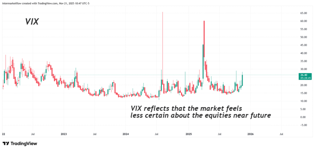
Last week we saw that there’s one variable that can truly destabilize markets: uncertainty. Here You can’t touch it or see it—but you can feel it. And even though it’s intangible, the market expresses it in many ways, across different assets. Uncertainty can encompass everything—when the whole system trembles—or focus on a single category. It […]
#2 T.A: XLF, the financial sector, midweek pure technical and complete set up for INBK
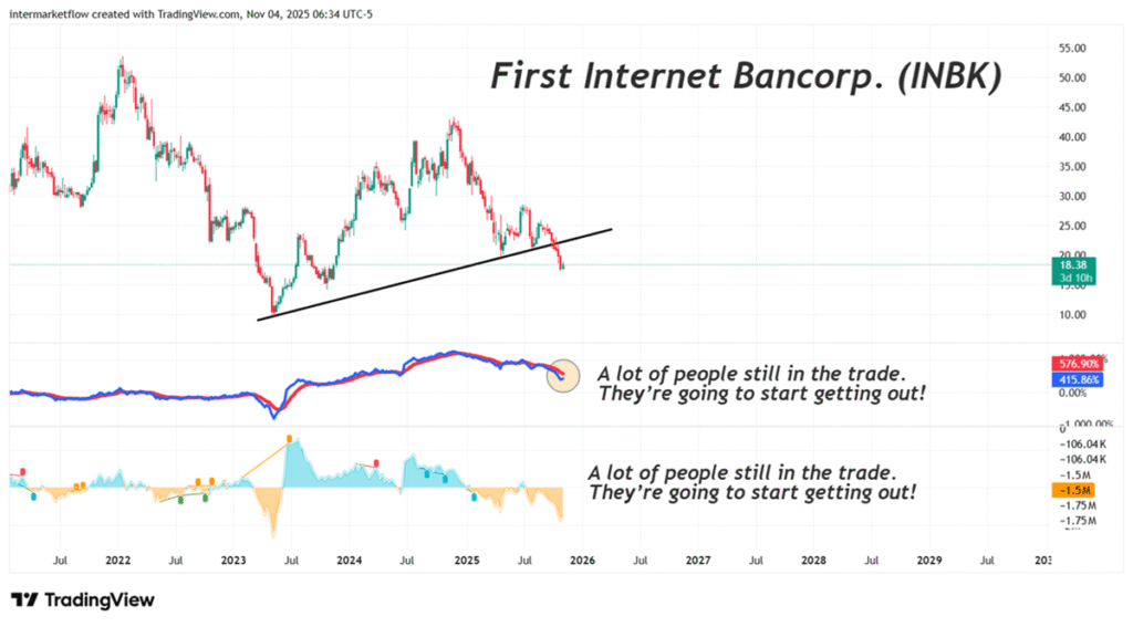
A purely technical analysis of the financial sector as a whole, with a focus on INBK and NWBI in particular.
#74 Complete Technical Set Up for the Home Builders Sector-Nov 26
A complete technical analysis covering all branches of technical study: trend, time, volume, mean reversion, and charting.