
Bond Market Stress: Why Stocks Remain Exposed
Main Conclusions from Our Previous Reports
- Hands-Out persistence: Confirmed week after week in our reports.
- Credit crisis unfolding: Masked by the broader bond correction.
- Volatility spread: The wide gap between bond and equity volatility remains a regime-defining feature.
- Yield curve: The upward curve shift remains unpriced in major equity indexes.
Market regime by intermarkets assets categories
How to Read: Left: returns. Right: trading volume. Light bars show 4W; dark bars show 1W. Values are Z-scores relative to each asset’s own history: green means above average, red below. Beyond ±2σ is extreme. A negative return Z-score means below-average performance, not necessarily a loss.
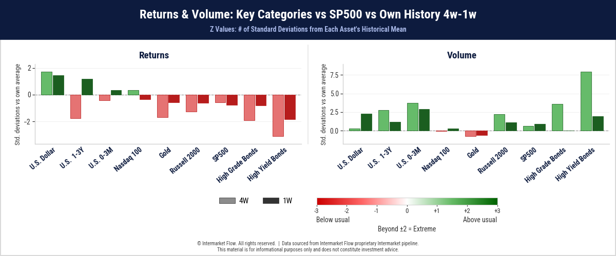
- The Hands-Out regime continues to act like a vacuum, favoring the dollar and short-term Treasuries while equities, gold, and credit suffer.
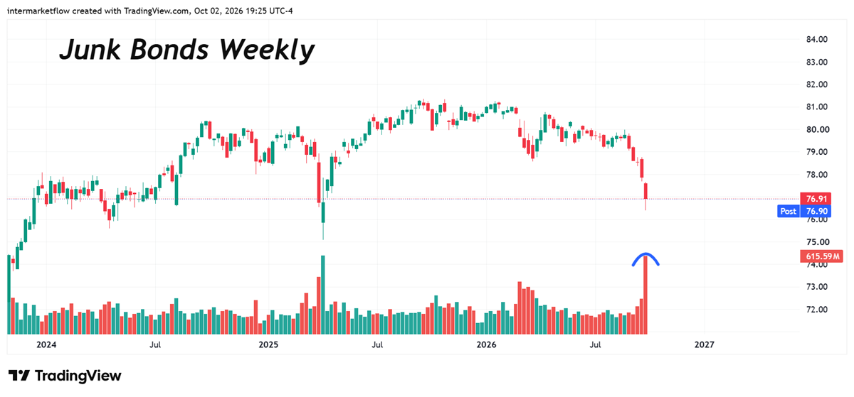
- High yield remains the weakest segment, combining the deepest return weakness with elevated trading volume.
- The regime is unchanged: neither Risk-On nor a conventional Risk-Off rotation—Risk-Out.
- Selling pressure is concentrated in bonds, particularly long maturities and lower-quality credit, while liquidity and short maturities remain favored.
Intermarket Capital Flow Size
How to Read: Bars show capital-flow size measured in dollar value, standardized against each asset’s own history. Light bars: 4W; dark bars: 1W. Blue means larger than usual; orange means smaller. Zero is the historical average; beyond ±2σ is extreme. Colors indicate size, not direction.
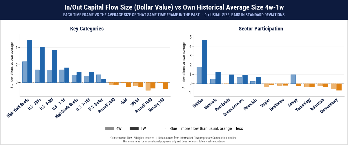
- Flow size shows where repositioning is concentrated.
- The moves are statistically extreme in long-duration and higher-risk bonds.
- Within equities, utilities show the largest anomaly, linking rate-sensitive stocks to the duration repricing underway in bonds.
How large—and how unusual—are these capital flows?
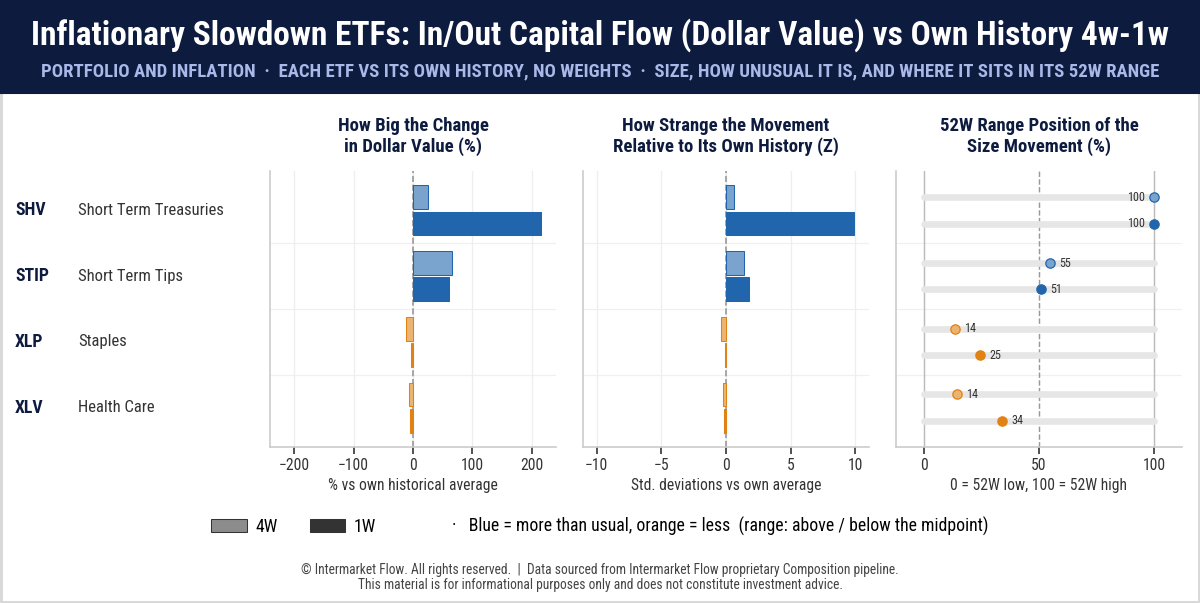
- Cash is King dominates even within the defensive basket. Weekly dollar-value activity in short-term Treasuries surges to the top of its 52-week range.
- Short-term TIPS show moderately above-average activity, while staples and healthcare remain below their historical norms.
The defensive response centers on liquidity, with no comparable expansion in defensive equities.
Bond Market Stress and the Macro Outlook
How to Read: Capital-flow size is grouped by inflation profiles (left) and macro stages (right), standardized against each group’s own history. Light bars: 4W; dark bars: 1W. Blue means larger than usual; orange means smaller. Beyond ±2σ is extreme. Bars measure size, not direction or scenario probabilities.
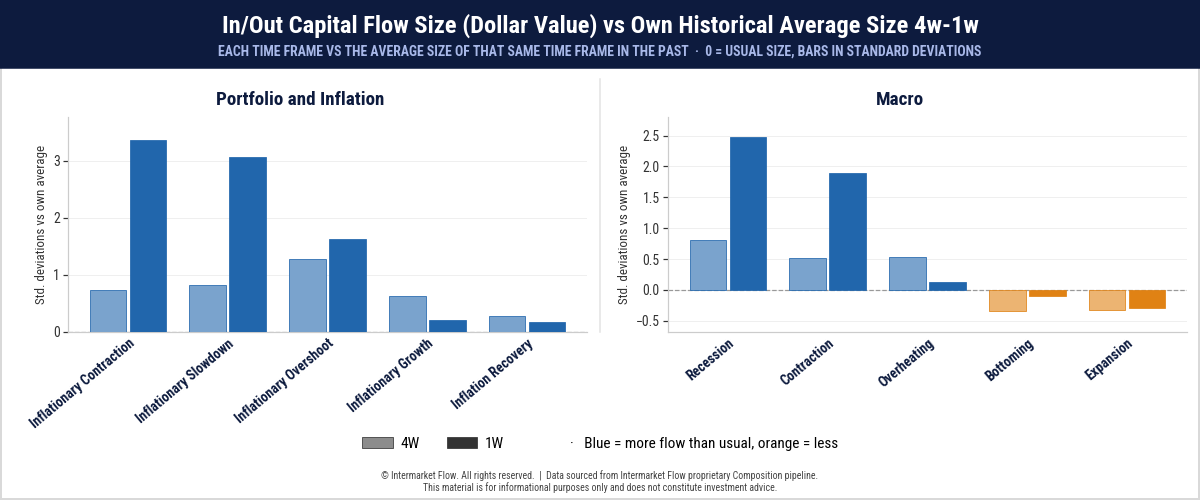
- Repositioning concentrates in inflationary contraction and slowdown baskets, where weekly dollar-value activity exceeds +3σ.
- The macro panel reinforces the contractionary picture: recession and contraction profiles dominate, while expansion remains subdued.
- The weekly shift intensifies sharply, particularly in the inflationary contraction and slowdown profiles.
Market Regime from a Volatility Perspective
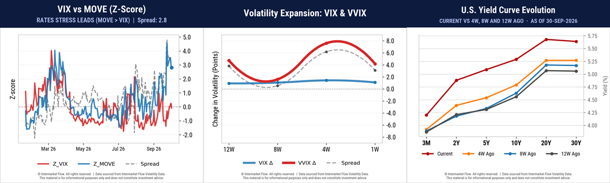
- The spread between bond and equity volatility remains at annual highs. (Left Chart)
- In the middle chart, VIX’s lack of movement is ultimately driving VVIX lower.
- Last week’s fear ultimately faded as the VIX remained flat.
- The rate of change in both is slowing, while the gap between bond and equity volatility levels remains enormous.
- The yield curve has shifted higher across all maturities, with the largest increases concentrated in the 2–10-year segment.
- Shorter-term yields are rising more than long-term yields, producing a bear flattening.
The disconnect between new interest-rate levels and major equity-index valuations remains unresolved. Our assessment is unchanged: this disconnect is unsustainable.
The Major Indexes, Sector Pricing, and the Real Economy
- Risk-On and the technical picture stands on the edge of a cliff.
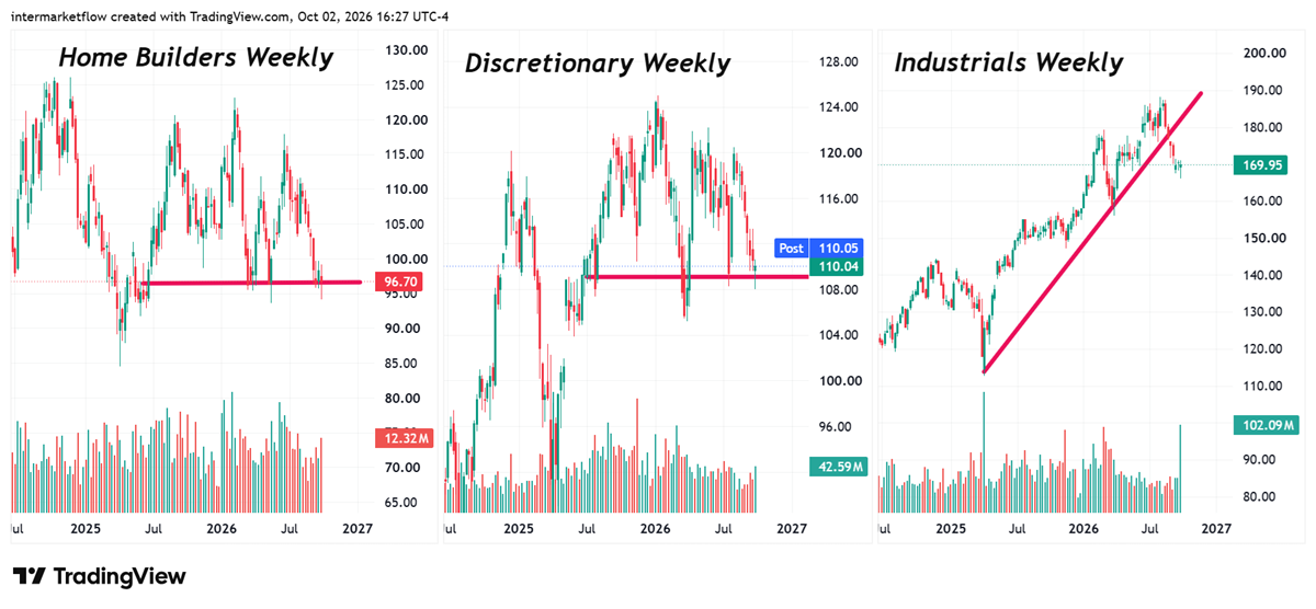
From a T.A perspective, several patterns are emerging
- Head-and-shoulders formations.
- Support levels under pressure.
- Broken trendlines.
Conventional Risk-Off assets offer no clear escape: they face their own technical fragility.
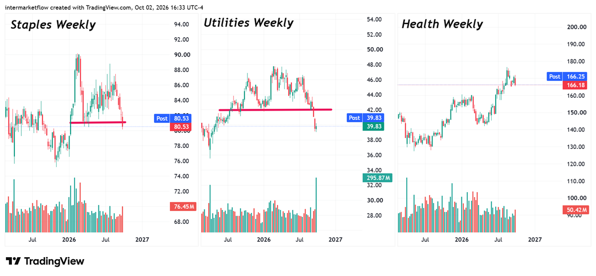
- Utilities: the technical breakdown is confirmed.
- The sector is the intermarket link between bonds and equities. Its debt structure and predictable cash flows give it bond-like characteristics.
This is the textbook intermarket sequence: bonds → equities. The major indexes are the outliers. Everything else is consistent, directional, and unmistakably clear.
Russell is our risk barometer
This is an updated version of the chart we have shared repeatedly. It is the index most connected to economic reality. The invalidation zones for our risk and macro scenarios are clearly marked.
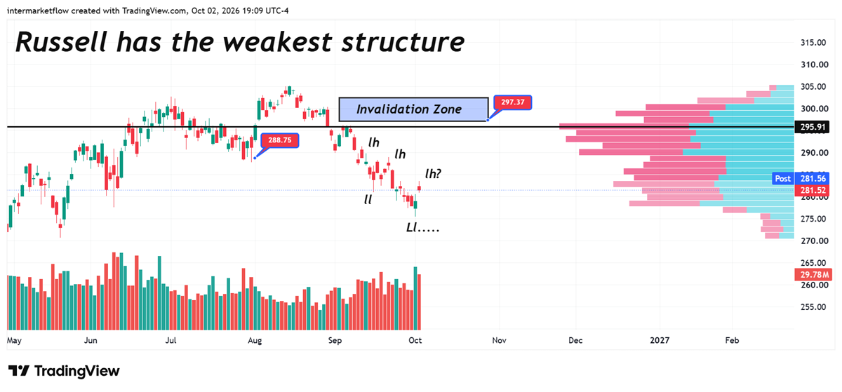
The link between high-yield bonds and Russell is another intermarket connection between bonds and equities.
Course of Action
As always, the approach depends on each reader’s risk appetite.
- Cash is the dominant position, both for today’s asymmetries and, more importantly, tomorrow’s opportunities.
- Holding cash is also an offensive strategy: it preserves the ability to act while avoiding market exposure today.
- For those willing to take risk, the bias is short, with a focus on credit risk. Small caps, high-beta stocks, and credit-dependent sectors are extremely exposed.
- Taking on upside risk here is absurd.
Key Takeaways
- Two additional intermarket links build on our previous reports: utilities and bonds; small caps and junk bonds.
- The disconnect lies in the major indexes.
- The macro narrative prices points toward contraction and recession.
- Cyclical and defensive sectors show similar price patterns, both technically on the edge of a cliff.
Intermarket Causality
The links between bonds and equities are beginning to emerge, marking the start of transmission from one asset class to another:
- Utilities and bonds.
- Small caps and credit.
- This is the beginning of a process that will spread further.
- Market prices are aligning with macroeconomic reality, while the major indexes remain completely disconnected.
- In the S&P 500, this disconnect is driven by large-cap companies, their resilience to higher rates, and expectations surrounding the AI trade.
- Nasdaq valuations are built on expectations surrounding the AI trade. These expectations are driving the disconnect between rising interest rates and the valuations of companies in the major indexes.
The Path Ahead
- The intermarket sequence points to a correction in the major indexes, followed by lower interest rates as the economy enters recession, and one final gold rally before a larger correction.
- This lies ahead, and as always in intermarket analysis, the challenge is timing. Tops and bottoms are processes, not events. They take time to develop.
- Knowing the path ahead makes the challenge clear: anticipating these shifts correctly is where real money is made.
- These are intermediate cycles, not daily moves. Patience is therefore the essential virtue.
This is Intermarket Flow’s core mission: follow the path, understand where we stand, and anticipate what comes next. For months, our focus has been on identifying the major correction ahead in equities. The market top is still forming.
Once that plays out, the next focus will be identifying the peak in interest rates, when the economy has entered recession, and when gold begins its final sprint.
And so the cycle continues—an endless path of learning.
That is why we invite you to subscribe.
Intermarket Flow
If you believe this is an error, please contact the administrator.