Intermarket Analysis Throught Macro and Technical Methods
#34 A Guide to Understanding Macro Narratives in Trading.
Applied with intermarket analysis to today’s market conditions.
Here you’ll find:
- The relationship between macro narratives and the markets.
- The evolution of a macro narrative.
- The typical price behavior at each stage of the narrative.
- An intermarket analysis covering the four categories to see how we’re starting 2025.
- A technical setup derived from the analysis and aligned with our macro view.
Another year has passed. I hope everyone enjoyed it and is ready for what’s coming next. For now, I thought it would be wise to take a pause and review the full intermarket picture. Let’s see what we can infer from price action and check some correlations.
To start, it’s always good to refresh our understanding of the dynamics behind macro narratives—how they dominate and evolve over time. This helps us better understand where we stand and prepare for what lies ahead.
The Economy as a Social Science.
The economy is a social science shaped by millions of agents (microeconomics), each making decisions based on specific events and newly available information entering the market daily. Ultimately, macroeconomics is nothing more than the sum of all these individual agents.
This complexity makes analysis challenging because it depends on the reactions of millions of micro-agents.
The Evolution of Macro Narratives: How to Trade Them.
G. Soros defined the sequence through which the dominant macro narrative in the market evolves. Here, we aim to describe how price action behaves at each stage.
Stage 1: The Dominant Macro Narrative.
There is a dominant and prevailing macro narrative: it drives and optimizes the collective behavior of micro-agents. A common, widespread belief triggers what we call herd behavior, which has the unique characteristic of efficiently feeding itself.
Prices exhibit a very strong and defined trend. Mean reversion is virtually nonexistent, and upward or downward movements are dictated solely by price momentum.
This becomes evident when prices lose rationality, giving rise to the famous phrase:
“The market can remain irrational longer than you can stay solvent.”
In this stage, the popular “buy the dip” strategy dominates. Its strength lies in its widespread adoption.
Stage 2: Reality Challenges the Dominant Macro Narrative.
Over time, the dominant narrative begins to confront a reality where new incoming information no longer fits. The “irrationality” of prices starts to become apparent.
Naturally, this new information is accepted by some and rejected by others. People tend to hear and see what aligns with their beliefs—a human pathology that resists change and admitting mistakes.
In this stage, volatility emerges. It reflects the selective interpretation of information by agents. A dispute begins between the dominant macro narrative and the one trying to take its place.
This conflict also arises among micro-agents, who are not all equal. In this battle, size plays a critical role.
- Price Behavior: Prices begin to encounter resistance, and profit-taking becomes more frequent, even if the overall trend persists. These are early warnings of trouble ahead.
This is why tops and bottoms take time to form—they are processes, not single events.
Stage 3: Narrative in Crisis.
This stage occurs when reality diverges too far from the dominant narrative, making the situation unsustainable. It’s important to note that changes in the macro narrative lag behind changes in reality. This lag is driven by herd behavior and people’s resistance to incorporating new information.
- Price Behavior: Prices behave similarly to Stage 2 but with more pronounced movements.
At this point, the market begins to provide valuable insights, as breaking points in price action become more evident.
Stage 4: Narrative Revolution.
This occurs when reality forces the majority of micro-agents, who were reluctant to admit they were wrong, to change their behavior. Not only that, but they also act differently and even in opposite ways.
This is the moment of violent market movements with very marked trends. It is the most profitable time for traders because, although it is volatile, it is when the P/L is at its maximum.
Stage 5: Change in Dominant Macro Narrative.
This occurs when the majority of micro-agents accept the new reality. This process feeds itself, generating herd behavior, and the entire cycle begins anew.
The new dominant macro narrative can take many forms: a correction, a continuation of the previous trend, or even lateralization or indecision.
Macro Narratives and Markets: A Current Example
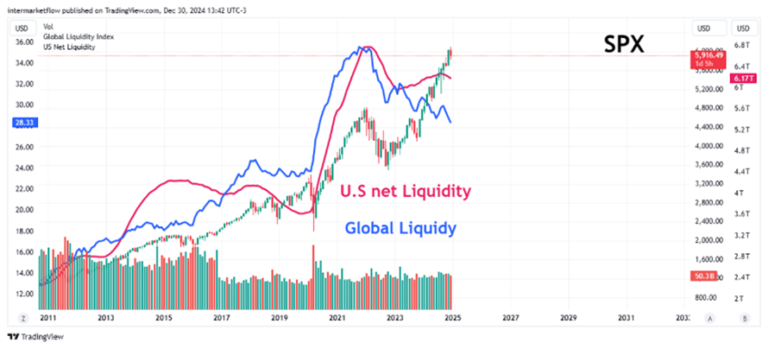
Looking at this chart, where are we in the macro narrative cycle? One thing is certain: this is an overcrowded trade.
Considering both global and U.S. liquidity, one could assume we are in the process of forming a top—a top significantly removed from its value zone.
This opens the door to a larger, more violent correction. Volatility hasn’t appeared yet, or it’s emerging gradually.
Intermarket Analysis and Macro Narratives.
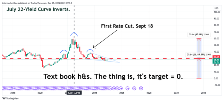
The 2-Year Rate, Real and Nominal.
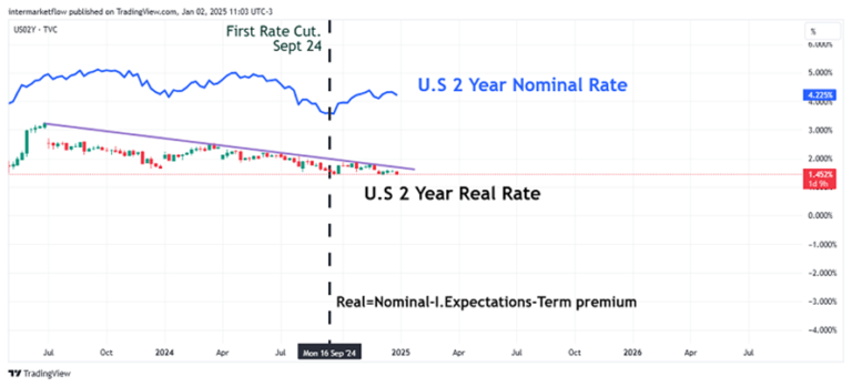
Macro Narratives: The 2-Year Rate from the First Cut (Sept 18th) to Today.
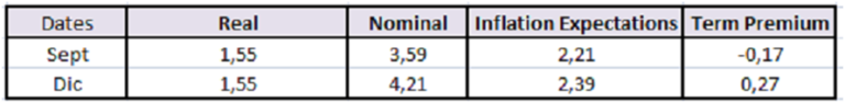
From September to date, the nominal rate has indeed risen. The issue is that this increase is driven by a rise in inflation expectations and, more importantly, an increase in the term premium. In other words, the market perceives greater interest rate risk over the next two years.
The real rate, however, has not moved. Essentially, it’s signaling uncertainty about what the F.E.D. will do. Consequently, there is greater uncertainty overall.
This is the macro narrative currently challenging the dominant one.
Macro Narrative and Currencies: The Dollar Index.
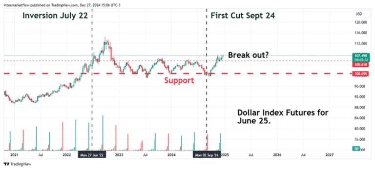
A rate cut should have resulted in a weaker dollar. Not only did this not happen, but instead, the dollar appears to have broken out of a sideways trend.
Often, we don’t fully understand what markets are doing, but it’s crucial to grasp what they should be doing. This is a red flag in analysis. Something is out of sync and happening beneath the surface.
Macro Narrative and Equities.
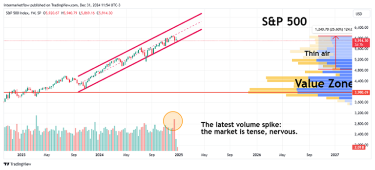
This is what we mean when an asset moves away from its value zone. It’s a clear example of herd behavior. However, as we’ve seen, it doesn’t have a definitive endpoint until a decisive break, is marked by price action.
Macro Narrative and Commodities: Energy and Industrial Metals.
Whenever possible, we use futures—the longer the time horizon, the better. Few things illustrate the market’s current sentiment as clearly as the future prices of any given asset.
In the same month the curve inverts, energy futures take a hit. The market begins to anticipate lower future prices for energy, essentially forecasting an economic slowdown or recession.
We’ve repeatedly observed (here) that commodities are both produced and consumed on a global scale. Therefore, the expected price conveys a global message.
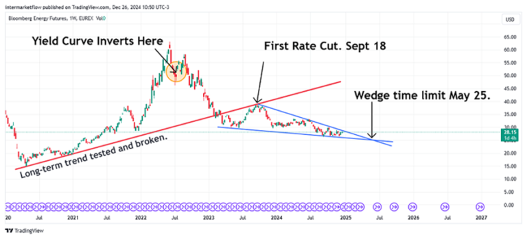
Using a weekly time frame, the main pattern holds. However, in recent months, energy futures have formed a wedge. As we’ve noted repeatedly, the key takeaway from a wedge is its timing. If this technical pattern plays out, it must do so before May 2025.
Macro Narratives and Industrial Metals: A Panoramic View.
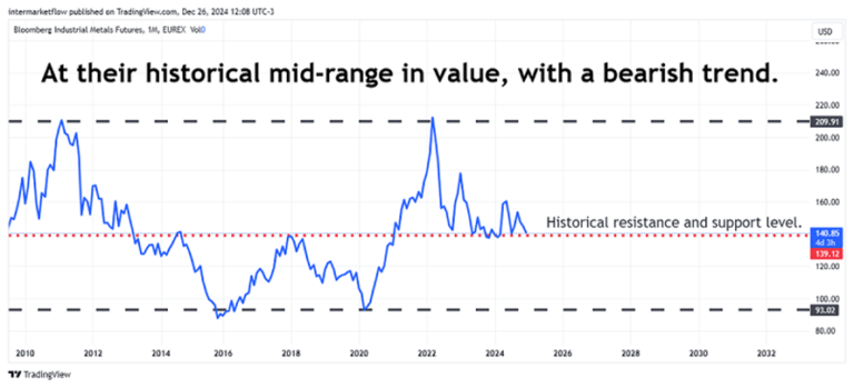
If we wanted to break down its trend, in P&F we can clearly see a discordant situation between the prevailing long-term trend and the also prevailing short-term trend.
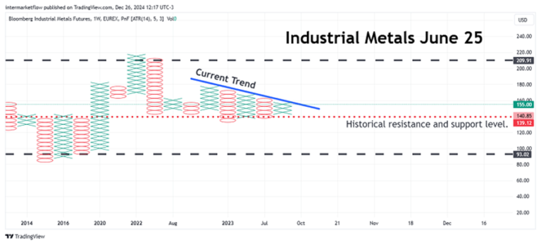
This is a chart to pin and glance at daily.
Macro Narratives and Precious Metals as of June 25.
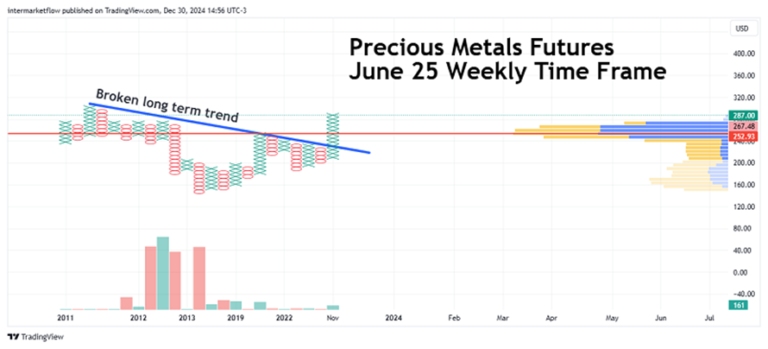
Why do precious metals have such a strong upward trend? In theory, they should have an inverse correlation with the dollar. Could it be that this time both the dollar and gold are acting as safe-haven assets?
The hypotheses are many, but this is yet another signal that something is happening beneath the surface.
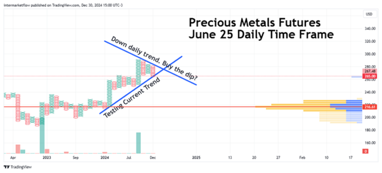
If we shift to the daily time frame, we see gold in a correction process.
Macro Narratives: The Money Markets.
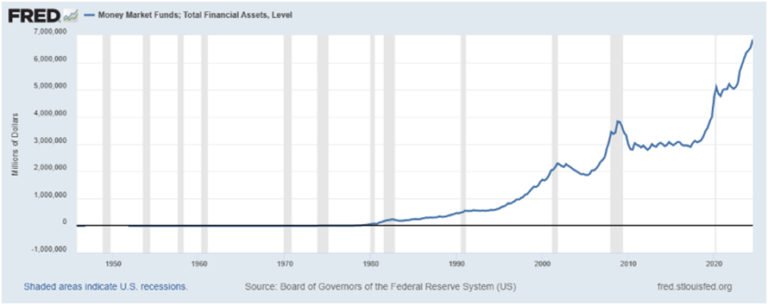
The amount of dollars in Money Markets. When we connect this chart with the breakout of the Dollar Index futures, we see intermarket analysis in full force.
- The rise of the dollar indicates that people globally are buying dollars and depositing them in Money Markets. This phenomenon is known as “Cash is King,” signaling a market with no clear direction and in risk-off mode.
- The rise of gold delivers the same message but in a much more decisive way, simply because the market is willing to pay the opportunity cost of holding gold.
- Where will all that mountain of dollars go when it leaves these markets, assuming rates continue to decline?
- With what dollars does the S&P 500 rise? Likely with the dollars of foreign investors who have nowhere else to go.
Note that peaks in Money Markets are 100% associated with recessions (shaded in gray).
Low futures for “economic” commodities, rising gold, a strong dollar, and Money Markets packed with cash—signals are everywhere.
Trading Macro Narratives.
I’ll leave you with the chart that set the stage for the setup featured in the next article published here on the blog.
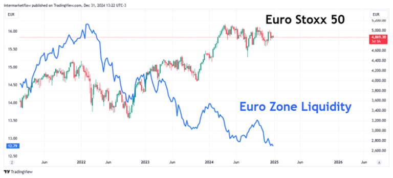
The chart presents a clear situation: liquidity is steadily declining, and equity indices appear to be in the process of forming a top—at least much more evidently than in the U.S.
I believe we are in Stage 2, likely transitioning into Stage 3. There are no definitive price signals yet, but we’re starting to observe behaviors consistent with these stages.
That’s all for today. I hope you found this helpful.
If you enjoyed our work, you can find us on X @intermarketflow or on our website at www.intermarketflow.com.
Even better, you can share it—it won’t cost you anything, and it will truly make our day!
It means a lot to us.
Thank you!
Martin