Intermarket Analysis Throught Macro and Technical Methods
#36 Effects on the real economy and generation of incorrect incentives by the lender of last resort.
Trading under the umbrella of the lender of last resort.
Here you’ll find:
- A chart illustrating the similarities between the current rate environment and the GFC. This chart emerged from the research for this article.
- An analysis of sector growth post-curve inversion (July 2022), relative to their averages and the market average.
- After tech, the sector with the highest growth has been consumer discretionary.
- An analysis of why this is unsustainable and part of the explanation for why it happened.
- With the regional banking crisis, the Fed revealed its reaction function: essentially, it saves everyone. This is not only immoral but also creates incentives for increased risk-taking by small banks.
- The level of delinquencies and the quality of loan portfolios in small banks.
- A conclusion that ties together the key points of the article.
- A technical setup derived from this article, implemented through technical analysis.
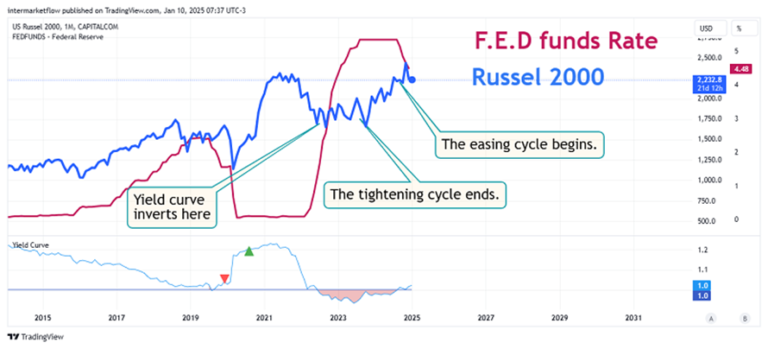
When the yield curve inverts, it makes explicit a change in market expectations, in the short (0 to 2 years), medium (2 to 10 years) and long (10 to 30 years) terms.
These changes in expectations started much earlier, but as we have seen here and in the following chart, macro narratives have a process to follow to become dominant.
For the time being, the moment of inversion can be taken as the moment at which the new narrative becomes dominant.
If the short-term rate is higher than the long-term rates, saving/not investing makes more sense. If savings yields go up, consumption propensities go down. This is basically monetary policy seeping into the real economy.
Before this changes there are sectors more or less affected according to the elasticity of their assets.
The evolution of rates since July 22, 2022. The moment of inversion.
Just when I thought I was out, they pull me back in.
Al Pacino The Godfather Part III
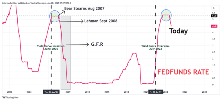
Impossible not to name very strong similarities with the GFC.
Take 1 second to understand this chart.
From left to right: FED FUNDS Rate chart.
– First vertical black dotted line, June 2006. On that date the curve inverted prior to the GFC.
– With black arrows the Bear Stearns Aug 2007 and Leahman Sept 2008 moments.
– Gray rectangle, the recession in the papers according to later info.
– Second Vertical dotted line, moment of the inversion this time. July 2022.
– The maximum level of the upward cycle is the same. On the 5% axis.
– That is when the recession starts, when the interest rate is cut in the middle of the cycle. So the question that arises is :
Are we already in the middle of the rate cut cycle?
Growth of economic sectors relative to their own average.
We took a sample (July 22-Dec 24) that covers the post-inversion period to date. We want to see how they perform relative to their post-investment average. Which sectors are expensive/cheap relative to themselves.
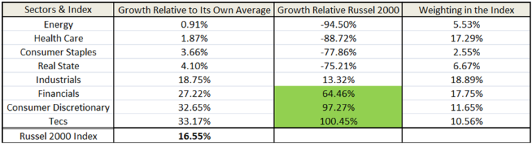
Energy, Health care, Consumer Staples are well below the growth of the market as a whole. Basically at the average of its sector for the study period.
If we expect a deceleration/recession, something we have argued throughout the blog and since June 2024. It is difficult to say that energy is cheap. Not the case for Health and Staples, defensive sectors that perform well in de-accelerations/recessions.
The same situation is generated at the other extreme.
Given our macro view, the discretionary sector is 97.27% above the post inversion, market average and 32.65% relative to its own average. This sector is expensive according to our macro view.
Why? Let 's see.
For a start, our macro view, which, among other things, argued this, back in June 2024.
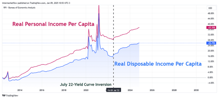
The vertical dotted line shows the moment of inversion. Inflation soars post covid, the F.E.D. reacts, inverting the curve on July 22. Note the gap between Income and Real Disposable Income as it increases. By eye, one could say that the current gap is almost double the pre-covid gap and one would not be far off the mark. That is to say, the gap stabilized but several levels below. This continues to this day.
Context Description: The curve inverts in July 2022.
– Propensity between savings (investment) and consumption changes.
– There is a change of expectations in several components: Inflation, Labor, growth of the economy at both micro and macro levels.
– Credit becomes more expensive.
Basically these are the objectives of monetary policy and the mechanism by which they filter through to the real economy.
Interest rate sensitivity and asset elasticity.
- Consumer Discretionary.
- Financials.
- Real Estate.
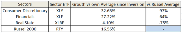
Real state is clearly adjusting to this new reality. We saw it here. Growing as a sector well below the overall market. Shorting real state was a good call in September 2024.
Discretionary grew almost 100% versus the market and is 32.65% above its own average.
How do you explain such growth in consumer discretionary, in the context of a phenomenal decline in real disposable income.
Consumer Discretionary:
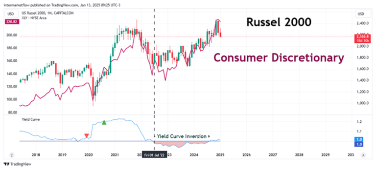
So that we are on the same page, when short rates exceed long rates, inverting the curve (vertical dotted line in black) discretionary consumption starts to rise. The assumption is that higher short rates mean more savings and less consumption. Alert!
Credits, Rates, Consumption and savings.
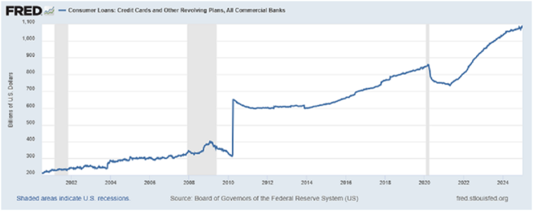
Consumer loans are growing strongly. In particular, the growth rate increased when the rate hike cycle started on Feb-22. This may be part of the explanation for what happened in consumer discretionary goods.
Delinquency rates on credit cards in the 100 largest banks.
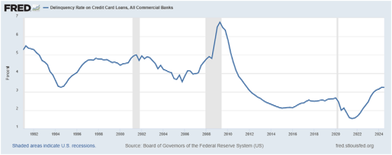
The reality is that the delinquency is growing, but it is far from the levels seen in the GFC. At least in the 100 largest banks in the country.
Delinquency rates on card loans in the rest of the banks. The smaller ones.
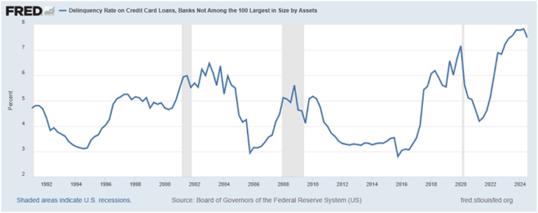
The story is very different here. The delinquency rates in the portfolios of small banks are 50% higher than in the GFC. Yes, you read that right, 50% higher than during the GFC.
The U.S. banking industry relative to other developed countries.
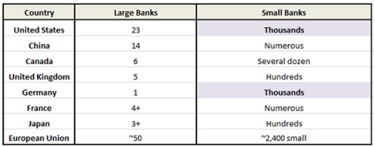
There are too many small banks relative to other countries with the exception of Germany. There is an imbalance here, which already showed signs, with the crisis of the regional banks.
It is very important to remember the reaction function of the F.E.D. at that time, opening a window for these banks, taking bonds at par (which were not at par). Basically a massive bailout by the lender of last resort.
There is a belief, probably true, that the crisis of ’29 was deepened by the collapse of the banks. There is also an obvious moral hazard, using taxpayer money to save banks is immoral. Not only that, it creates the wrong incentives.
In an industry so out of balance. With a known central bank reaction function, the incentive generated is greater risk taking by banks. Especially the small ones.
Type of Credit by Bank Size.
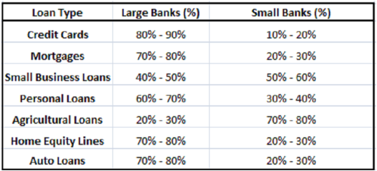
Credit portfolios of small banks.
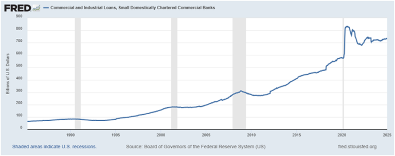
Commercial and industrial loans are on the rise. Surely a portfolio with increasing rates and therefore, also risk.
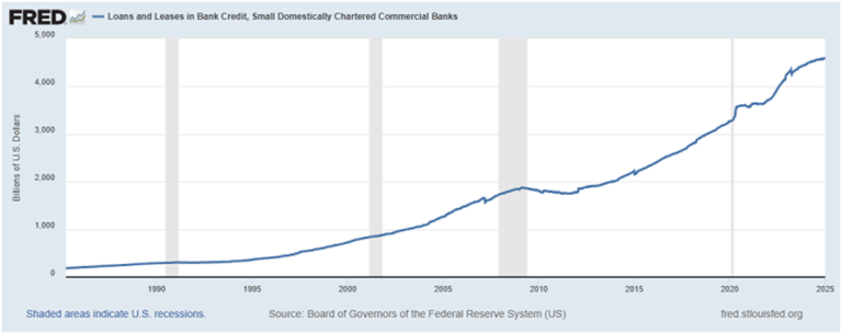
Personal loans and leasing follow the same trend.Growing with higher rates and therefore riskier loans. However, they continue to be granted at increasing rates.
Why?
To seek profitability.
Risk?
It is relative. If we have a lender of last resort, the risk is 0. A little noise, pass hands, of a few below par bonds for cash, until things calm down again.
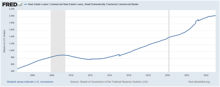
Real State loans from small commercial banks.
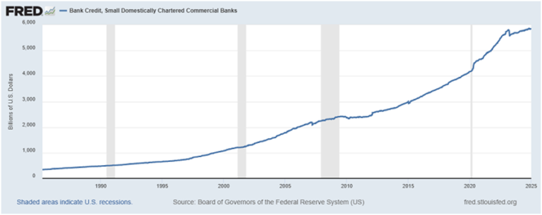
In short, small commercial bank lending continues to grow at the same rate as system-wide lending.
The quality of their loan portfolio cannot be the same as it was with rates at 0%. Loans that inevitably raise their rates generate by definition a riskier portfolio.
Clearly, the growth of consumer discretionary goods is partly explained by the growth of credit.
A sign of the level of difference between the quality of the portfolios of the large and the small ones is the different delinquency rates they have, for example in credit card loans.
As a refresher, the delinquency rate in this type of credit for small banks is today approximately 50% higher than in the GFC.
Conclusions:
– The change in the economic scenario from inversion to the present is not stopping the consumption of discretionary goods.
– Credit, taken as a whole, continues to grow at the same rate as it did prior to the inversion. These loans are more expensive and therefore riskier. Banks portfolios are riskier than before as a whole.
– Segmenting between large and small banks, we see that the delinquency rate of small banks in their credit card loans is 50% higher than the value it had in the GFC.
– Relative to the rest of the developed countries, the number of small banks in the U.S. is enormous.
– The lender of last resort, the central bank, has already revealed its reaction function with regional banks.
– As a consequence, incentives are aligned to increased risk taking. Especially in the smaller banks.
What we have is a loop; whereas the delinquencies grow and the small banks start to fall, the lender of last resort solves the problems. Remember, these are problems in a sector that is overcrowded.
There are too many small banks that in a capitalist market would tend to disappear.
“There is no such thing as a free lunch.”
Milton Friedman
Well, that’s all for today. The technical setup generated by this analysis can be found in the following blog article. I hope you liked it.
If you enjoyed our work, you can find us on X @intermarketflow or on our site intermarketflow.com.
Better yet you can subscribe – it will cost you absolutely nothing and you’ll really brighten our day!
It means a lot to us.
Thank you!
Martin