#28 Point and Figure Basics: Charting Objectives Explained
Point and Figure:Can You Identify Two or Three Trends in an Asset at the Same Time?
In this article, you’ll find a detailed description of the Point and Figure charting method.
- Its primary function (trend identification across different time frames).
- The methodology for plotting it.
- Its pros and cons.
- An example to clarify its use.
- I hope you enjoy it and find it useful, as it’s a fundamental tool in technical analysis.
Coherence between trends when trading is essential. Here’s an objective method, without ambiguity or subjectivity, to achieve this.
Decoding the Patterns: Key Features Explained.
The point and figure chart is a technical analysis tool used in financial markets to identify trends and price patterns, without considering the time factor. Its primary function is to identify the real trends active in a given asset across different time frames.
Any asset can exhibit an uptrend in the current daily timeframe, a downtrend in the current weekly timeframe, and a sideways movement in the current monthly time frame. This tool helps us identify these trends, allowing us to align our analysis coherently with our chosen timeframe.
What Makes Point and Figure Charts Unique?
By excluding time from the analysis and focusing on price action, one can understand price action across different timeframes. Before we dive into the parameters of this graphical method, let’s introduce the following charts.
Point and Figure: Hourly Chart.

This is an hourly chart for gold. The prevailing trend at that moment was bullish. If you were trading on the hourly chart, the logical choice would be to go long. However, it’s undeniable that this trend exists within a larger, bearish cycle with very little upside left. Trading this bullish setup would be a major mistake.
Point and Figure: Daily Chart, Same Asset, Same Moment.

Here, we can clearly see what we referred to as the “larger cycle trend” in the previous chart. It’s clearly bearish, but it’s embedded in a larger bullish cycle undergoing a process of lateralization and/or consolidation.
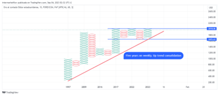
Point and Figure: Weekly Chart.

The asset is consolidating within a higher-degree uptrend.
Identification of Trends: Point and Figure
Trends are identified through bullish patterns (at least 3 marked with “x”) and bearish patterns (at least 3 marked with “o”).
For example, on an hourly time frame, a bullish trend is confirmed when there’s a sequence of at least three significant bullish closes.
This “significance” is assigned personally and aligns with the asset’s historical volatility (ATR). This method eliminates noise from the asset that may be generated by one bullish close.
A trend change is only marked when there are at least three closes in the same direction, of a specific magnitude.
Technical Analysis: Point and Figure
We know that three forces are simultaneously acting on the price of an asset:
- Trend
- Mean Reversion
- Momentum
While the point and figure chart primarily focuses on identifying trends, it can also provide clues about momentum and mean reversion in prices. It’s not an isolated tool.
Traders often use point and figure charts alongside other technical analysis tools to make more informed investment decisions.
Summarizing from the Previous Point and Figure Charts:
- Bullish Trend on the Hourly Chart:
Within a larger bearish trend. The continuation of bullish closes confirms the bullish trend on the hourly time frame.
- Daily Chart:
The trend is bearish within a larger bullish trend or consolidation, as seen in the weekly chart.
- Weekly Chart:
The current trend is lateralization, consolidation, extended over time, and within a larger bullish cycle. Note the dates—this chart represents five years of price movement on a weekly frequency.
Ultimately, the decision you make is directly tied to the timeframe you use as your trigger.
Conclusion:
Seeing the bigger picture is crucial for trading. You need to find coherence.Building a setup requires patience, knowledge, and effort. This is one of the tools we use at Intermarket Flow, and it’s not used in isolation. It complements other types of indicators, oscillators, Chartism, Elliot Waves, Mean Reversion tools and more that contribute to the technical analysis of prices.
Interpretation of Point and Figure Metrics
For example
Point and Figure [ ATR(14),10,3]
- ATR(14) It tells us that the Average True Range used is based on 14 periods backward. If we’re in a monthly timeframe, it measures the average volatility of the past 14 months.
- 10/3 tells us that it requires 3 closes of 10 or more points in order to chart them. Closures below those 10 points will not be considered and, therefore, will not be plotted.
Changes in trend direction.
- Only in cases where we have 3 closures above 10 points will the new trend be plotted with an X or an O, as appropriate.
Trend Continuation.
- Once a trend is established, an X or an O, depending on the trend’s direction, will be added each time there is a closure of more than 10 points in the same direction.
- Plotting a trend reversal, regardless of the timeframe, requires conclusive conditions. This makes it more reliable for identifying trends but also slower. The latter is its biggest weakness.
That’s all for now. The subscription won’t cost you anything and it makes our day. You can find us at intermarketflow.com and on X @intermarketflow.
See you soon,
Martin
Intermarketflow.com
- Intermarketflow
