Yield Curve: Signals and Leading Times to Recessions
Predicting next recession trough Yield Curve Interpretations.
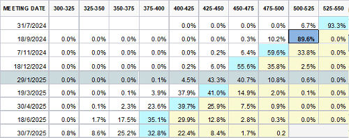
• Probability of Rate Cuts in September
The market is almost certain of a rate cut. More than a month remains until the Fed meeting, yet it assigns a 89.6% probability of a cut. A lot of information will come in from late July, August, and mid-September, so this level of certainty may change. Assuming the market is correct, several countdowns to the next recession begin.
First rate cut as a leading indicator
Each start of rate cuts by the Fed preceded every recession. This leading indicator has 100% effectiveness. It comes from the market’s core, accumulating all available information to date and, most importantly, reflecting future expectations.
Effectiveness as a Leading Indicator
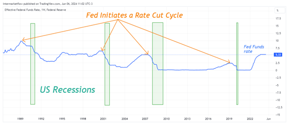
Quantifying this Chart
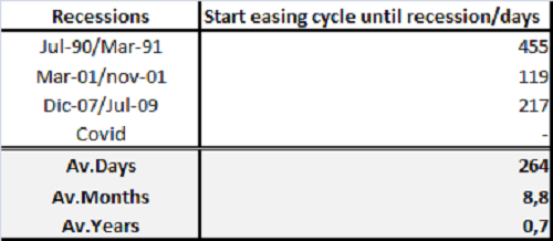
Decoding Yield Curve Inversions
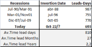
The most popular interpretation. We have a start date in this case, July 2022. Let’s review history to analyze similar cases in the past. We have minimum, average, and maximum times for the onset of a recession.
Quantifying
The Role of 30-Year Yield Spreads in Economic Forecasting
Probably the least known of the three but equally efficient. Every time the spread between the 30-year yield and the F.E.D funds rate reaches its minimum, the clock starts counting down to the next recession. Another leading indicator with 100% effectiveness. Unlike the other two, the starting point is not as clear but is generated based on expectations in the long end of the curve. The interpretation is straightforward: the more negative the spread, the worse the agents’ expectations for the future. They act accordingly, which, in a way, leads to what we know as a “self-fulfilling prophecy”.
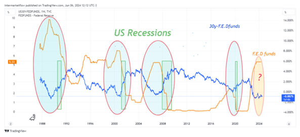
Quantifying this Chart
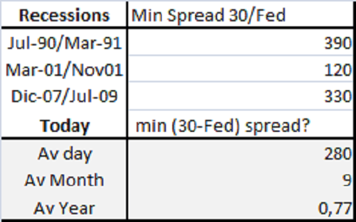
Quantifying Yield Curve Reflections
The yield curve reflects the expectations of all market participants. It defines nominal rates for each period, which implicitly include real rates, inflation expectations and the term premium for each period.
Predicting next recession. Key Indicators of Imminent Rate Cuts. Signals and Lead Times
This is why the message conveyed by nominal rates is so important
Visualizing Data: Charts and Trends to Watch
Chart 1: We see three timelines, one for each indicator. They mark the start date, average, and maximum length.
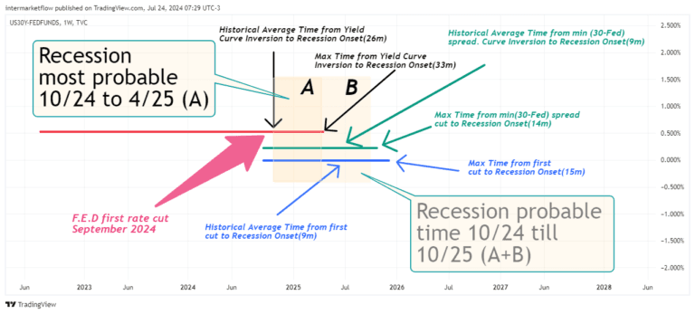
Chart 2: Cleaning the Chart for Clarity
We take the average of each indicator as a determining point. Being an average, it will, of course, have errors, and it is added that these are data with significant dispersion.
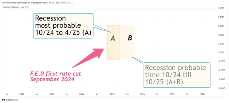
A: Period of Overlapping Yield Curve Indicators
We call the period where the three indicators overlap, the most likely period, from October 2024 to April 2025. If not then, it could occur between May and October 2025.
Recession Takes Time to Kick In. Yield curve leading times We are here now
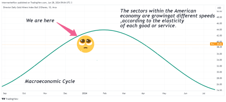
Implications for Market Sectors
This simplifies the outlook significantly. The sectors, vehicles, and assets to operate within and outside the United States. Could be stocks, bonds, currencies, or commodities. They must perform in slowing economy and dropping short term rates.
To conclude
The yield curve can determine the assets to operate, type of asset, class of asset, maturity, whether short, medium, or long-term. Understanding it is crucial for trading.
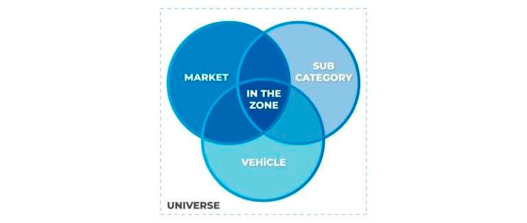
Intermarket Acting in All Its Splendor
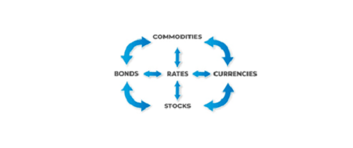
Conclusions
So clear….
- Defensive sectors in Stocks
- Slow down economy sectors in stocks
- Bonds, Selecting Maturity.
- Currencies-Rate diferentials re acomodations
- Commodities or any other non bearing interest asset. The cost of opportunity is coming down for them. Look Gold, Bitcoin for example.
- Commodities exporting countries and currencies?
Preparing Your Portfolio for Economic Slowdown
Uncertainty arises when we attempt to estimate the time from deceleration to recession. The markets, through charts, will speak for themselves and resolve this. Regardless, the focus now shifts in a different direction: relative valuations between probable sectors and between assets within these sectors. Remember, we already got the sectors to trade. Additionally, decisions about currencies for portfolio composition and risk profiles relative to the current portfolio become crucial as well as one perception of market context.
Risk-in-off decisions. It´s time to move!
I hope you enjoyed it as much as I enjoyed writing it. Share it,
Subscribe, it won’t cost you anything and it will make our day. Stay in touch.
Note: Subscribers get an email every 7 to 10 days, with technical set-ups based on Macro Analysis just like this one. Actual potential trades wich we send for marketing porpuses, not trade recommendations.
Enjoy!
Martin
Unlock Full Access
We create professional content for traders, based on intermarket, macro, technical, quant, and flow analysis.
Welcome aboard — enjoy the ride.
If you have already registered before, please enter your email again to recover your session.
6 Responses