
Rates and Market Trends

As always, we start in the same place: rates
3 Months + F.E.D Funds

2 Year + F.E.D Funds

10 Year + F.E.D Funds

Across these three time horizons, the correlation with the FED’s rates is beginning to decline. The market anticipates changes across all of them. It expresses its view. One way to start breaking down this view is through the 10-2 year spread.
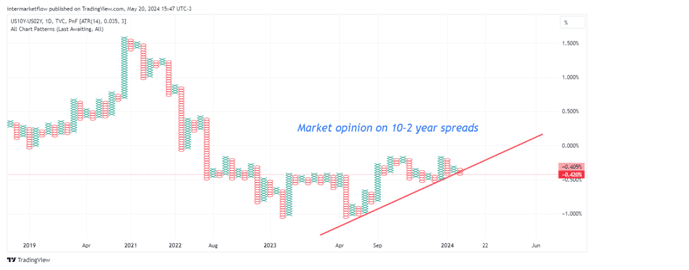
Analyzing the trend of this spread in three timeframes

Day
Week

Month
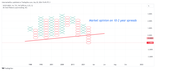
Is quite interesting, especially over the monthly timeframe. Take notice it charts the market’s perspective of this relationship (10-2 spreads) from 1988 to today. This spread could be described as stable, within certain parameters, for a very long time. This has changed, and the 10/2 spread is now sharply falling in the larger timeframe (monthly) and now also in the smaller (daily). What about the week?
If we abandon point and figure (the most reliable method for determining market trends) and switch to Japanese candlesticks, which are faster but less reliable, we see this.
Clearly, a possibilities arrise giving this movement in the rates market.

Recapping, the breakdown of correlations across the three time horizons shows us that a new macro narrative is entering. Logically, this is the natural process of the market as information comes in. The market’s view on the 10-2 spread is bearish. There are several possible/probable scenarios:
- Both rates falling, with the 10-year dropping faster. It’s possible.
- Both rates rising, with the 2-year climbing faster.
- Stability in the 2-year rate with the 10-year falling. It could be.
- Stability in the 10-year rate with the 2-year rising.
The probability of each scenario aligns with one’s “macro view.” Common sense indicates that we are entering or near the final stage of an economic cycle. This is what the F.E.D has been aiming for since it started the rate hike cycle. This bullish process generated this slowdown.
The dilemma. Rates and Market trends

This capital is in the financial system. In Intermarket analysis, rarely is the expulsion center so clear. By simplifying the analysis to the extreme, it doesn’t have many exits:
- Commodities
- Bonds
- Currencies (including cryptocurrencies), which goes hand in hand with the choice of asset
- Stocks
Finding the next most probable stop is the first step in Intermarket analysis. This search is based on a macro view and is triggered through technical analysis. The “macro view” is complex because it tries to encompass a global situation. To address this limitation, we focus primarily on the American economy as a proxy for developed markets, both at the macro and technical levels.
We begin with a quick overview of the indices for stocks, bonds, commodities, and currencies to identify the next most probable stop, also segmented by type of economy:
- Developed
- Emerging
- Frontier
In detail: S&P 500

The rally in the S&P 500 is weak. It lacks the strength and certainty that increasing volume would provide. Worse still, it is so overextended that it has moved far from the value zone—the zone that generates buyer and seller interest. Today, the S&P 500 is what we call a thin market. Very few buyers are entering, enough to keep the price up or stable. What we don’t yet have are sellers. Very few of them will be needed for a correction, and there’s a long way to the value zone. It’s becoming increasingly tempting.
In detail: DAX

A carbon copy of the situation faced by the S&P 500. This rise is not sustainable unless volume appears. This is what the technical analyst calls a bearish divergence. Within technical analysis, it’s the most compelling signal. Its flaw is not what it indicates, but when. It doesn’t help you define the timing.
In Detail: Bovespa Brasil

To analyze Ibovespa, we had to turn to the futures market. The situation is analogous to that of developed countries, with the difference that the overextension from the value zone is much less. It’s less exposed to an “attack.” The P/L ratio is not as attractive.
In detail: Nifty 50 India

Same situation. It’s in full bearish divergence, outside the main value zone but, notably, generating a new higher interest zone. This could be read as the start of a consolidation that would be confirmed with the appearance of volume.
In detail: CN50 China
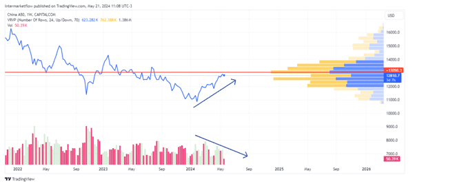
In divergence, without strength or conviction. Right in the value zone. No man’s land with a wounded index.
Seeing these stock indices, we can conclude that capital is not flowing into stocks in general. We can see differences between markets and economies in similar situations. We can also “identify” the most exposed or most oversized markets. All this information is extremely valuable. This information matches up with a macro view for execution.
In detail: Commodities (Bloomberg Commodity Index future)
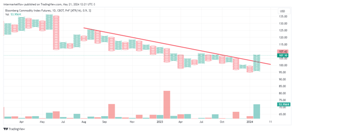
This chart catches the eye of a trader. There’s a break in the downtrend with volume. Using daily time frame. The larger timeframes have not yet confirmed. At a minimum, we have material to set up a short-term setup. We can say that capital is flowing here. It’s time to delve into the index to see which group is the recipient. It’s equivalent to analyzing groups of stocks.
In detail: Currencies, Dollar Index

With decreasing volume in an upward trend. Right in the value zone. No man’s land.
Lastly, to finish with bonds. If you read this report carefully, you will have read between the lines part of my macro view. It is based on a fall in the 10-year rate. This per se positions me long on bonds and duration. Regardless of that, let’s see what the market says.
In detail: Bonds(TLT)
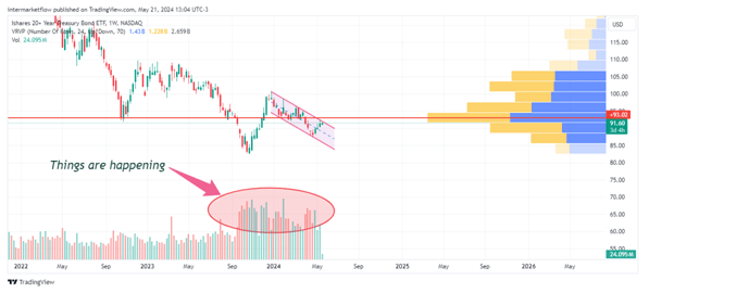
The market is active. There’s volume. We are right in the value zone. In a full battle without a confirmed direction technically.
Main conclusions:
- There is no action in the stocks with some indices extremely expensive.
- There is action in commodities in general. Let’s get into the details.
- In the dollar/fiat currencies, there’s not much noise among them. Basically, none of them direct a trade to any asset denominated in that currency.
- There is action in bonds, without a confirmed direction yet. We also need to delve into segmenting by parts of the curve to better analyze it.
If you enjoyed our work, you can find us on X @intermarketflow or on our website intermarketflow.com
Even better, you can subscribe or share it.
It will cost you absolutely nothing and will truly make our day!
It means a lot to us.
In addition, all information related to trades, setups, and actionable aspects is only sent via email to subscribers.
Thank you!
Martin

