
1.Bear Flattening
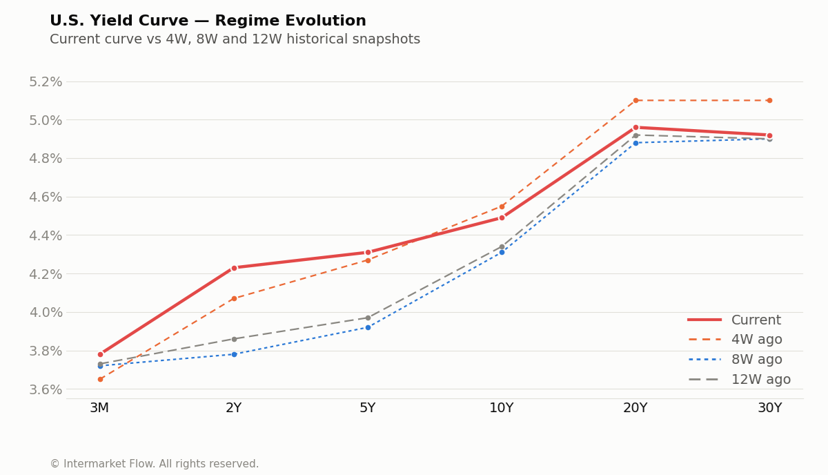
The upward shift in the short end of the curve, combined with falling long-term yields, confirms a restrictive policy regime with a direct, negative impact on future growth expectations. This evolution in the U.S. Yield Curve represents the definitive message the bond market is imposing on the economy.Below is the evolution of the yield curve across multiple time windows:
2 State of Risk: Return / Volume Z-Score (4W vs 1W)
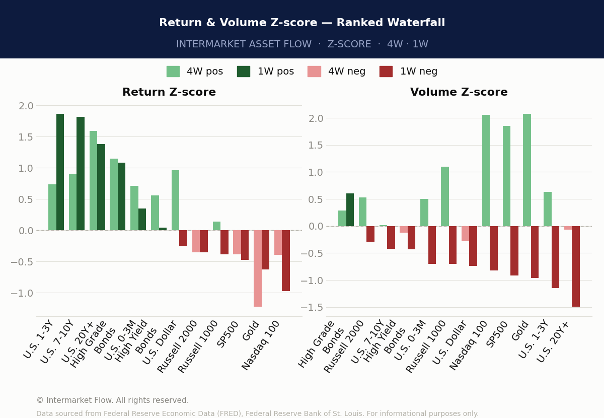
The message originating from the bond market is being mirrored in the performance of assets across both Risk-On and Risk-Off regimes.We track asset behavior through Return and Volume Z-scores across 1W and 4W windows:
The gradient is clean, and it doesn’t lie.
- Risk-off — bonds, high grade, the long end of the curve — holds positive return across both windows. Risk-on — Nasdaq, SP500, Russell — sits negative. That’s not a rotation. That’s a verdict.
- Volume tells you why it matters. Across the board, the 4W-to-1W flow is contracting. The entry that showed up four weeks ago wasn’t healthy accumulation — it deflated.
- One asset breaks that pattern: High Grade Bonds, where return and volume actually converge.
3.Credit vs Equity
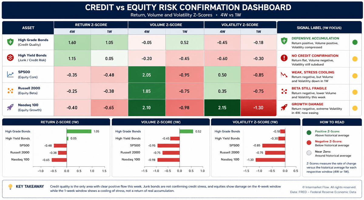
- High Grade Bonds: real defensive accumulation — positive return, volume rising into the 1W window, volatility compressed.
- High Yield: Negative returns and volume evolution.
- The equity block — SP500, Russell 2000, Nasdaq — reads weak stress cooling, fragile beta, growth damage.
- Nasdaq is the worst of the three: the most negative return, the most extreme volume, the most extreme volatility. That combination has a name. It’s distribution, not continuation.
A Closer Look at the Most Representative Assets
4W → 1W evolution.
Key Points
- Volume four weeks back tells the real story — both in the risk block and in fixed income.
- Statistically extreme volume readings across the risk block.
- That volume wasn’t accumulation. If it were, returns would have been positive over the window. They weren’t.
- Volatility closes the picture on this block — Nasdaq especially, with statistically extreme readings.
- Nasdaq is the risk asset where the rally looks most exhausted: the lowest return, the highest volume, the highest volatility. That combination is distribution — in the exact asset that led the last rally.
- Volatility compression is far greater in the risk block than in credit. That asymmetry is the setup for a violent move.
Credit
- Volume entering four weeks ago sat close to its historical average and produced positive returns in both quality and lower-grade credit.
- This past week, the two diverged. High Grade: volume in, returns positive — bullish convergence. Lower-quality credit: volume in was mildly negative, returns mildly negative too — convergence as well, but bearish.
The three vertical histograms show the weekly evolution of every asset across return, volume and volatility. The picture only gets sharper from here.
4.Timing Trading.
Russell 2000
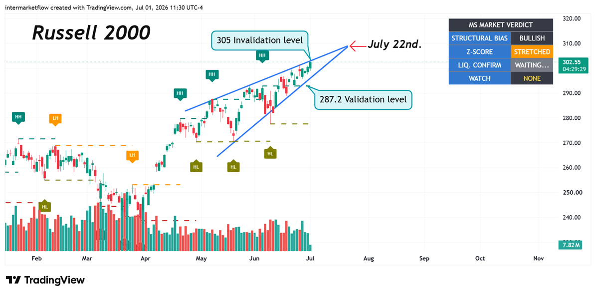
The Opportunity SetThe Russell 200 represents the index where the greatest opportunities will emerge should our thesis be validated. A superficial and isolated reading of this index might be misinterpreted as a powerful rally. However, the data confirms it is not.
SP500: Structural Transition
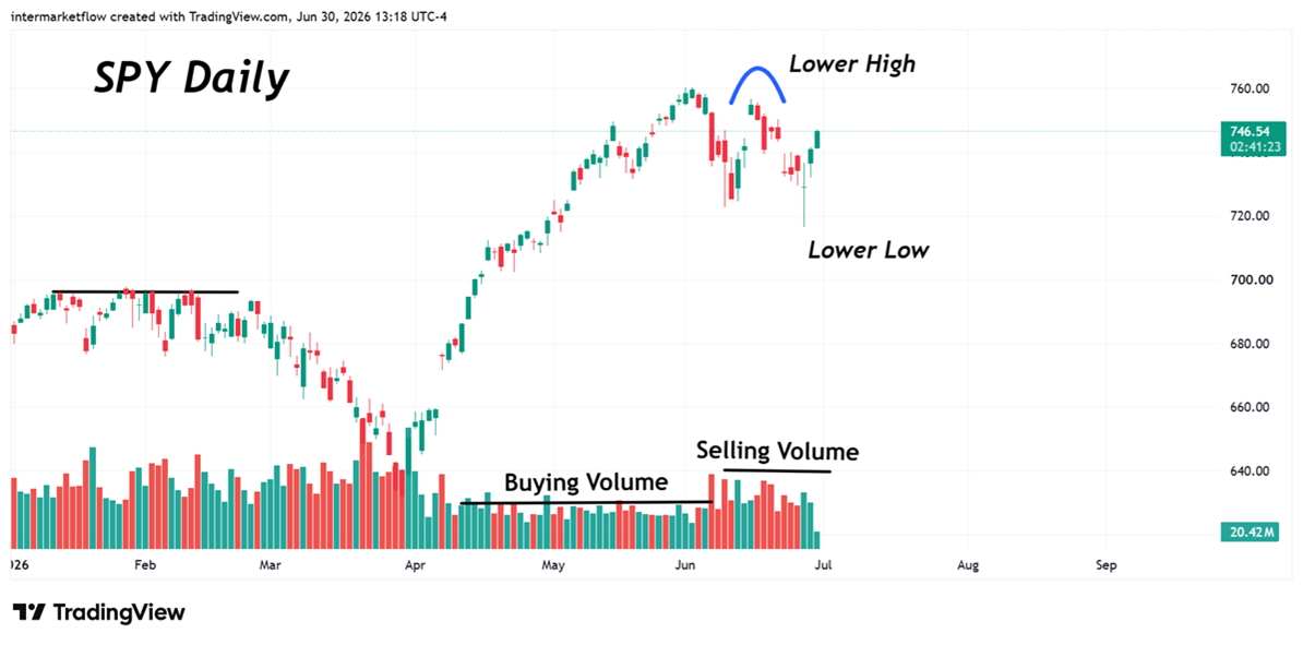
The SP500 shows significantly higher weakness, currently transitioning from a bullish to a bearish market structure. The technical evidence confirms a lower high, with the index currently trading sideways.
Nasdaq 100
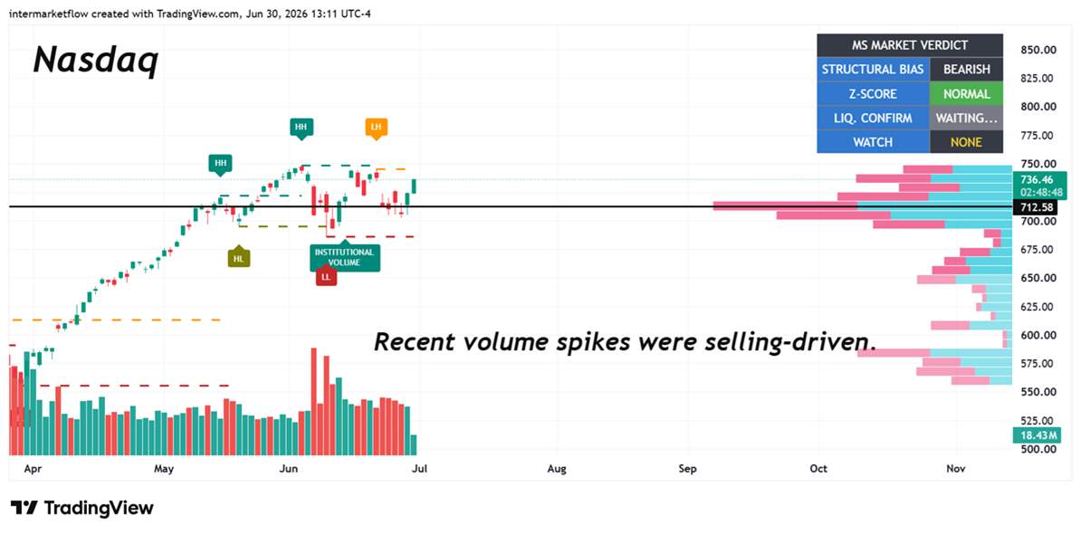
- The pattern looks similar to SPY. The flow underneath it doesn’t. We’ve already shown it — the weakness feeding into Nasdaq is far greater than what’s carrying the rest of this move.
- The critical level is the P.O.C. of the last rally — it carries the added weight that no interest showed up below that price. A break of 712 is the validation level.
4.Technical Setup: Validation & Invalidation Levels
We maintain a technical framework to validate our thesis. The following levels are our critical control points for the current market structure:
- Nasdaq: A break below the 712 level serves as our technical validation to confirm the bearish bias. Conversely, our invalidation level is defined by an upside break with institutional volume above 750.
- Russell 2000: Our primary validation level is set at 287.2, with a structural invalidation point at 305.
- Junk Bonds: We are monitoring defined technical levels to distinguish between real capital inflows and mere speculative activity.
If you believe this is an error, please contact the administrator.
Professional execution requires objective, pre-defined levels. Subscribe to gain full access to our technical setup analysis and receive real-time updates on these critical market triggers.