Equity, Bonds, Currencies and Commodities
Capital flow activity across the 4 major categories
The chart below describes the evolution of capital activity across the 4 major categories, equity, bonds, currencies and the one we group as “Cash is king” over the last 3 months. When analyzing the period between 4 and 12 weeks ago, the situation was very clear and well-defined. There was high activity in commodities, reaching up to three standard deviations from their 2-year average. Activity in both bonds and equities remained constrained around their historical averages.
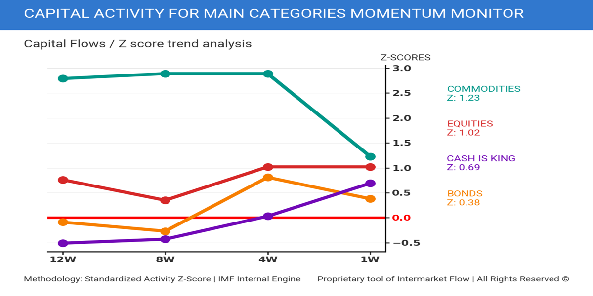
Over the last 4 weeks, the situation changed. Activity in the category we label as “Cash is King”—which groups Bills, the Dollar, and Gold—started gaining traction. An increase in activity within this category, without a corresponding effect in any of the others, implies that flows are being absorbed internally. If the situation were reversed, one of the other categories would show higher activity, reflecting the inflow of that capital.
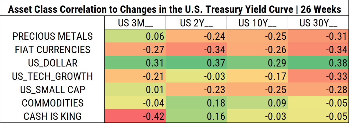
Looking at the last 26 weeks (approx. 6 months), everything seems to follow a logical pattern. Regardless of magnitude, the correlation symbols between the different asset classes and the yield curve are “correct”.
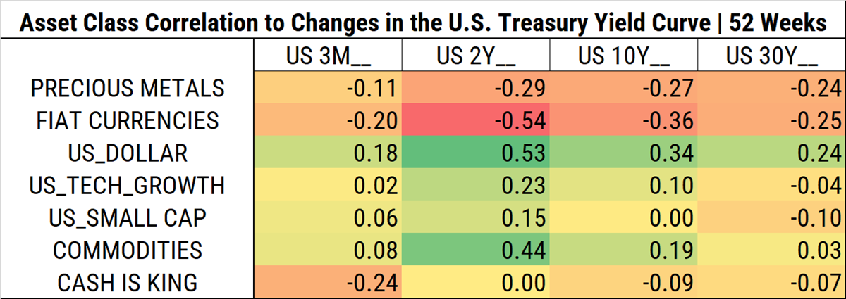
Widening the lens to the past 52 weeks, the situation reflected by the correlations is different.
- Tech stocks exhibited a slightly positive correlation with rates across the entire yield structure.
- Small caps expressed a similar situation.
- The correlation with commodities was nearly zero.
In other words, there was a positive correlation between tech and small caps with interest rates.
In the following heat map, we show the changes in correlations in absolute terms. We aim to illustrate magnitude before diving into directionality.
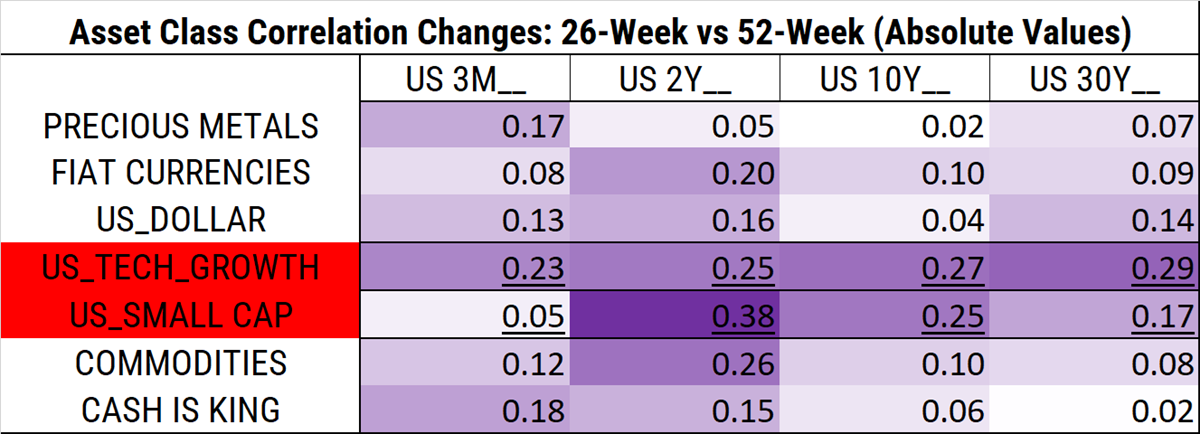
Keep in mind: a 0.25 variation in a coefficient that ranges from 0 to 1 represents a 25% change. The stock or asset becomes 25% more sensitive to rate changes. This is no small matter.
The largest moves are occurring in the 2-year segment. Beyond being the biggest in absolute terms, they are also reversing the sign of the correlation. Tech stocks and small caps are now negatively correlated with interest rates.
Equities, Bonds, Currencies and Rates
This last month, changes occurred within the components of nominal yields. Not in its final value.
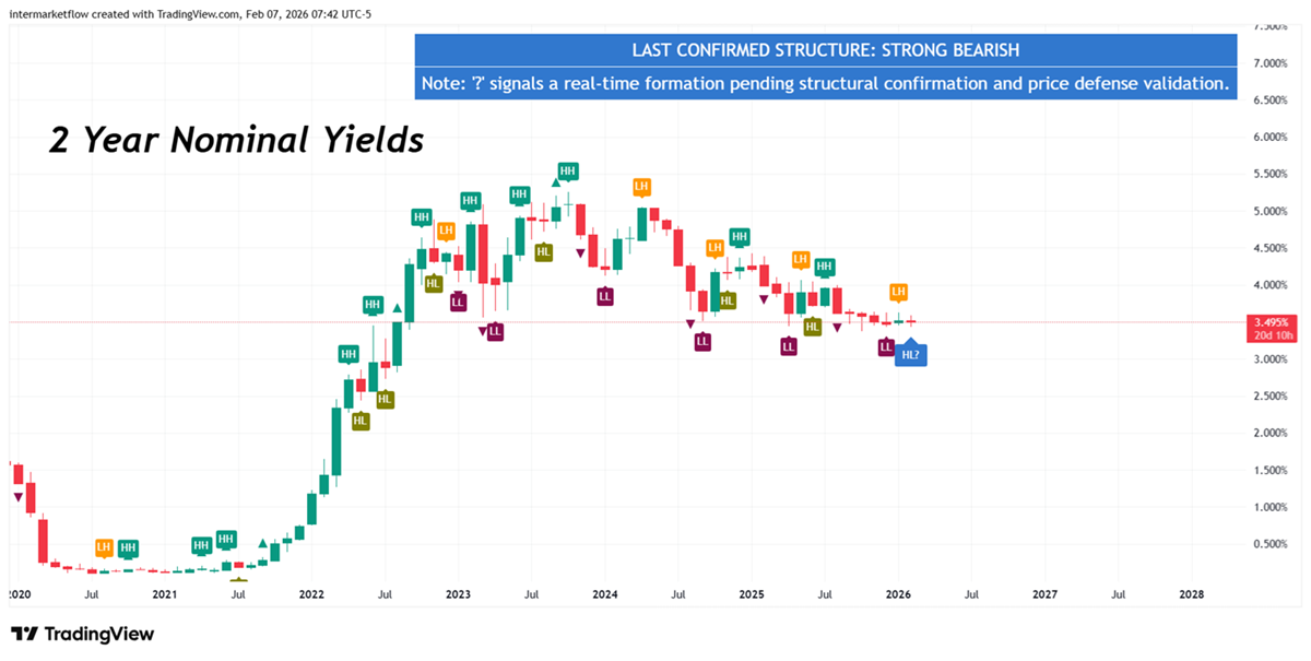
Nominal Rate (2 years)= Real ꭇate (2 years) + Expected Inflation (2 years) + Term Premium (2 years)
The 2-year nominal yield value has not changed over the past month. On the contrary, it has become increasingly compressed. Changes occurred within the components of nominal yields. Not in its final value.
Equity, Bonds and th Macro Narrative
This directly reflects the clash between macro narratives: the dominant one, and the one attempting to displace it.
Two possible interpretations:
- Still dominant: A growing economy, with exceptionally high levels of investment and strong productivity gains that will more than proportionally offset underlying inflation.
- A growing economy driven by investment and the trade balance, where productivity gains stem from lower labor utilization, while inflation currently exceeds those productivity gains.
Of course, there are many more possible interpretations. What matters is understanding that these interpretations exist along a gradient, competing with one another like a tug of war, until one prevails and market prices ultimately validate it.
Summarizing
- The sensitivity of tech stocks to the yield curve across all terms has flipped. 52 weeks ago, the correlation between rates and tech was positive. Over the last 26 weeks, this relationship has strongly inverted.
- Small caps underwent the same process. There was a reversal in the relationship—from positive to extremely negative in absolute terms(a total range of 0.38 or 38%). Considering this coefficient ranges from 0 to 1 (Pearson), the shift is significant.
- The most substantial changes in sensitivity are occurring at the short end of the curve, specifically the 2-year term.
- This characteristic tends to point to real rates and term premium as the factors in dispute, just because inflation expectations two years ahead do not seem so difficult to foresee.
The most visible battlefronts:
- Spreads across different types of credit, by maturity and quality
- VIX
- SPY
- Gold
- Credit default swaps across different debt profiles
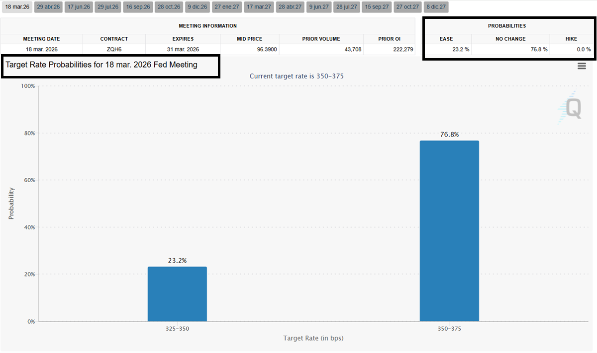
All of them, under the current context of no rate change for the following FED meeting.
In the mid-week report, we will dive into the technical analysis of sectors, assets, and potential trading vehicles.
See you there
Martin
If you believe this is an error, please contact the administrator.
One Response