End of QT
End of QT ≠ QE is the first concept we need to truly absorb. What ended on Monday was a mechanism through which the Fed was absorbing liquidity from the system. The specific methodology — the “how” — has already been explained here, and it’s not relevant for today’s piece.
Markets have been pricing in the December 10 rate cut with fairly steady confidence. (You can track live cut probabilities here.)
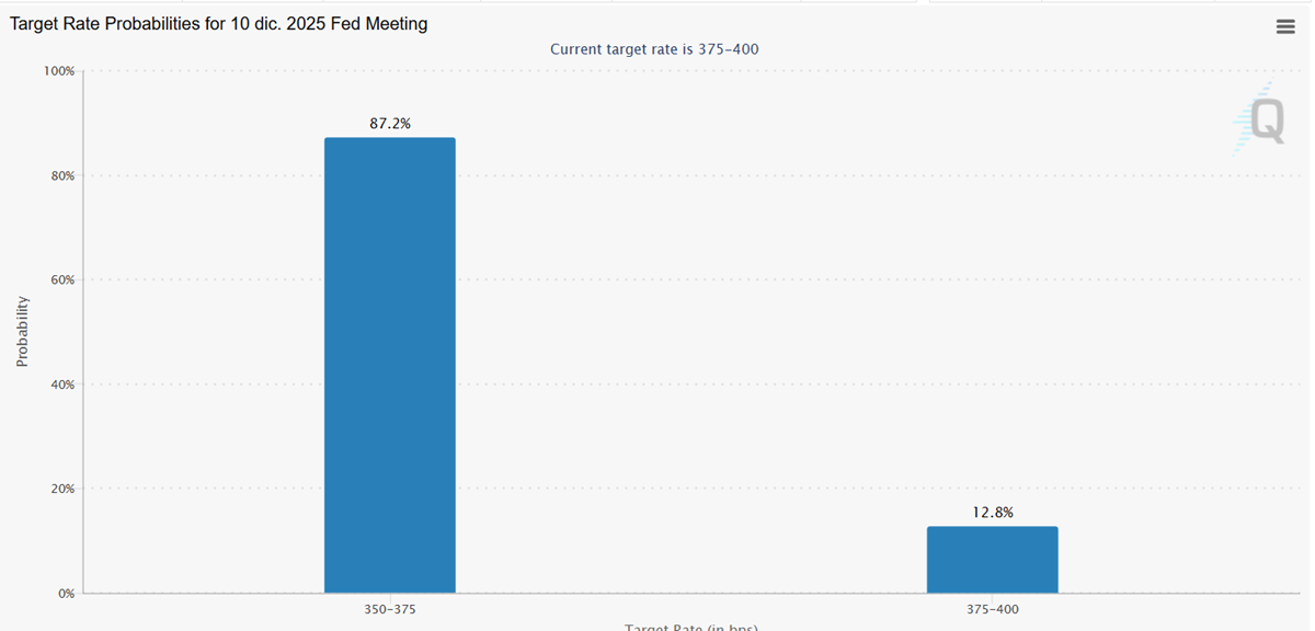
Relative to what we had before, this is an easier policy backdrop. Two variables changed at the same time, and the market has been trading these, near-certainties, over the last few weeks:
- QT ending. Already a discount on prices
- Short-end rate cut: Through the futures market, you can tell the market has treated it as almost a certainty for the past couple of weeks — and it has been trading with that premise in mind
QT, Rate cuts and the short end of the curve
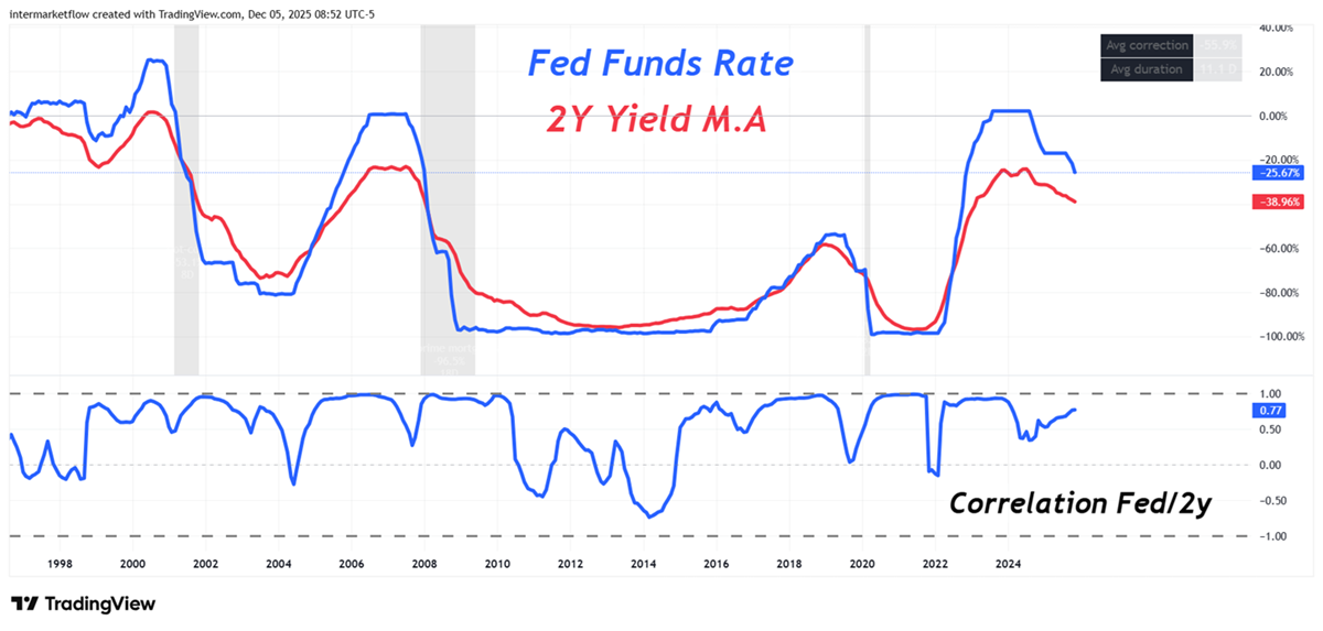
As we already saw here, the correlation with the 2-year yield is high. This yield is heavily influenced by the Fed’s rate policy, and its decline is one necessary — though not sufficient — condition for rate cuts to filter into the real economy.
QT and the middle of the curve: The real economy movements in this cases.
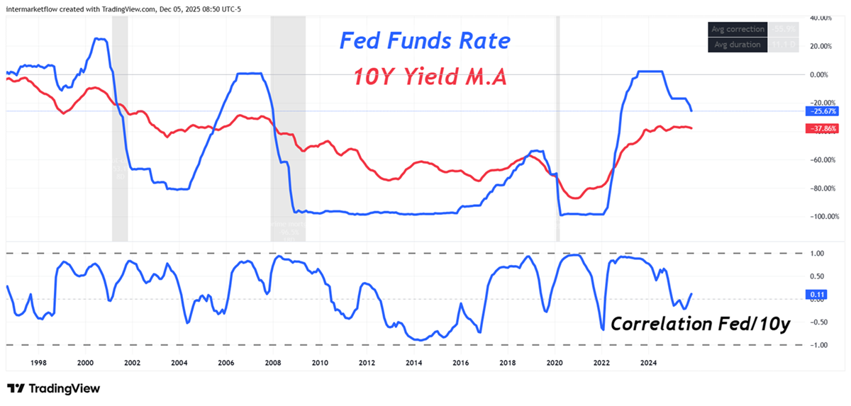
As you can see, the correlation with the 10-year yield is far less stable and far less direct. We also covered this here, a long time ago.This is the key transmission rate into the real economy, because it largely determines the average cost of credit across most borrowing categories.
If these shifts fail to bring the 10-year yield down, the real-economy impact will be much more limited.
Background: The real economy
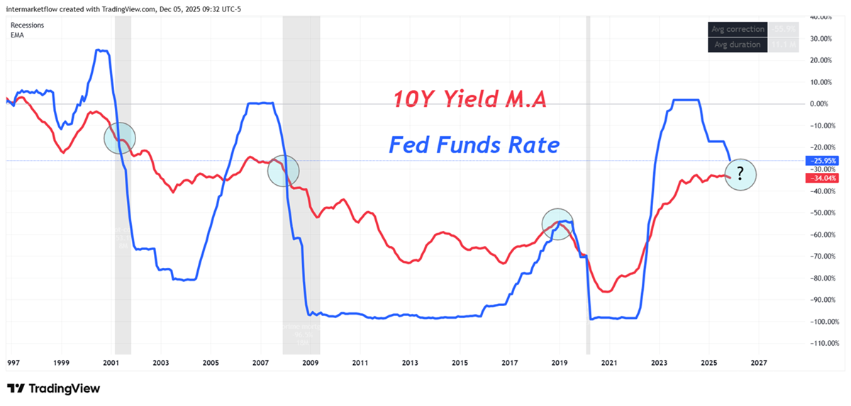
History doesn’t repeat… but it sometimes rhymes. This is another relationship worth tracking closely, because it’s an excellent leading/coincident indicator of recessions.
The macro ecosystem and the real economy
When the drain stops, trends in bank reserves improve. Does that mean banks will lend more?
Not at all. Banks will only lend more if they believe there’s real business in it. We’ve already looked at where delinquencies stand across different credit types here.
And we asked this in the previous article: are you really going to inject more money into a business that isn’t working?
The blind spot behind easy optimism is this: liquidity or for that case, cheaper credit can support prices and buy time, but they don’t fix solvency.
They don’t turn losing businesses into profitable ones, erase defaults when the credit cycle is already mature and it doesn’t restore housing affordability if long rates and real income don’t cooperate.
The real key: reaching the real economy.
- Credit expansion (lower rates + more lending + more borrowers)
- Inflation not re-accelerating
What really matters
We also have to understand that the real economy, as we used to study it, stopped growing mainly through productivity gains (AI has the potential to change that) and demographic growth (which is no longer the engine it used to be). Instead, it evolved into a system that grows — and survives — through constant refinancing, with one hard constraint: it already carries a large debt stock.
Naturally, that creates rising solvency risk, which likely ends up showing in the term premium — especially on the long end of the curve (for example, the 10-year yield).
The system needs more and more liquidity because it was built in a way where, without elastic balance sheets, the real economy seizes up. And those balance sheets aren’t just the central bank’s — they’re also, and increasingly, the end consumer’s. The consumer needs more credit to keep consuming so the wheel keeps turning.
Remember: roughly 70% of the economy is consumption.
Context
- The low- to middle-income consumer is at the edge of their capacity. Evidence includes record delinquencies in credit cards and autos, among others.
- Higher bank reserves do not automatically mean credit will grow. A bank expands its loan book only if it believes it will make money. With delinquency trends rising across credit categories — as we already reviewed here and here — why would loan origination accelerate?
In summary: the scenarios I see
- We move into a clean risk-on regime. The gap between markets and the real economy keeps widening until the real economy forces the adjustment.
- Inflation comes back hard.
- Liquidity doesn’t reach the real economy, and inflation rises. (Stagflation scenario)
- Liquidity doesn’t reach the real economy, and inflation keeps falling due to an incoming recession.
I ask myself, why so pessimistic?
Because I don’t see convincing reasons why a more expansionary monetary policy would actually filter into an economy where everything is already saturated.
Let’s watch the markets — at the end of the day, they’re the judges
Step 1: The full intermarket picture.
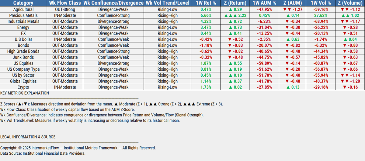
Inflows, again Precious Metals, Dollar and some in Crypto. I highlighted the U.S. equities row, but the same applies to global equities as well: volume collapsed this week, no matter how you parameterize it. In the U.S. case, when you measure the move versus its own historical average, this week’s drop is extreme. And this is happening with QT out of the picture and a rate cut priced in for five days from now. Returns look solid, but the weakness is underneath the surface.
I wouldn’t be surprised if, after the cut on the 10th, we get the classic “buy the rumor, sell the news.” In my opinion, it could be more like a run for the exits on the news and whoever’s last, turn off the lights.
Also note the type of flow in precious metals, row 2.. It’s convergent in both price and volume, and the move is strong relative to its own history. Volatility is high and still rising — so be careful. This isn’t an asset I’d buy on a breakout; I’d buy it on a dip.
Step 2: Intra Sectors Charts
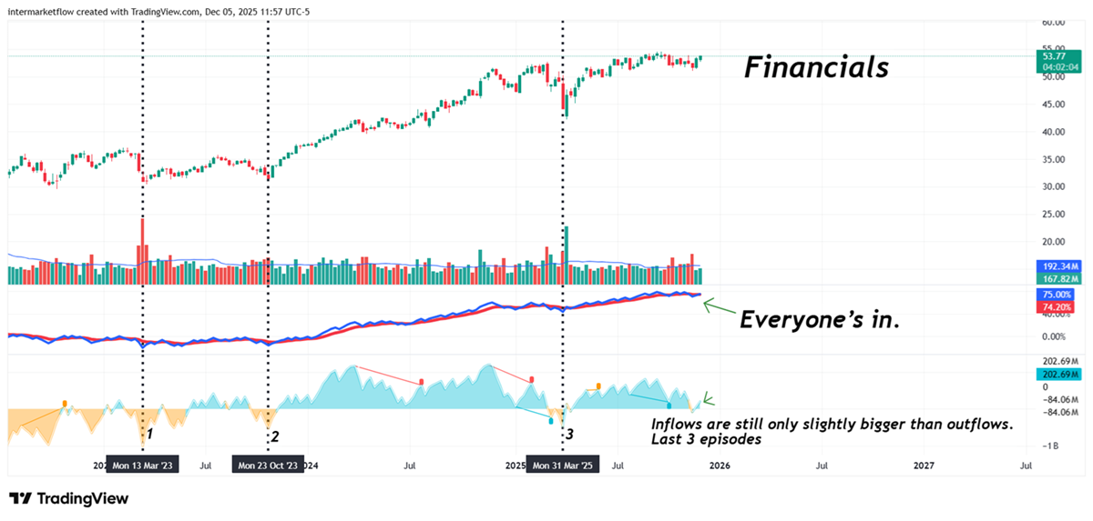
Financials Weekly
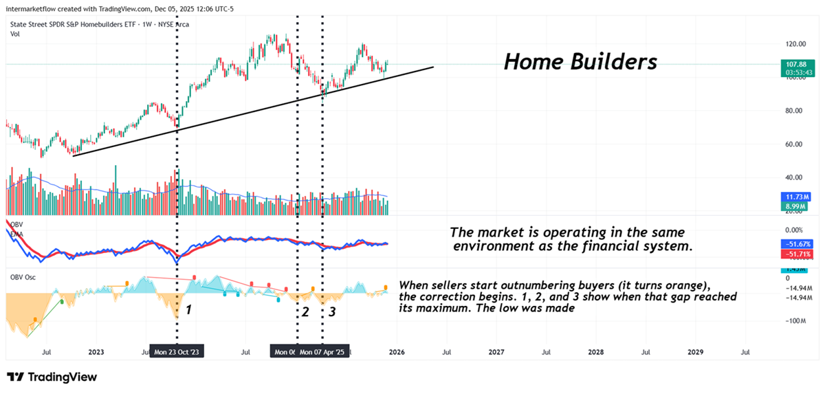
Home builders Weekly
Real State Weekly
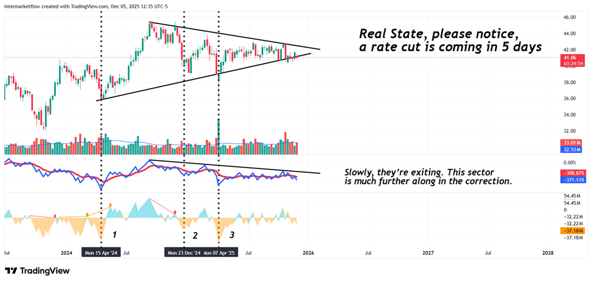
Three distinct stages in the correction process. The first oscillator shows how many players are in the asset, but I especially marked points 1, 2, and 3. Those are the moments when the inflow of sellers was at its maximum relative to buyers.
You might say, “Sure — that’s obvious.” But that’s not the point. The point is that before that, when this relationship turns negative, and the chart starts turning orange, the situation becomes critical. And it already is today in all three cases, with the ratio at 0 (tied) or very close to 0.
Martin
If you believe this is an error, please contact the administrator.