Over the last quarter, the market compressed and decompressed both volume and volatility. They first appeared in bonds twice and later in equities and gold.
Across all these moves, the market kept moving back and forth without confirming a clear direction. But each move left signals beneath the surface.
Let’s break them down
12 Weeks back: the starting point
The larger and light-colored bubbles show the 12-week starting point across all dimensions for the three regimes: Dollar Value, returns, volume and volatility.

Returns were statistically high across risk assets, close to 2σ above their historical 12-week average. That was the equity sprint that started in March/April. This trend has not been fully reversed yet, so it remains the prevailing price trend.
But there was, and still is, an inconsistency: volume and volatility were still suppressed. Risk On was not expanding with participation.
Key point: prices were moving, but market activity was not confirming the move. At that stage, Risk Off and Credit Crisis assets were basically outside the map.
4 weeks back: the attempted breakout
The second bubble shows the last month starting point, showing the evolution from the 12-month time frame.
Volume and volatility expanded sharply, but not in a Risk On direction. Risk assets were sold, while returns appeared in Risk Off assets. This stage started to show up four weeks ago.
Key point: when volume and volatility returned, the market sold risk and bought safety / credit protection.
Monthly to Last week evolution: back into contraction, but with clear differences
Volume and volatility collapsed again, pushing all regimes back into contraction.
- The 4-week breakout attempt was rejected.
- We still do not have confirmed Risk On.
- We still do not have confirmed Risk Off, but we are moving closer.
- We still do not have confirmed Credit Stress, but it is clearly on the radar.
- Inside that contraction, the decline in return and volume was much stronger in risk assets, while safer assets generated positive returns.
- This is not massive yet, but it is a pattern. It repeated across the last two volatility decompression events.
Connection with Technical Analysis
- We may be going through what traditional technical analysts call a double top in formation.
- The chartist pattern reflects repeated breakout attempts without flow confirmation.
- Price tests the same area, but volume, Dollar Value and the needed volatility do not validate the move.

This market context generates what we call a double top. This can provide an edge.
- Four clear points emerge, which act as a starting point. It is there where flows and volatility have to appear, or the break will fail, validating the figure or confirming it.
- A first technical target.
- Timing. This figure is confirmed or invalidated within an explicit period of time.
How the market exits this trap.
Bullish validation
- Returns stay positive and volume / Dollar Value and volatility turn positive, making new all-time highs. Invalidating the double top figure.
Bearish rejection
- Returns fall while volume / Dollar Value and volatility rise, confirming the double top.
Prolonged compression
- Prices keep drifting higher with low volume and low volatility, moving sideways until a catalyst appears. The latest Fed announcement might have already set up that catalyst.
Remember the last two attempts to validate the bullish path failed and exposed a market leaning against risk.
What to watch
Big Tech / AI needs volume and Dollar Value to validate leadership.

This is the key chart because it is the leadership and engine of this rally. SPY repeats the pattern that this sector is forming. The same logic and analysis described above applies.
Discretionary
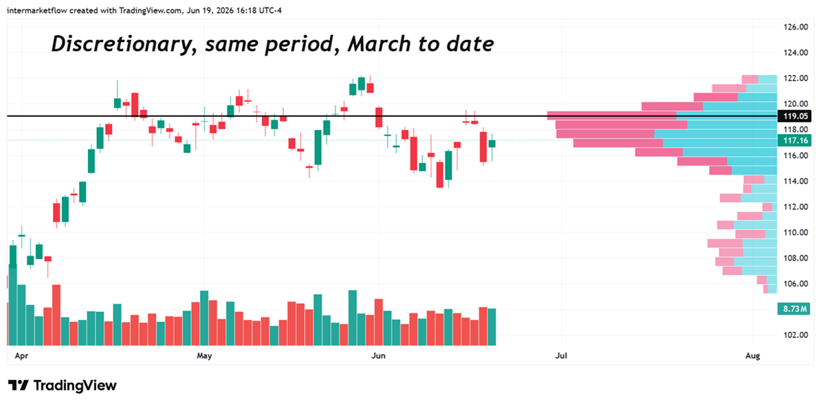
P.O.C. — Point of Control — is the most traded price of the period under study and therefore the current equilibrium price. The value area, where we find at least 70% of the transactions, marks the limits beyond which risk appetite is confirmed or invalidated.
Utilities
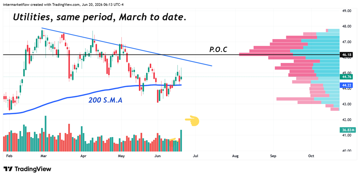
A horrible chart, which becomes relevant through its resolution, indicating the market’s risk profile.
HYG is the credit trigger
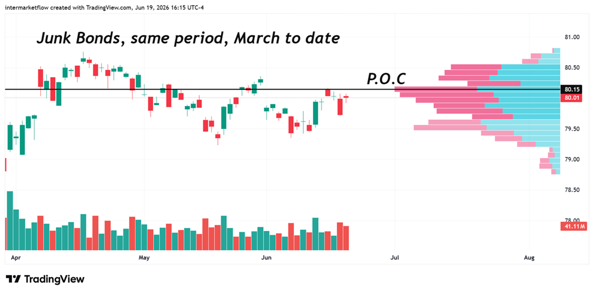
Negative return with rising volume / Dollar Value and volatility confirms stress.
Cash is King Scenario
Dollar and Bills show increasing volume, Dollar Value and volatility.
These are some of the charts that determine breaking levels. Of course major indexes are the main chart, but looking under the hood will give us valuable information.
The key is not whether price rises. The key is where capital flows push asset prices: into Risk On, into defensives, or into selling credit.
If you believe this is an error, please contact the administrator.