The Dot-com and G.F. C were the last two major bubbles and recessions experienced by the U.S. economy — both of which had repercussions across the world.
We went back to analyze them. We wanted to understand the context in which they occurred — why they appeared, how they burst, and what similarities they share with the current situation.
Dot-Com: A summary of the key variables
The first thing to understand is that absolute interest rate levels reflect different eras — shaped by productivity and demographics. So, the real insight doesn’t come from comparing levels, but from studying how rates evolve, especially real rates.
Key points – Dot-Com bubble (1998–2001)
- Origin: Fed cut rates three times after the LTCM collapse and the Asian crisis, creating a large liquidity pool of cheap money.
- Inflation: Not part of the problem; remained within the Fed’s target.
- Excesses: Liquidity and irrational expectations drove a massive tech rally — the Nasdaq rose 260% between Oct 1998 and Mar 2000.
- Tightening phase: Fed later raised rates by 50 bps; by early 2000 the yield curve inverted, coinciding with the Nasdaq peak.
- Trigger: Liquidity dried up and funding costs rose, causing a gradual collapse rather than a sharp shock.
- Labor market: Unemployment reacted only after the crash — a coincident, sticky variable slow to rise and slow to recover.
- Policy response: Fed cut rates from 6.5% to 1.75%.
- True recovery came through negative real rates, not just nominal cuts.
- Summary: Born from excess liquidity and unrealistic valuations that failed to live up to actual results; ended when liquidity evaporated. Recovery began only when real rates turned negative.
GFC: A summary of the key variables
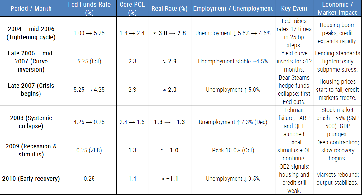
Key points – G.F.C. (Global Financial Crisis 2007–2009)
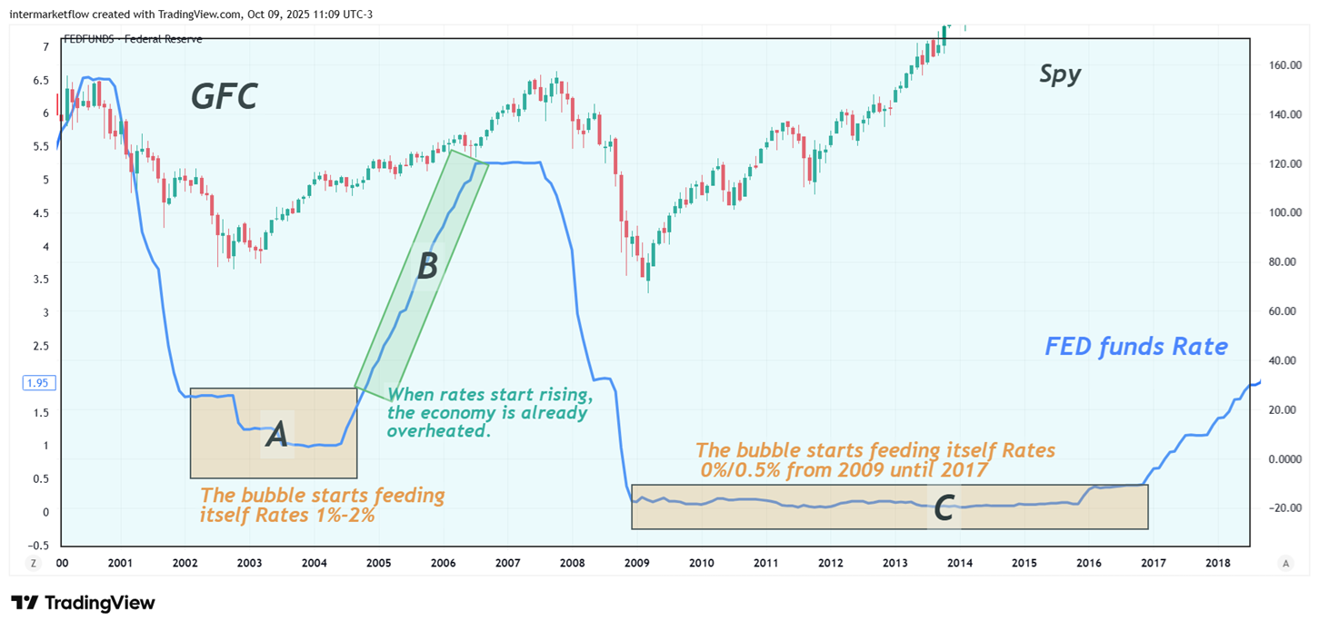
- Liquidity accumulation: Another long phase of excess liquidity began right after the previous recovery — the same pattern seen after the dot-com crash — once real rates turned negative.
- Inflation: Not part of the problem; remained within the Fed’s target, just like in 2000.
- Unemployment didn’t work as a leading indicator. It’s a sticky variable — it accelerates during the crisis and becomes sticky again during the recovery.
- Confidence erosion: The crisis unfolded through a sequence of sharp, visible shocks that gradually undermined trust — similar to the liquidity cracks seen in 2000.
- Fast rate adjustment: The tightening cycle was quick, not gradual, again echoing the dot-com pattern.
- Bubble core: This time centered on housing, financed by massive, cheap credit and a broken or nonexistent credit-scoring system. Rates were low, and profits came from volume — much like the speculative momentum in tech during 2000.
- Policy response: Recovery once again came through negative real rates, confirming the recurring formula that ends each cycle.
Common Factors
- Both followed long periods of easy money, then sharp rate hikes by the Fed.
- Monetary tightening before the crash.
- Unemployment not a leading indicator
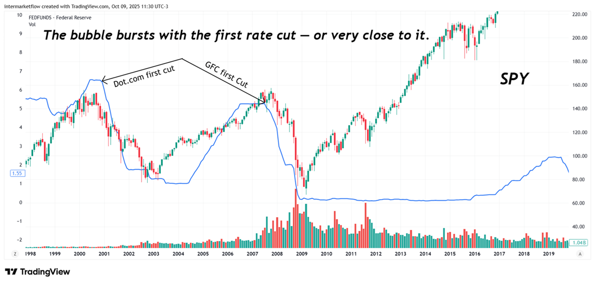
- Yield curve inversion, clear warning in both cycles (Jan 2000 / mid-2006).Preceded recession by 6-18 months.
- Excess leverage and mispriced risk
- In both, risk models assumed liquidity would never vanish.
- Liquidity shock as the trigger
- Massive policy reversal in both cases reaching negative real rates
- The crisis began around — or shortly after — the first rate cut.
 Context leading up to the current situation
Current situation Differences from previous cycles: the accumulation period
Nearly eight years of negative — or near-negative — real rates, with unrestricted access to credit.This created a liquidity pool far larger than in previous cycles.
Covid
Covid triggered a wave of liquidity that lifted virtually every asset class.
These dynamics created the key difference between today and the previous two crises: inflation
Current Situation
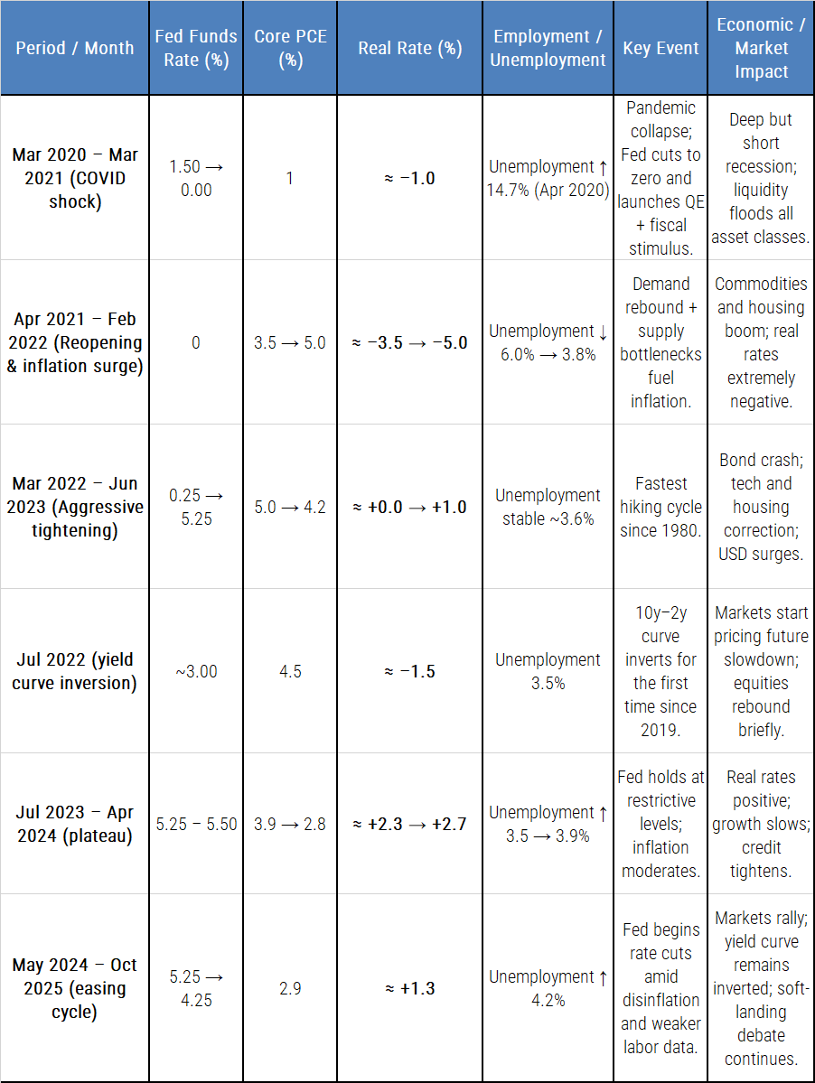
Common themes with the Current Cycle (2020-2025)
- Prolonged liquidity excess → rapid tightening
- Dot-Com: post-LTCM easing → aggressive hikes.G
- FC: housing boom under ultra-low rates → sharp normalization
- Current: pandemic stimulus → fastest hikes since Volcker
- Yield curve inversion as recurring signal
–Jan 2000 → Recession 2001
–Jul 2006 → Recession 2008
–Jul 2022 → ? (still unresolved)
- Asset overvaluation under cheap money
–2000: tech stocks.
–2008: real estate & credit.
–2021: everything — tech, crypto, housing, private equity.
- Structural disconnect between markets and the real economy
Each time, asset prices detached from fundamentals before correction.
Earnings and productivity couldn’t justify valuations.
- Delayed labor-market response
Employment stays strong until late in the cycle, then turns quickly.
- Fed trapped between inflation and financial stability
–2000: feared overheating.
–2008: feared systemic collapse.
–2024-25: balancing inflation vs. labour weakness
- Repetition of moral hazard
Each cycle ends with rescue policies that rebuild the next bubble on a different asset class.
As an observation, the current situation offers more monetary policy tools — many of them designed specifically to sustain liquidity, despite the sharp rate-hike cycle. In fact, QT never came close to offsetting the magnitude of QE.
Stats and setups we’ll be studying next week
Those who’ve been following us already know our stance. We’ve been building it for a while — grounded in intermarket logic, macro fundamentals, and technical analysis.
Whether this pullback is just profit-taking or the start of a deeper correction remains to be seen.What we can do, from a technical standpoint, is outline the levels that define each scenario.
Weekly Stats
Last week turned into a clear risk-off move — and it showed up across every market. Let’s take a look.
Bonds
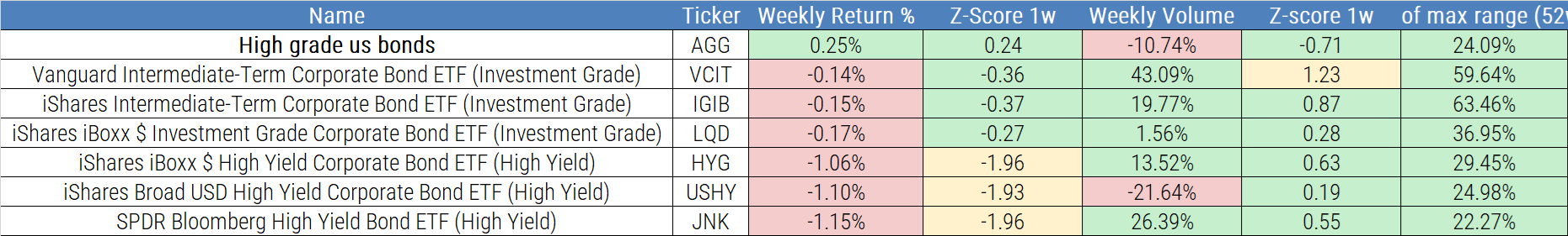
Returns were negative across almost every category except one type of high grade.
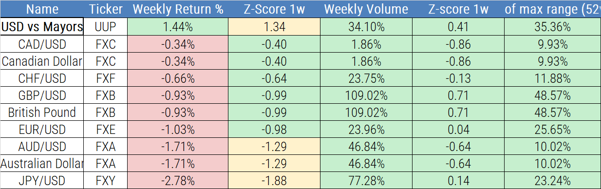
However, the goal of these tables isn’t to track direction, but to measure intensity — that’s what the Z-score captures. Look at the intensity of the moves in high yield — all clustered around 2, which, as we know, signals an extremely strong move. In fact, the difference is so small that it only shows up in the cell color — they’re right at the limit, following a traffic-light logic.
Equities as a global category
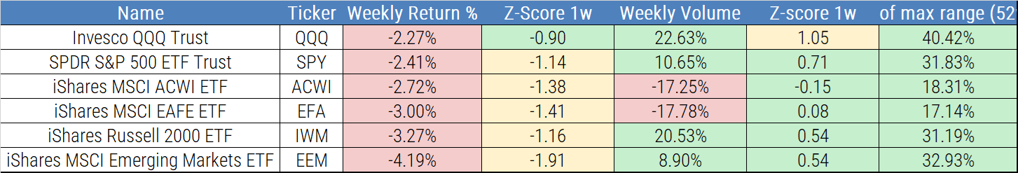
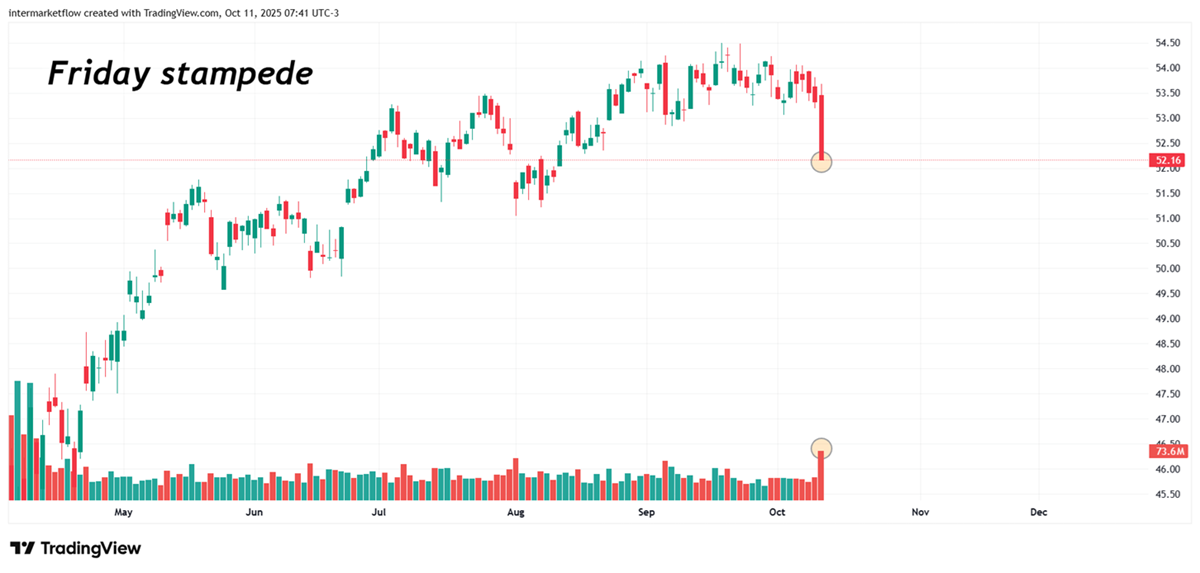
Stampede. Risk off!
Type of Company
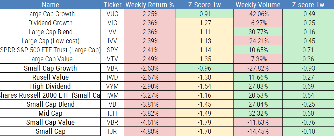
The selloff hit the whole category — but it was furious in small caps. Risk off!
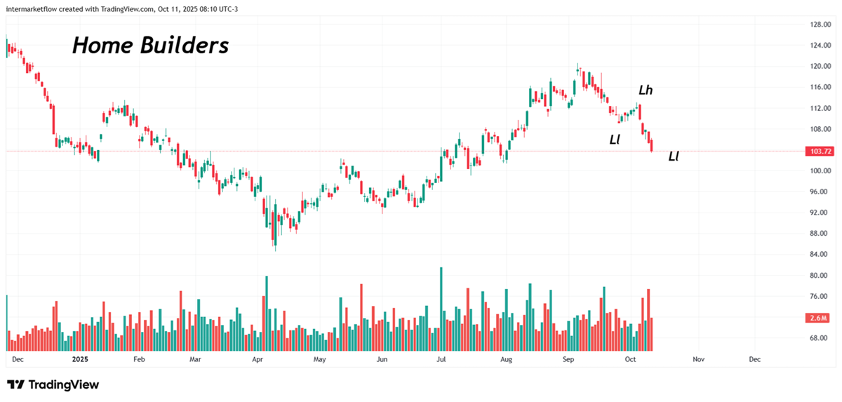
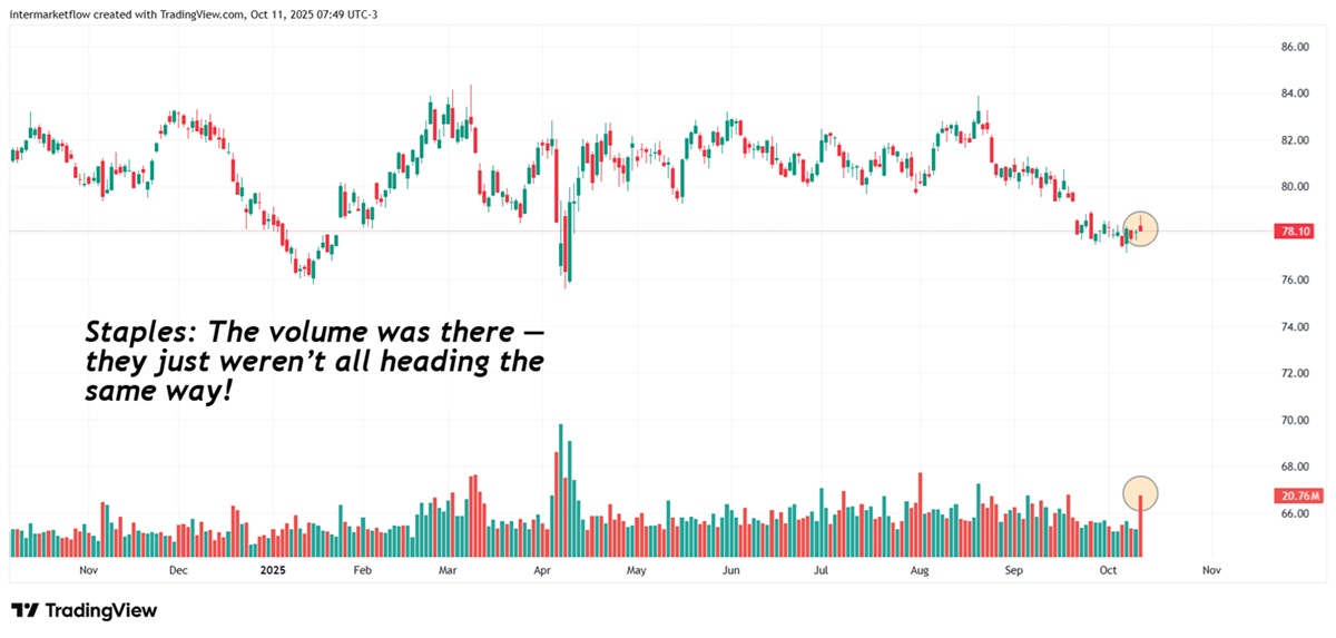
Sectors
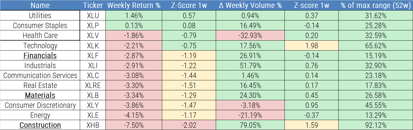
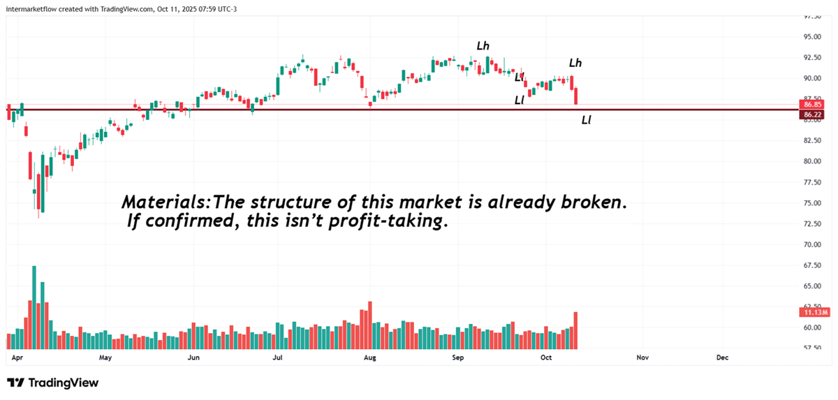
We’ve been tracking imbalances across sectors — finance, construction, real estate, materials — and warned about consumer discretionary earlier on. All of it’s on the blog.
The intensity of the rotation is striking — just look at the Z-scores, especially in construction.
The drop in returns was extreme on its own, but the magnitude of volume flows dimensions it.
This wasn’t a correction — it was a stampede.
Vehicles are starting to emerge. Regardless of your overall market view, relative strength is standing out clearly — and the potential vehicles for each scenario are taking shape.
Currencies: Old fashion classic fly to quality?
The companies that took the hardest hit this week — the cherry on top
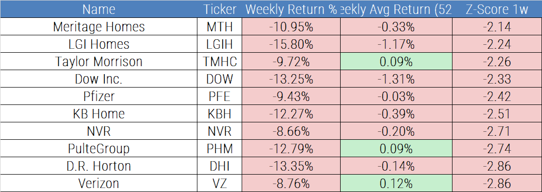
Look at Z’s to grasp intensity. Materials, construction well above extreme moves. Among the 10 hit the hardest, 6 constructors.
So… what now?
A couple of charts to make the situation clear
Financials
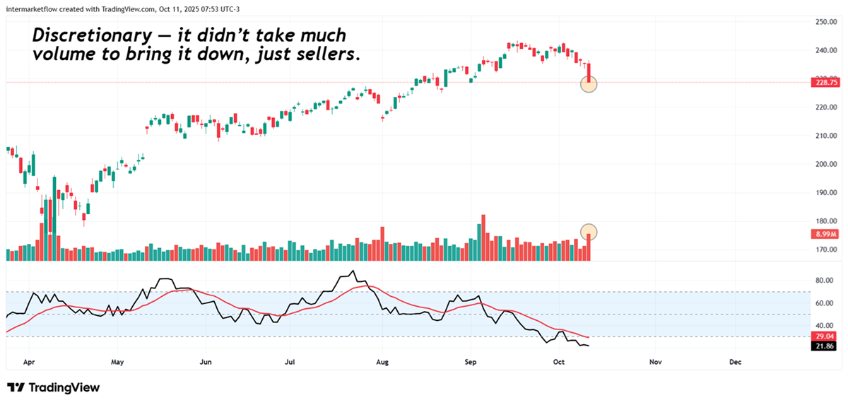
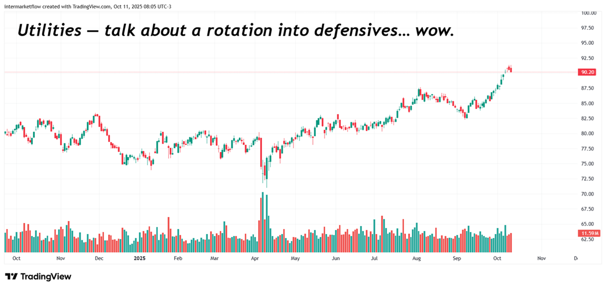
The situation couldn’t be clearer. This week wasn’t just a rotation into defensives — it was an exodus from cyclicals. That says a lot about whether this is simple profit-taking or a deeper correction.
If you believe this is an error, please contact the administrator.
One Response