Executive Summary:
- Two images say more than 2,000 words
- They capture the stagflation running through the economy.
- The spike in rate volatility requires checking it daily
- We compare the six major fast-food chains with the six largest banks showing how the banking sector is still tied to the broader market and hasn’t corrected yet.
- The differences between their business models and the lags in how each reacts to the economic backdrop
- Then we break down the SP500 technical setup
- The six key fast-food charts and the ones we are following.
In the mid-week technical report, I focus on the technical and quantitative signals that cough our eyes. The two following charts are worth a looking.They highlight what looks like a stagflationary backdrop. Trading stagflation is far more complex than trading a recession (we saw this already here), mainly because rate uncertainty distorts every move.
In an stagflation environment with weak real activity, sectors react at different times and in different ways. This chart series captures that dynamic through a clean comparison: a discretionary proxy versus a financials proxy.
Two images for a 2,000-word piece? Stagflation in charts
The 6 Major Fast-Food Companies in a Stagflationary Context
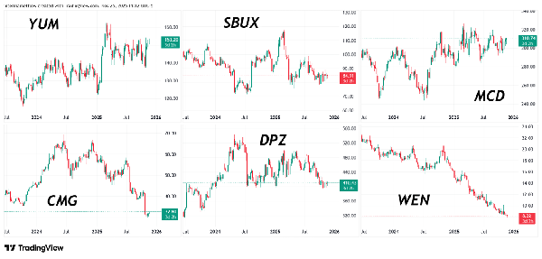
Step back about 20 cm from the screen to get a more panoramic view. What are these six companies going through?
The 6 Major Banks in a Stagflationary Context
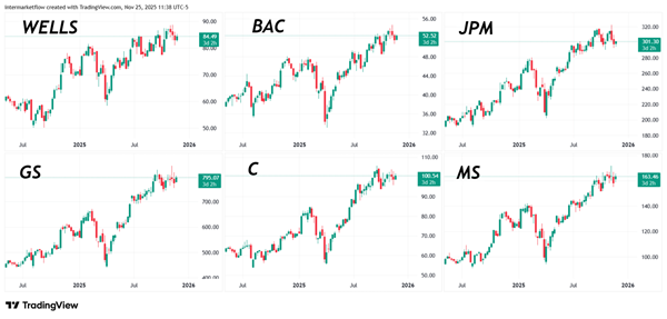
What are these six companies going through?
Both sectors rely on consumer demand, but fast food reacts quickly while financials move slowly. That’s why fast food is already showing the stagflation shock, while financials are still being lifted by the broader market despite the clear stress in their credit books, (we saw this here for all types of credits) especially for those four major banks, (we named them here) that hold 90% of the consumer credit market.
Rate-cut probabilities for December 10. Just 15 days away.
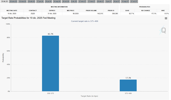
Rate-cut odds are moving fast—check them in real time. Here. With an 82% cut probability priced in, every new data will generate different reactions.
If you were to take a trade, and we will as this probability reaches 100%, checking this cart on a daily basis is key.
The vehicle: today’s dilemma
To trade whichever vehicle we choose, we need a clear view of the overall market and of the specific sector.
The Mid-Week report focuses on T.A., so let’s get to it
SPY: Weekly time-frame volume analysis in a stagflationary context
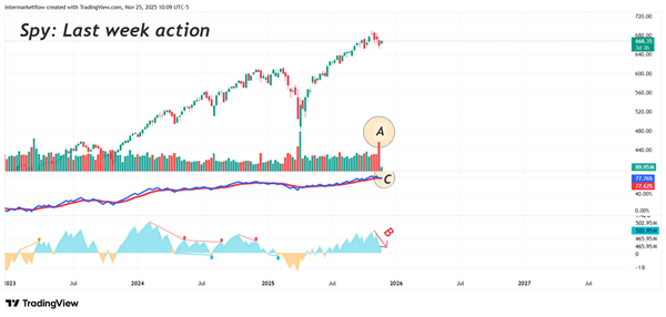
We’re on the weekly chart. Last week’s volume was exceptional(A). Point C shows how many participants remain in the trade, and point B shows whether that participation is growing. It’s still positive—buyers still lead—but the rate is falling, and if that continues, sellers will eventually take over. Corrections usually start when this metric flips negative, signaling sellers > buyers and triggering a classic oversupply move.
Volume-Weighted RSI: Redefining Oscillation
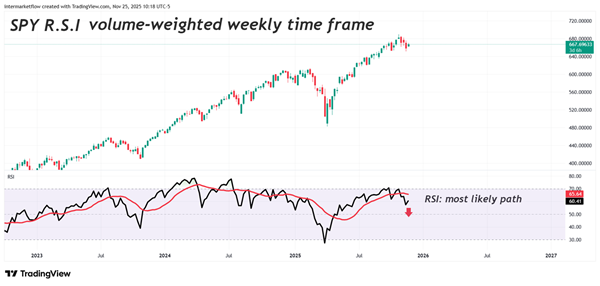
It’s the classic RSI (Relative Strength Index) with a slight correction. It weighs each price by the volume that formed it.I consider that a price achieved during the Asian open is not the same as one achieved in London or New York. Volumes change, and greater volume means greater validation.
Oscillators Weekly time frame
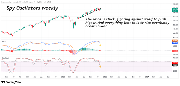
Price is stuck in its own friction—buyers and sellers are evenly matched. The oscillators show that, but more importantly, they show the level where that friction sits.
Daily Point & Figure
The trend tool par excellence, we’re only now getting the first real correction signal.
More info on this charting method here
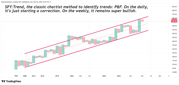
Trend 2: Basic tools but highly effective due to its popularity.
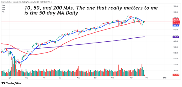
The current trend on the daily chart is short. This is not the same on the weekly chart yet, but there is a detail that is a subtlety we must observe.
Weekly Time Frame: Understanding Mean Reversion
Let’s go to the weekly time frame for a second to understand what the concept of Mean Reversion means.
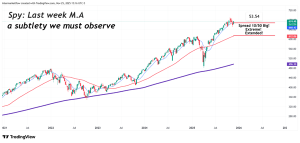
Aligning timeframes in a stagflationary context
Right now the weakness is clear in discretionary names. Financials have bigger downside potential, but there’s no confirmation yet. What’s certain is that their weakness will start the moment the broader market rolls over—they’re moving together.
Thursday’s correction, the daily setup splits into two fronts: price and volume
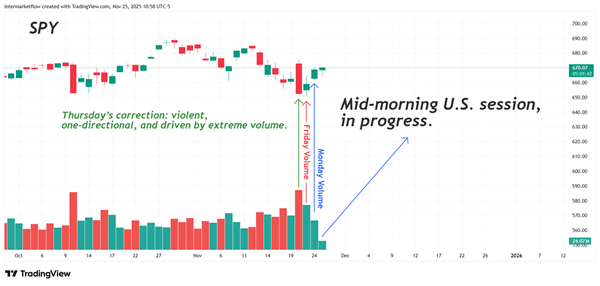
The correction—unrelated to any new developments—started on Thursday in the mid-afternoon
Thursday brought a volume spike and a clean, one-directional candle. But the real read starts on Friday: volume stayed high, yet the move wasn’t decisive—the candle even closed slightly positive. Monday came with lower volume but a stronger candle, hinting at a buy-the-dip attempt. And Tuesday is still in play as I write this, with rate-cut odds back near the highs.
The correction still has fuel. Volume is present, price is bouncing, and the right move now is to stay patient and keep tracking market structure.
The 6 major fast-food companies: A quick snapshot of the charts that caught our attention
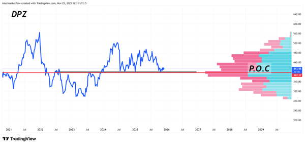
This price is sitting right on top of a major support. And it’s not just the chart pattern that makes it important. It’s an equilibrium level — the most liquid price, the point where buyers and sellers traded the highest volume. That’s exactly what the P.O.C. represents.
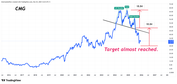
This train has already left the station. Beautiful head and shoulders. As usual in chartism, its popularity is what makes it reliable. The first target is almost reached.
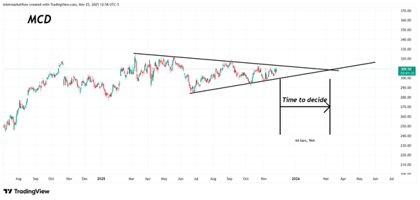
In the middle of the consolidation. Triangular patterns have the virtue of setting the timing of price movements. This chart has potential, and we’re keeping it on our radar.
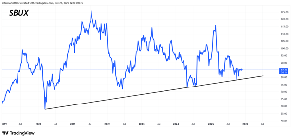
When I chart trends, I prefer to use closing prices. They remove noise and have stronger technical validity.
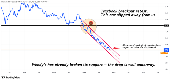
I don’t “forgive” myself for these things. But when a train has already left the station, it’s better to wait for the next one.The break out re test is an excellent trigger. The reason for this is the super short stop loss which configures a good P/L.
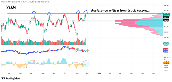
This chart is the one we are looking at closely. A summary of the arguments — some technical, others not.
- If you take a step back from the screen and look at the charts, we’re seeing a sector that’s dropping sharply along with the macro cycle.
- This is a trend, which transforms a potential contrarious trade in a trend following trade.
- The micro shows up too, of course — not all companies are the same, and they don’t operate in the same markets. Even so, the business units tied to the U.S. economy will fall in line with the macro cycle.
- It’s more diversified across different brands. In a way, it feels like we’re diluting the micro risk of each individual company.
- Technically, it has the best risk/reward.
- The volume-related factors line up well and are attractive, in the sense that they still have room to move — on the downside.
It’s not tradable yet for two reasons.
First, neither the broader market nor rates have defined a clear direction.
Second, a potential rate cut can still create noise. We just need to keep watching it, set the alerts, and go fishing. At least with this one!
We are in touch
Martin
Unlock Full Access
We create professional content for traders, based on intermarket, macro, technical, quant, and flow analysis.
Welcome aboard — enjoy the ride.
If you have already registered before, please enter your email again to recover your session.