Executive Summary
Sector Profile
- The methodology for trading early-stage corrections and the two technical variables that matter most throughout the process
- How to select the right vehicle by filtering through sector profiles
- The three sectors we’ve already analyzed from a macro perspective and their different degrees of correction
- Beta as an additional dimension to consider when choosing the vehicle
- Company size as another factor that materially affects the trade
- Final vehicle selection and the technical setup used to execute the trade
At this point, we can say with reasonable confidence that a correction is underway. Its shape and depth will ultimately depend on two forces: the intensity of the downside momentum and the strength of the buy-the-dip counter-move. I read both through volume and how price reacts to different levels of volume. To do this properly, I always drop one time frame below the one I use as my base.
Sector Profile: Disconnected Sectors
We’ve identified three sectors that have already corrected to some extent and remain highly disconnected from the real economy—and from the impact that economic conditions will eventually have on their future earnings.
- Discretionary (especially those targeting low-income segments). We saw it here
- Financials (small names corrected, but four large ones still have hidden paper losses). We saw this a couple of times, among them here.
- Home Builders. We saw them here
We exclude Tech, as its bubble reactions may be deferred, though they are unavoidable.
Sector Profiles

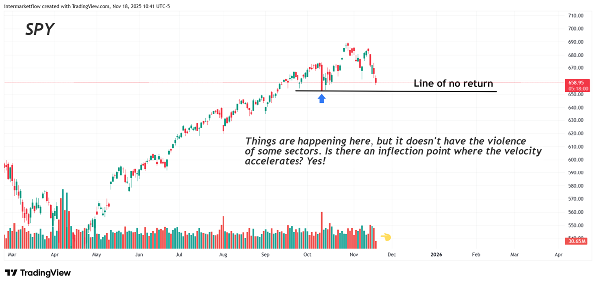
The volume is not exploding. We are looking for a correction, which is happening, but we need more violence. This is because violence confirms the movement, but above all, because a fast, sharp, and well-measured move is the most profitable movement within the markets.

We’re dropping to the daily chart; we already have it on the weekly. Yesterday, Monday, there was already a peak, and yet the Initial and Continuing Claims had not been released. We have nervous players here. More importantly, from a technical standpoint, the breakdown setup is much cleaner. It has only just confirmed the signal, which means a potentially stronger P/L and a much tighter invalidation point.

Again, the reaction kicked in yesterday. Remember, this is another sector that was lagging during the broader correction. It’s now playing catch-up, just like Financials. That improves the P/L for both sectors today and that makes them far more attractive vehicles to trade.
This is exactly where all the macro work we’ve been doing—and the statistics we’ve been tracking—prove their value. Without that framework, none of this would be possible.
More on Sector Profiles
We are quite clear on the profiles. Who has paper losses? Who is targeting the low and middle-income segments? Something is missing….
This chart adds another profile for the company or ETF we are looking at. How much Beta do we want? The answer is clear: confirming the break point of no return, the more Beta the better.
Sector Profiles: HIBS a -3x high beta Sp500 companies

This chart relates to the question of the major correction: a -3x-leveraged ETF of the SPY. I took it to the weekly timeframe, and the market has been accumulating it. It doesn’t confirm what will happen to the upside, but it does confirm that many are speculating on that. Be careful operating 3x-ETFs; they are very expensive to hold over time.
More on Methodology
The last article discussed two levels of analysis.
- The macro, the real economy—where is it? Which sector will it benefit or hurt the most?
- The other level is the analysis of the macro narrative: what stage of its cycle is it in? Well, at a minimum, we can say that it is being challenged, probably in Stage 4, but we cannot technically confirm that until the line in the sand is broken.
Sector Profiles: High Beta Companies

Last Sunday, we sent out these three tables. The first was searching for those with the highest Beta over the last six months. At the end of the table, you’ll find the companies with the weakest performance last week—likely the ones showing the most vulnerability today.
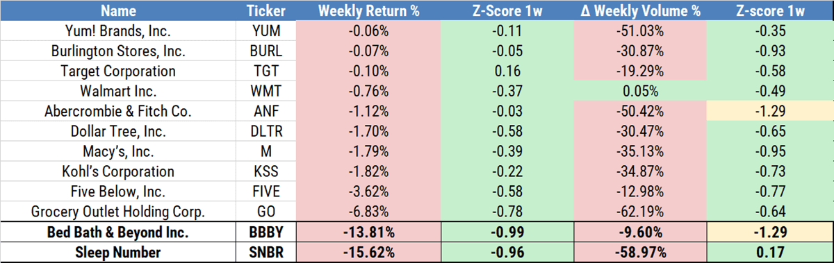
These are discretionary, targeting the low and middle-income segments. That area is packed with opportunities. At the end of the table, you’ll find the companies with the weakest performance last week—likely the ones showing the most vulnerability today.

Yet, more on sector profiles
The table is from Sunday. It showed Small Cap weakness—a different profile.
Below, we include TZA a -3x ETF of the sector and the role of volume live!


On the weekly chart, the signal is already in. The move has started, but when you switch down to the daily, you can see that we need to wait for a pullback. Otherwise, the invalidation point sits too far away, and you’re forced to cut position size to keep your risk in line.

When I trade this type of break, I always wait for the retest of the breakout level. If it doesn’t happen, I skip the trade. The retest tightens the invalidation point while improving the P/L.
I invite you to view the weekly charts of the assets listed in the tables. What do you see? What do they convey to you? The message is clear, in my view.
We’ll see you shortly, God willing
Martin
If you believe this is an error, please contact the administrator.
One Response